How to Use Split-Screen Effects to Compare Examples in 5 Simple Steps
Have you ever tried to explain “old vs. new” with nothing but words… and realized people are just staring at you? I’ve been there. Split-screen effects fix that instantly by putting two visuals side by side, so the comparison is obvious at a glance.
In this post, I’ll walk you through how I set up split screens for real projects (including what I actually click in common tools). I’ll also show you a concrete before/after example: comparing two website hero sections—one with a cluttered layout and one with a cleaner design—so viewers can see the difference without guessing.
If you want comparisons that look clear, balanced, and professional (not like two random screenshots stuck together), keep reading.
1. Understand Split-Screen Effects for Comparison
At its core, a split-screen is just a layout that divides your frame into two panels. What makes it useful is the way it forces your audience to compare—left vs. right, before vs. after, problem vs. solution.
Here’s the “why it works” part I notice every time: people don’t have to remember what they saw a second ago. Your viewer can compare instantly, because both states are visible at once.
When I use split screens, I’m usually doing one of these:
- Before/after (redesigns, UI updates, color grading changes)
- Two options (Product A vs. Product B, two thumbnail styles, two pricing layouts)
- Two data views (same metric, different time periods or segments)
- Two perspectives (camera angle vs. screen capture, gameplay vs. commentary)
And quick reality check: split screens aren’t “fancy graphics.” They’re a communication tool. If your goal is contrast, clarity, and speed, they’re perfect. If you’re just showing two unrelated clips, they’ll probably feel random.
2. Identify Key Use Cases for Split-Screen Comparisons
Before you even open an editor, decide what you’re trying to make people notice. Split screens work best when there’s a clear point of comparison.
Some use cases that consistently perform well (at least in my experience) are:
- Device/resolution comparisons: show how the same UI looks on 1920×1080 vs. 360×800, for example.
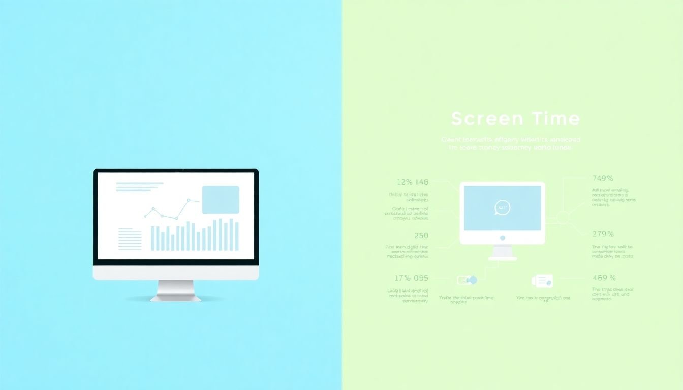
- Regional or audience comparisons: highlight differences in behavior (like screen time or multitasking).
- Process comparisons: show “how it used to be” vs. “how it works now” in a workflow.
- Time-based changes: growth over time (monthly performance, before/after adoption, new feature rollout).
- Feature vs. benefit: left panel shows a feature, right panel shows the outcome (or a user reaction).
One thing I’ve learned the hard way: if there isn’t a meaningful difference, split screens won’t magically create one. Your layout will just make the blandness more obvious.
3. Follow Practical Steps to Create Effective Comparisons
Alright—here’s the part you actually came for. I’m going to break it down into five simple steps, but with tool-specific details so you can build it without guessing.
Step 1: Gather assets (and make them comparable)
Collect the visuals you want to compare—images, video clips, or screen recordings. Then do a quick sanity check:
- Same subject: same screen area, same framing, or same chart type.
- Similar lighting/contrast: if one image is dramatically brighter, your split will look “wrong” even if the layout is perfect.
- Same aspect ratio when possible: if you’re comparing on-screen UI, try to export both at the same resolution.
My go-to tip: if you’re comparing two screenshots, I crop them so the important content starts in the same relative position (top-left or center). It makes the comparison feel intentional.
Step 2: Choose your tool and create the split layout
Pick the editor you’ll actually use. Here are three common workflows that work well.
Premiere Pro (quick split-screen setup)
- Open New Project (or your existing project).
- Create a Sequence that matches your final output (for YouTube, I usually start with 1920×1080, 30fps).
- Drag both video clips (or images) to the timeline.
- Select the first clip → go to Effect Controls → under Motion, adjust Position and Scale to move it to the left half.
- Select the second clip → set it to the right half.
- Optional but helpful: add a thin divider line using a shape overlay (or a simple graphic) so the split is obvious.
DaVinci Resolve (clean and precise)
- Create a New Timeline with your target resolution (example: 1920×1080).
- Place your two clips on the timeline (track A and track B).
- Go to the Edit page → select a clip → open Inspector.
- Under Transform, set the clip’s position to the left or right.
- Adjust Zoom (or Scale) so both sides fill their halves consistently.
- Add a divider line by overlaying a simple graphic on a higher track if you want crisp separation.
Canva (fast for image comparisons)
- Create a design with your target size (for video thumbnails I use 1920×1080).
- Use a 2-column layout (or add a rectangle line and align content to each side).
- Place your left image on the left half and the right image on the right half.
- Add a divider line (thin and subtle usually looks best).
- Export as PNG for static images, or MP4/GIF if you’re animating.
Step 3: Use a clean split ratio (and label it properly)
Here’s a measurable rule I follow: use a 50/50 split by default.
If one side is the “reference” (like the old version), you can give it a slightly larger area—maybe 60/40—but don’t go extreme. Viewers need both sides to feel equally readable.
Label placement matters too. In my projects, I keep text:
- Inside safe margins: avoid putting labels right at the edge where they get cropped on phones.
- Top-left or top-center: it’s easier to scan quickly.
- Short: 2–4 words beats a full sentence.
Step 4: Match color, brightness, and sharpness
This is where split screens either look professional… or like a rushed collage.
What I do before I export:
- Match brightness/contrast: if one side looks washed out, adjust exposure or levels.
- Match color temperature: warm vs. cool differences are super noticeable.
- Match sharpness: one side being noticeably blurrier screams “editing mistake.”
Practical method (no fancy tools required): toggle between sides while zoomed in. If the skin tones, UI colors, or chart colors don’t “feel” consistent, fix it before you finalize the layout.
Step 5: Export with the right specs (so it stays readable)
Export settings depend on where you’re posting, but here are solid defaults I use:
- YouTube / video platforms: H.264, 1080p, 30fps (or match your source), bitrate around 8–12 Mbps for 1080p.
- Social clips: keep it under 20–30 seconds if the comparison is simple.
- Text readability: if your labels are small, export a test version and check on your phone before doing the “real” export.
6. Addressing Common Challenges in Split-Screen Creation
Even when you know what you’re doing, split screens can trip you up. Here are the problems I run into most often—and how I fix them.
1) One side looks sharper or brighter.
That’s usually a mix of resolution, color, and scaling differences. Before you place clips side by side, adjust them so both halves feel consistent. If you’re matching UI screens, I also make sure both sides are scaled to the same “relative size” of the main content.
2) Aspect ratios don’t match.
If one clip is 16:9 and the other is 4:3 (or you captured at different sizes), you’ve got two options: crop or letterbox. Cropping is fine if you keep the key content visible. Letterboxing is safer if you don’t want to cut anything important.
3) It feels cluttered.
If your labels, arrows, and extra text stack up, viewers stop comparing and start scanning. I keep it simple: one label per side, a subtle divider, and only one “callout” if you absolutely need it.
4) Mobile readability issues.
This one’s real. Text that looks perfect on desktop can become tiny on a phone. Do a quick test: export a short sample, open it on your phone, and check whether you can read the labels in under 2 seconds.
5) Divider line is too loud (or missing).
If there’s no visual separation, people can’t tell where one side ends. If the divider is too thick or high-contrast, it becomes distracting. Thin and subtle usually wins.
By the way, the tools can help with this. If you’re using editors like DaVinci Resolve or Canva, you can quickly adjust positioning, scaling, and simple overlays to fix these common issues without starting over.
7. How to Use Split-Screen Effectively in Different Content Types
Different content styles need different split-screen behavior. Here’s what I’ve found works best.
Tutorials / educational videos: Use split screens to compare steps, outcomes, or two methods. For example, left side shows “Step 1” while right side shows “Step 2 result.” Just don’t keep it on the entire time—mix it with full-screen shots so the split remains special.
Marketing: Put the product feature on one side and the benefit on the other. If you’re comparing two products, keep the framing consistent so viewers aren’t distracted by different angles.
Data content: Use the split to show the same chart type with different time periods or segments. Viewers understand comparisons faster when the visuals match.
Reviews / streaming comparisons: Split-screen is great for “screen on one side, reaction on the other.” It gives context without requiring viewers to pause the video.
My rule of thumb: use split screens when the comparison is the point. If you’re just showing two things, use full screen and cut between them instead.
8. Styling Tips for Making Split-Screen Content Look Better
Styling is where split screens go from “works” to “looks intentional.”
- Use a subtle divider: a 2–4px line (depending on resolution) is usually enough.
- Keep borders consistent: if you add a border, use the same thickness and padding on both sides.
- Choose one accent color: let that accent color appear in labels or arrows, not everywhere.
- Short captions only: “Before” / “After” or “Option A” / “Option B.” Save the details for voiceover or description.
- Soften busy backgrounds: if the visuals are noisy, a light blur or dim overlay behind labels makes text readable.
- Use transitions sparingly: a simple fade or slide can feel polished, but constant motion can pull attention away from the comparison.
Also, keep your branding consistent—same font, same label style, same corner rounding (if you use it). Viewers subconsciously trust content that looks cohesive.
9. Best Practices for Sharing Split-Screen Content Online
Once you’ve built the split-screen, your job isn’t done. Sharing is where formats and compression can ruin readability.
- Preview on multiple devices: desktop + phone at minimum.
- Compress smartly: keep quality high enough that labels and chart text don’t turn into mush.
- Match platform expectations: YouTube likes 16:9 1080p; vertical platforms may need a different layout or safe margins.
- Front-load the comparison: show the split early so people immediately understand what they’re looking at.
- Write descriptions that explain the “why”: don’t just say “comparison video.” Mention what improved or what’s different.
- Ask a specific question: “Which layout do you prefer and why?” gets better comments than “Thoughts?”
If you’ve got related tutorials or supporting posts, link them. But keep it relevant—don’t spam visitors with unrelated pages.
10. Using Real Data to Support Your Split-Screen Comparisons
Here’s a simple truth: split screens are persuasive when the comparison is backed by facts.
In my own content, I like using data in a “same metric, different segment” format. For example:
- Left: % of devices using 1920×1080
- Right: % of devices using 360×800
If you want reference numbers, one source reported that 7.97% of devices use 1920×1080 and 6.58% use 360×800 (source: Statcounter).
Another comparison I’ve used is daily screen time. One report notes Americans are around 7 hours while South Africans average over 9 hours daily in front of screens (source: Exploding Topics).
And here’s a practical walkthrough for turning that into a split-screen visual (no guessing):
- Pick one chart type (bar chart works great for side-by-side comparisons).
- Create the chart with two bars per panel (or one bar per panel if you’re keeping it super clean).
- Export the chart as a PNG at high resolution (so text stays sharp).
- Place chart A on the left and chart B on the right in your editor.
- Add a label like “1920×1080” and “360×800” directly above each chart.
- Optional: add a short “data takeaway” line under the split (example: “More common resolution = better for layout previews”).
For second-screen behavior, one source reported that 88% of Americans and 86% of internet users worldwide multitask while watching TV (source: Arena).
When you show that data visually in a split layout, it’s not just interesting—it’s easier to remember.
And yes, linking back to the original source (like createaicourse.com) helps readers verify claims and can support SEO by reinforcing relevance.
FAQs
Split-screen effects display two (or more) visuals side by side so viewers can compare them quickly—like before/after changes, two product options, or contrasting data. It’s especially useful when you want the comparison to be obvious without forcing viewers to remember what they saw a few seconds earlier.
Use split-screen comparisons when there’s a clear “A vs. B” moment: redesigns, feature comparisons, two methods in a tutorial, or two segments of the same metric. If your content isn’t actually being compared, split screens can feel distracting—so I only use them when the difference is the point.
You’ve got a lot of options. For video editing, people commonly use Adobe Premiere Pro, DaVinci Resolve, and Final Cut Pro. For simpler layouts and faster image comparisons, Canva and Kapwing are popular because they’re straightforward and quick to export.
Keep labels short, place them away from the edges (so mobile cropping doesn’t cut them off), and export a quick test to check on your phone. If your labels are smaller than you think they should be, they probably are.
Most of the time, yes—50/50 looks clean and fair for comparisons. If one side is the reference (like a “before” state you want viewers to focus on), you can go slightly uneven (like 60/40), but I wouldn’t push it too far. The goal is balance and readability.
Usually it’s color/brightness differences, different scaling, or mismatched resolution/sharpness. Before you lock the layout, match the look of both sides—then re-check on mobile. That one step fixes a ton of “this feels off” problems.