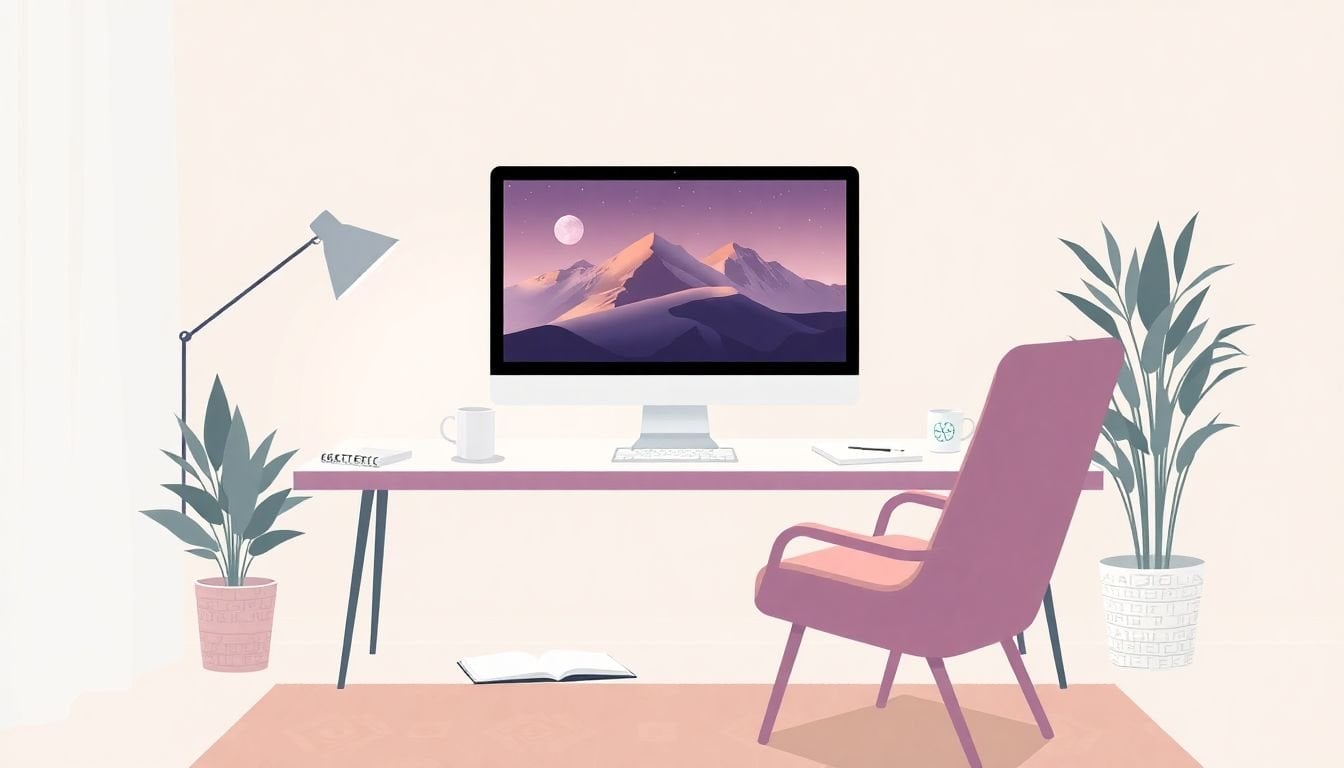
How to Create Course Artwork Using Diffusion Models in 6 Simple Steps
I get it—when you’re trying to create course artwork, it can feel weirdly hard at first. You’re not trying to become an artist. You just want thumbnails, slide visuals, and banners that look consistent and actually fit your course. And yeah, you might wonder: do I need fancy design skills or expensive software to pull this off?
In my experience, diffusion models are the fastest way to get there. I’ve used them to generate a full set of course visuals for a mini-course (thumbnail + slide illustrations + a banner), and what surprised me most was how much you can improve results just by changing your workflow—not by “getting better at art.”
Below, I’ll show you a practical, step-by-step process I used to go from a rough idea to usable course artwork. No fluff. I’ll include prompt templates, settings ranges I actually tested, and a couple of quick case notes from my own runs.
Key Takeaways
Key Takeaways
- Pick your tool based on output style and workflow: Stable Diffusion for control and customization, DALL-E 3 for strong prompt-following and creative results.
- Write prompts like you’re giving a brief to a designer: include subject, setting, lighting, composition, and a consistent style line.
- Generate in small batches and refine with targeted prompt edits (not random tinkering). Track what settings you used so you can repeat winners.
- Fine-tuning is optional. If you want strict consistency (same character, same visual language), LoRA-style fine-tuning with a small, well-labeled dataset can help a lot.
- Before uploading to your course platform, resize and compress for web use (don’t just dump 4K images everywhere).
- For commercial courses, be intentional about licensing and provenance—keep notes on training data and follow platform terms.

Step 1: Choose the Right Diffusion Model (and Tool) for Your Course
Choosing the model isn’t just a technical decision—it decides how much control you’ll have over style, consistency, and speed. When I’m making course artwork, I’m usually juggling three deliverables: a thumbnail (small but attention-grabbing), slide visuals (clean and readable), and a banner (wide composition).
Here’s how I pick:
- Stable Diffusion: I like it when I want more control over composition and I’m okay doing a bit of setup. It’s great for consistent styles, and you can often tweak details like sampler, steps, and resolution more directly. If you want a place to start, Stable Diffusion is a common entry point.
- DALL-E 3: If I need the model to follow more nuanced prompt instructions (like “use a flat vector style, but keep the character proportions”), DALL-E 3 usually saves me time. It’s less “tweak everything,” more “good results quickly.” You can explore info via DALL-E 3.
- Workflow matters: Some tools are easier for batch generation and export. If you’re producing 30+ assets, batch support becomes a big deal. Also check whether the platform supports custom models or style references.
- Cost and iteration speed: Free or cheap options are great for testing prompts. For production runs, I usually switch to whichever tool lets me iterate quickly without fighting the UI.
One thing I don’t skip: check the tool’s licensing and data policies before you build a course that you’ll sell commercially. Some models are trained on large datasets with restrictions you should understand upfront.
Step 2: Turn Your Course Idea into a Prompt That Actually Works
This is where most people overcomplicate things. They think they need fancy art direction. You don’t. You need a prompt that’s clear about subject, style, and composition.
Before I generate anything, I write down three lines:
- Subject: what’s in the image (e.g., “a student using a laptop and looking confident”).
- Style: how it should look (e.g., “modern flat vector, clean shapes, minimal shading”).
- Composition: how it should be framed (e.g., “centered, negative space on the right for a title”).
My prompt template for course artwork
Template (copy/paste):
[STYLE LINE], [SUBJECT], [SETTING], [LIGHTING], [COMPOSITION], [COLOR PALETTE], high quality, no text, no watermark
A worked example: thumbnail + slide + banner
Thumbnail (16:9-ish but cropped later):
Modern flat vector illustration, confident student using a laptop, bright classroom background, soft daylight, centered composition, bold shapes, teal and orange color palette, leave empty space at the top for course title, no text, no watermark
Slide visual (16:9):
Clean vector style, simple icons around a laptop, subtle gradient background, consistent line thickness, balanced layout, teal/orange palette, no text, no watermark
Banner (wide):
Flat vector hero banner, laptop in the foreground with floating learning icons, wide panoramic composition, left-to-right flow, bright and friendly colors, clean negative space on the left, no text, no watermark
What I noticed after a bunch of runs: adding too many “art-y” adjectives can make the model wander. Instead, I keep the prompt tight and repeat the same style line across all assets so the set feels cohesive.
If you want consistency, don’t redesign the wheel for every image. Use the same style line and just swap the subject and setting.
Step 3: Generate and Refine Artwork Using Diffusion Models (with settings I tested)
Once your prompt is ready, generate in batches. Not one image. I usually do 8–16 variations per asset, then pick the best 1–3 to refine.
Most tools let you adjust a few core settings. Here are the ones I actually watch:
- Steps (how long the model “thinks”)
- Guidance scale (how strongly it follows your prompt)
- Seed (helps you reproduce a look)
- Resolution / aspect ratio (critical for course layouts)
Stable Diffusion-style settings (practical ranges)
If you’re using a Stable Diffusion interface (or a tool that exposes similar controls), these ranges are a good starting point:
- Steps: 25–40 for most course visuals
- Guidance scale: 5–8 (lower = more creative drift; higher = more prompt-locked but can get “stiff”)
- Seed: save the seed for your best result so you can iterate without losing direction
- Aspect ratio: 16:9 for slides, 1:1 or 4:5 for thumbnails depending on your course platform
My refinement loop (this is the part that saves hours)
When the first batch isn’t right, I don’t rewrite the whole prompt. I make one change at a time:
- If it ignores the style: increase guidance scale slightly (e.g., 6 → 7) and keep the style line unchanged.
- If it looks blurry or “unfinished”: increase steps a bit (e.g., 30 → 38).
- If the composition is wrong: add one composition phrase like “centered composition” or “leave empty space on the right for title.”
- If the colors are off: explicitly mention the palette (teal/orange, etc.).
Quick case note from my workflow
I generated 30 thumbnails for a “Module 3: Getting Started” section. The biggest improvement came from two changes: (1) I fixed the style line and reused it across all thumbnails, and (2) I added “leave empty space for title” to the prompt. Without that, the model loved putting important visual elements right where my title text needed to go.
In the best batch, I used roughly 32 steps and a guidance scale around 7. After that, I could pick winners quickly and only do light touch-ups in an editor.
Step 4: Fine-Tune and Customize Your Diffusion Model (when you actually need it)
Let me be blunt: fine-tuning isn’t required for most course artwork. If you’re happy with “good enough” consistency, you can stick to prompting and selection.
But if you want strict consistency—same character, same visual language, same layout vibe across dozens of assets—fine-tuning can help. I’ve only gone this route when I needed a cohesive brand feel.
What to fine-tune (and what to avoid)
- LoRA / lightweight adapters are usually the sweet spot for course creators because they’re cheaper than full fine-tunes.
- A full fine-tune can be overkill unless you’re doing serious production work.
- Don’t train on random images. You’ll get messy outputs if your dataset isn’t consistent.
Dataset size targets (practical numbers)
For LoRA-style adapters, I’ve seen decent results with:
- 20–50 images for a very specific style (same character / same theme)
- 50–200 images if you want the model to generalize across multiple scenes while keeping the style
Also, captioning matters. Even simple captions like “teal/orange flat vector, classroom scene” can help more than you’d expect.
How I’d structure training (high-level but actionable)
- Resolution: pick something close to your final use (e.g., 512x512 base for many workflows, or higher if your tool supports it)
- Captioning: include style + subject + setting; keep wording consistent
- Training method: LoRA adapter training (lightweight)
- Hyperparameters: start with conservative defaults, then adjust only if results are washed out or too “overfit”
Expected time/cost (what it feels like in practice)
On a typical single consumer GPU setup, a LoRA run with a small dataset can take anywhere from 1–6 hours depending on resolution, batch size, and your training steps. If you’re using a managed platform, you’ll pay per run, but you avoid the headache of environment setup.
If you don’t want to deal with any of that, skip fine-tuning and just focus on prompt consistency + post-processing.
Copyright + licensing checks for training data (do this before you train)
If your course is commercial, treat this seriously. Here’s a practical checklist:
- Use images you own or images with explicit licenses that allow training/adaptation.
- Keep a provenance folder (links, license text, and dates). Future-you will thank you.
- Document your dataset: number of images, what they represent, and the captioning approach.
- Follow platform terms for any model or hosting service you use.
- If you can’t verify licensing, don’t train on it. Generate your own assets instead.
This isn’t about fear—it’s about not creating a course asset you later have to pull.
Step 5: Incorporate Generated Artwork into Your Course (formats, sizes, and naming)
Now the fun part: putting your artwork to work. The biggest mistake I see is uploading huge images everywhere. It looks fine on your computer. It might slow down the course for students.
Here’s a simple approach I use:
- Thumbnails: export at a clear square or platform-friendly size (common: 1024x1024, then let the platform crop)
- Slides: use 1920x1080 (16:9) so you don’t get blurry scaling
- Banners: aim for wide exports like 2560x1440 or whatever your course builder prefers
Where to insert images
- Google Slides / PowerPoint: insert the image, then resize to fit. Try not to stretch it—crop instead.
- LMS / course pages: upload to your lesson/module pages. If you’re using learning management systems, check recommended image sizes and compression rules.
Overlay tip (so your text stays readable)
If you’re adding title text on top of artwork, add a subtle overlay in your editor. Even a simple semi-transparent rectangle behind the text makes a huge difference for readability.
Also: keep your visual style consistent across modules. Students notice patterns—even if they don’t say anything.
Practical naming convention (helps when you scale)
- course-module-03_thumbnail_v01.png
- course-module-03_slide-01_v02.png
- course-hero_banner_v01.png
Step 6: Keep Up with Diffusion Tech (and avoid common pitfalls)
Diffusion models move fast. New checkpoints, better samplers, improved prompt handling—it all changes how quickly you get usable results.
What I do is follow updates from the same places I test models from, like Stable Diffusion and DALL-E 3. I also check communities (Reddit/Discord) because that’s where people share “what actually worked” settings.
About attribution scores (use it correctly)
You’ll see tools mention attribution or similarity metrics. One example is the paper:
“DAS: Detecting Attribution of Synthetic Images” by [authors as listed in the paper] (arXiv: 2404.07982).
In practice, these attribution scores try to estimate whether a generated image resembles or can be traced back to certain sources. I treat it as a risk signal, not a final legal verdict. If your score looks concerning, I’d re-generate, simplify the prompt, avoid overly specific copyrighted references, and keep your provenance notes.
Also, if you’re using cloud-based tools, you’ll usually get updates automatically. For organized workflows, I’ve found it helpful to use an online AI art platform that’s already designed for exporting and reusing assets.
Bottom line: keep iterating, save your prompts/seeds, and don’t ignore image optimization. Consistency beats “random creativity” when you’re building a real course.
FAQs
A diffusion model generates images by starting from random noise and gradually refining it into a detailed image that matches your prompt. It’s basically learning how to “denoise” into something meaningful, guided by text input.
Do it in a repeatable way:
- Use a consistent style line across your whole course asset set.
- Generate 8–16 variations per asset, then pick the best starting point.
- Adjust one setting at a time: if it ignores your prompt, nudge guidance scale up; if it’s low detail, raise steps slightly.
- Fix composition with explicit phrases like “centered composition” or “leave empty space for title.”
- Post-process lightly (crop, sharpen, color balance). Don’t rely on the model to do perfect layout for you.
If you want a concrete prompt tweak, try swapping your last line from “high quality” to something like: no text, no watermark, leave negative space for title.
Yes. Some tools support custom models, and others let you fine-tune (often via lightweight methods like LoRA adapters). Fine-tuning is most useful when you need consistent style or a specific subject/character across many images.
If you don’t need strict consistency, you can get surprisingly far with prompting + selecting the best outputs and then doing small edits.
- Thumbnails: use a bold, high-contrast image and keep space for the module title.
- Slide visuals: generate 16:9 images (1920x1080) so they don’t blur when you scale.
- Lesson headers: add a hero image at the top of each module page.
- Project examples: generate “before/after” visuals or sample outcomes students can imitate.
Quick troubleshooting checklist: if text is hard to read, add an overlay; if images look inconsistent, lock the style line and regenerate; if files load slowly, export smaller (web-friendly) versions.