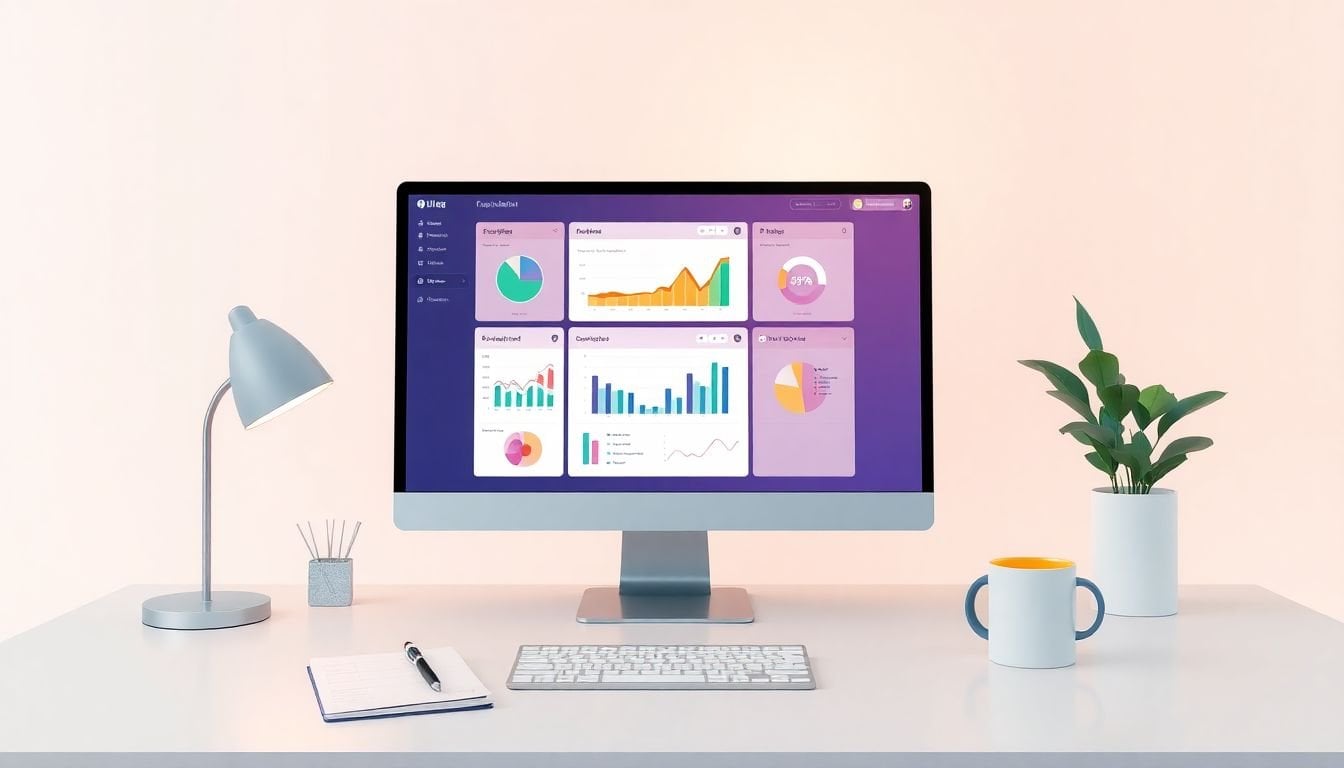
Setting Up Dashboards for Real-Time Insights: 10 Essential Steps
I’ve built a few “real-time” dashboards that sounded great on paper… and then lagged the moment traffic spiked. So when people ask me how to set up dashboards for real-time insights, I always tell them the same thing: start with the KPIs, then build the pipeline, and only then worry about visuals. Otherwise, you end up with pretty charts that don’t help anyone make decisions.
In this post, I’m going to walk through 10 essential steps I actually use to get dashboards updating fast, staying accurate, and not turning into a maintenance nightmare.
Quick translation: “Real-time” doesn’t always mean “every second.” In most setups, it means “fresh enough to act on within minutes,” with alerts when something breaks or goes sideways.
Key Takeaways
- Pick a small set of KPI dashboards first (I usually start with 5–8 total) so your “real-time” view stays focused.
- Choose tools based on connectors, latency tolerance, and governance—not just how nice the charts look.
- Connect sources using APIs/connectors, then validate with a “known good” test query before you trust the numbers.
- For streaming, decide your refresh strategy up front (e.g., 15s/1m/5m) based on event volume and how fast teams need answers.
- Build metrics with explicit definitions (event names, filters, time windows) so you don’t get KPI drift.
- Design the layout around decisions: top-of-page = what to watch right now, middle = diagnosis, bottom = context.
- Implement updates realistically: poll where streaming isn’t worth the complexity; stream where it matters.
- Use alerts with real thresholds and escalation paths (e.g., “bounce rate +20% in 10 minutes” → Slack + incident ticket).
- Monitor data freshness and pipeline health, not just business KPIs—this is where most failures hide.
- Maintain the dashboard like a product: version metrics, review performance, update connectors, and clean up unused charts.

1. Set Up Dashboards for Real-Time Insights
When I say “real-time dashboard,” I’m not talking about a single magic feature. I’m talking about a system that updates on a schedule and signals when it needs attention. That’s what lets you react quickly instead of reading yesterday’s numbers.
Start with your goals. Then pick KPIs that map directly to those goals. For a marketing team, that might be:
- Traffic (sessions, users)
- Engagement (events, engaged sessions)
- Conversions (purchase count, sign-ups)
If you’re working with Google Analytics 4, I’ve found it helps to be very explicit about event/metric names. For example, rather than “conversion,” define it as something like:
- Conversion event:
purchase(or your custom event likesign_up_complete) - Engagement:
user_engagementplus an event count you control - Time window: last 15 minutes / last 1 hour (pick one and stick to it)
Also, don’t skip the “who is this for?” question. A dashboard for executives should look different from one for someone troubleshooting a broken funnel. The fastest way to waste time is building one dashboard that tries to serve everyone.
Finally, personalize the interface—but in a useful way. I usually limit the color palette to two accent colors and keep “alerts” visually consistent (for example, red always means “action needed”).
2. Choose the Right Tools and Technologies
Tool choice is where a lot of real-time projects either succeed fast or stall for weeks. I don’t pick tools based on “best visuals.” I pick based on how the data actually gets to the dashboard.
Here’s what I look at when comparing options like Tableau, Power BI, or Google Data Studio (now Looker Studio):
- Latency + refresh options: Can you refresh every 15s/1m/5m without breaking?
- Connector support: Does it connect cleanly to GA4, BigQuery, Postgres, Salesforce, etc.?
- Governance/security: Role-based access, audit logs, and row-level security if you need it.
- Cost model: Some setups get expensive fast when you query the same data every minute.
- Operational sanity: How hard is it to debug when numbers don’t match?
One scenario I see a lot: small team + GA4 + BigQuery. In that case, I’d usually go with a BI tool that reads from BigQuery and supports scheduled refresh. You get speed, and you avoid re-building the same joins inside the dashboard.
Another scenario: enterprise + CRM + streaming. If you’re ingesting events continuously, you’ll probably want a warehouse + streaming layer (Kafka/Pub/Sub, etc.) and then a BI tool that can query pre-aggregated tables. Real-time dashboards are often “real-time enough” when the heavy lifting happens upstream.
And yeah—customer support matters. When something doesn’t work at 9am on launch day, you’ll be grateful you can reach someone who knows the connector.
3. Connect Your Data Sources
Connecting data sources sounds simple until you try to reconcile numbers. I always treat this step like a mini science experiment: connect, verify, then build dashboards on top.
First, list every system feeding your KPIs:
- GA4 (events, conversions)
- Ad platforms (Google Ads, Meta, etc.)
- CRM (leads, pipeline stage changes)
- Support tools (tickets created/resolved)
Then decide how you’ll connect them:
- Connectors (fastest): built-in integrations inside your BI tool.
- APIs (most control): pull data on a schedule or on demand.
- ETL/ELT (best for reliability): move data into a warehouse first, then query it.
For GA4 specifically, a common pattern I use is:
- GA4 → export to BigQuery (native export or scheduled transfer)
- BigQuery → build clean reporting tables (events, sessions, conversions)
- BI tool → dashboard reads those tables
If you want a reality check, don’t trust the dashboard until you run a known-good query. For example: pick a 15-minute window, compare the dashboard’s “sign-ups” to what you see in GA4 for that same window. If they don’t match, it’s usually one of these:
- Filters don’t match (UTM/source definitions differ)
- Event names differ (custom events renamed or missing)
- Time zone mismatch (GA4 uses a property time zone; your warehouse might use UTC)
- Deduping logic is wrong (especially for leads)
4. Set Up Real-Time Data Streaming
Streaming is where you get the “freshness” people expect. But it’s also where complexity creeps in. So I recommend you decide what actually needs real-time.
Here’s a practical way to think about it:
- Needs near-real-time: checkout/purchase funnel, site outages, ad campaign performance, fraud/spam detection
- Can be delayed: daily revenue summaries, weekly content performance, long-term cohort analysis
For streaming, you typically set up a pipeline like:
Source → stream → warehouse → dashboard
For example, you might use Google Cloud Pub/Sub to ingest events, then land them in a warehouse (BigQuery/Snowflake), then query pre-aggregated tables for the dashboard.
What I’ve learned the hard way: measure latency once you build it. Don’t guess. Check:
- Time from event created → event available in warehouse
- Time from warehouse update → dashboard refresh
- Time from refresh → user sees it (yes, sometimes caching adds extra delay)
If you’re not doing true streaming, polling can still work. I’ve shipped dashboards that poll every 1 minute using scheduled queries and “last 15 minutes” windows—fast enough for most marketing and product monitoring.
5. Build Dashboard Metrics and Visualizations
This is the step that decides whether your dashboard is trusted or ignored. If your metrics aren’t defined clearly, people will stop using it.
Start with metric definitions that are unambiguous. For GA4-style data, I like to write down:
- Metric: “Conversions (last 15m)”
- Definition: count of
purchasewhereevent_timestampis within the last 15 minutes - Filters: exclude internal traffic, filter to the right country/property
- Deduping: how do you handle retries?
Then build visuals that answer specific questions. A few examples that work well in real-time monitoring:
- Line chart: sessions or conversions over the last hour (spot sudden dips/spikes)
- Bar chart: top landing pages driving engagement right now
- Funnel view: landing → key event → conversion (helps diagnose drop-offs)
- Heat map: device + country performance (great for campaign troubleshooting)
And no, you don’t need 30 charts. I usually aim for 3–6 primary visuals on the first screen, plus drilldowns for people who want details.
If you’re building in a BI tool, I’ve had decent results with Tableau and Looker Studio for quick iteration. The key is not the tool—it’s that the charts reflect your KPI definitions.
6. Design the Dashboard Layout
Layout is underrated. A dashboard can have perfect data and still fail if it’s hard to interpret in under 30 seconds.
Here’s how I structure it:
- Top row: the 3–5 KPIs that matter right now (with deltas vs. previous 15m/1h)
- Middle: diagnosis charts (traffic sources, top pages, funnel step breakdown)
- Bottom: context and “what changed” panels (segment filters, event breakdowns, data freshness)
Group related metrics together. For example, keep conversion KPIs near the acquisition metrics. That way, when conversions drop, you can immediately check whether traffic quality changed.
Use whitespace aggressively. If everything is bold and colorful, nothing is. I also keep typography consistent and avoid tiny legends that people can’t read on mobile.
Make it responsive, yes—but also test it. I’ve seen dashboards that looked great on a 27-inch monitor and turned into unreadable blocks on a laptop during an on-call shift. Get a couple of real users to check it before launch.
7. Implement Real-Time Data Updates
Updates are where “real-time” either becomes real or stays marketing.
First, decide your refresh interval by use case. Here are ranges that tend to make sense:
- High urgency (outages, checkout errors): 15s–1m
- Campaign monitoring: 1m–5m
- General engagement trends: 5m–15m
Then implement updates using what your stack supports. Many BI tools let you refresh on a schedule, but I often still do one extra step: pre-aggregate upstream so the dashboard queries are fast.
For example, instead of recalculating funnel metrics from raw events every minute, create a table like funnel_last_15m that updates every minute. The dashboard reads from that table and stays snappy.
Real-time updates are especially helpful during campaigns because you can validate things like tagging, landing page performance, and whether conversion events are firing correctly.
One practical trick: when you deploy a tracking change, temporarily add a “tag health” widget. I typically track a couple of events (like page_view and your conversion event) and alert if their counts drop to near-zero.
8. Add Alerts and Notifications
Alerts are what turn a dashboard into an operational tool. Otherwise, it’s just a screen you hope people check.
Set alerts for specific KPI thresholds and define escalation. Here are examples I’d actually use:
- Engagement drop:
user_engagementcount drops > 30% compared to the previous 15 minutes - Conversion slowdown: conversions < 70% of the 1-hour rolling average
- Tag failure: conversion event (
purchaseorsign_up_complete) stops firing for 10–15 minutes - Latency issue: data freshness > 5 minutes behind “now” (this one saves you constantly)
When an alert triggers, don’t just send a notification—route it. For example:
- Slack channel for “FYI” alerts
- Email/Teams for “action required”
- Incident ticket creation for repeated failures (e.g., 3 triggers in 30 minutes)
Also, be careful with alert volume. Too many alerts and people mute them. Too few and you miss the real problems. I usually start with 5–10 alerts total and expand only after the team confirms they’re useful.
9. Ensure Effective Real-Time Monitoring
Monitoring isn’t just watching KPIs. If your pipeline breaks, your dashboard will lie—quietly.
Here’s what I monitor in real-time setups:
- Data freshness: “last updated at” timestamp in the warehouse
- Ingestion volume: events/minute (drop-to-zero is a huge red flag)
- Schema changes: new/removed fields in event payloads
- Pipeline errors: failed jobs, retry counts, queue backlog
- Dashboard performance: query time and page load time
About the “dedicated monitoring tool” idea: if you have budget, it can help by tracking pipeline health and alerting faster than BI-only solutions. If you don’t, you can still do a cost-effective version by:
- Scheduling a freshness query every 1–5 minutes
- Logging results to a table (or even a simple status endpoint)
- Alerting when freshness or event counts cross thresholds
In my experience, the best teams assign someone to own monitoring during business hours—otherwise alerts turn into “someone should look at that.”
10. Optimize and Maintain the Dashboard
Real-time dashboards aren’t “set it and forget it.” They’re more like living systems.
Here’s what I revisit regularly:
- KPI alignment: are the KPIs still tied to current business goals?
- Metric definitions: did an event name change? did filters change?
- Connector health: APIs get rate-limited, credentials expire, schemas evolve.
- Performance: if load time creeps up, users stop trusting it.
One concrete improvement I made on a previous dashboard: we reduced load time by cutting the number of “heavy” charts on the default view and switching to pre-aggregated tables updated every minute. It wasn’t glamorous, but it made the dashboard usable during peak traffic.
Also, ask for feedback from the people using it. If someone says, “I can’t tell what changed,” that’s usually a layout or delta/threshold problem—not a data problem.
Finally, keep integrations in sync. When one data source lags (or starts sending duplicates), real-time dashboards amplify the issue. Maintenance is what keeps them reliable.
FAQs
Real-time dashboards help teams spot issues and opportunities faster—like sudden engagement drops, broken conversion tracking, or campaign changes—so decisions happen while the effect is still happening, not after it’s already gone.
Common options include Tableau, Power BI, and Google Data Studio (Looker Studio). “Optimal” depends on your data sources and refresh needs—some tools work great for warehouse-based dashboards, while others are better when you need strong governance, streaming support, or specific connectors.
Use built-in connectors when available, or connect via APIs. In many real-time setups, I recommend landing data in a warehouse (like BigQuery/Snowflake) first, then building a clean reporting layer so the dashboard queries stay fast and consistent.
Focus on visual hierarchy and decision flow. Put the most important KPIs at the top, group related metrics together (e.g., acquisition near conversion), and keep charts readable at a glance. If users can’t interpret it quickly, the layout needs work—not more data.