
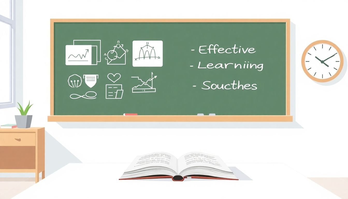
How to Use Visuals and Interactivity in Video Lessons Using Dual Coding Theory
I’ve had the same problem as a lot of instructors: you record a video, it’s clear in your head, but once it’s on the screen… the visuals don’t match the words, or the words don’t match the visuals. And suddenly learners are stuck. They’re either reading tiny slide text or watching something that has nothing to do with what you’re saying.
What changed everything for me was building lessons around the idea that people learn through two channels: words (what you say and narrate) and visuals (what you show). That’s the core of dual coding theory. And yes—when you actually design for it (instead of “adding a graphic somewhere”), it feels noticeably easier for learners to follow.
In one course I redesigned last year, the original lesson was basically narration over a static slide deck. Completion was fine, but quiz performance lagged—especially on questions that required learners to explain a process in order. After I rebuilt it with synced diagrams and short “check yourself” prompts, the same cohort scored higher on the first attempt. Not magic—just better alignment.
So in this post, I’m going to walk you through a practical dual-coding workflow for video lessons: how I plan visuals, how I script narration so it lands right when the graphic appears, and how I add interactivity in a way that improves measurable outcomes (not just engagement for engagement’s sake).
Key Takeaways
- Pair narration with visuals that directly represent the same idea at the same moment—no “random images” allowed.
- Use simple graphics (flowcharts, labeled diagrams, step sequences) and keep text minimal so learners don’t split attention.
- Add interactivity at predictable points (for example, a 10–20 second question after each major step) and use the results to revise.
- Revisit key ideas with spaced review: short recap at the start/end of the lesson plus a later quiz or prompt.
- Give learners control (pause/rewind/skip) and break lessons into smaller segments so they can self-pace.
- Use feedback and analytics to spot mismatches—especially drop-offs right after a graphic appears or quiz accuracy below your target.
- Avoid common video traps: text-heavy slides, low audio quality, distracting motion, and narration that doesn’t match what’s on screen.
- Use real-world examples and stories to turn abstract concepts into something learners can picture and remember.

1. Combine Visuals and Narration for Better Learning
Dual coding theory is basically saying: when you present information in both verbal and visual form, learners have more ways to build meaning. That only helps if you design it intentionally.
Here’s what I mean by “intentional.” When I script a lesson, I decide what the learner should see while I say each sentence. Then I edit so the graphic appears at the exact moment the explanation starts.
For example, if I’m explaining a process, I don’t show the whole flowchart right away. I reveal step 1 when I narrate step 1. I reveal step 2 when I get to step 2. Otherwise, learners spend time figuring out the graphic instead of listening.
Also, I keep my narration “clean.” Short sentences. Clear verbs. No extra filler like “as you can see” or “this is important.” If the visual matters, I name it directly: “This arrow means X” or “Notice the difference between A and B.”
One practical tweak that improved my own results: I record narration separately and then sync it to the timeline. That way, I can adjust pacing without re-recording everything. It’s tedious at first, but it’s the difference between “close enough” and “actually aligned.”
Quick reality check: you don’t need to cite a dozen papers to know this works. But if you want a solid foundation, dual coding is commonly associated with Paivio’s work (1971, 1986), and the broader “multimedia learning” ideas are discussed in Mayer’s research (e.g., Mayer, 2001). What you’re doing in practice is reducing cognitive load while giving learners two matching representations.
2. Use Clear and Relevant Graphics
Graphics are the anchor. If they’re unclear, they don’t support learning—they compete with your narration.
Let me be specific about what “clutter” looks like, because it happens more than people admit:
- Too much text: a slide with 6–10 bullet points while you’re explaining one idea.
- Small labels: arrows or nodes labeled in tiny font that learners can’t read at normal screen sizes.
- Decorations: icons that look nice but don’t map to anything you say.
- Busy diagrams: multiple colors, gradients, and effects that make the “main point” hard to spot.
Here’s the checklist I use instead:
- One graphic = one job. If it’s doing two jobs, split it into two visuals or two moments in time.
- Max 1–2 colors for meaning (and optional neutral grays). Too many colors usually means nobody knows what matters.
- Label density: if the learner has to zoom to read labels, the labels are too small.
- Use familiar shapes: boxes for steps, arrows for flow, brackets for grouping.
- Reveal gradually: show only what you’re explaining right now.
If you want a simple storyboard template, try this structure:
- Timestamp 00:00–00:10: show the “big picture” diagram (no fine labels).
- Timestamp 00:10–00:25: step 1 visual appears; narration explains what it is and why it matters.
- Timestamp 00:25–00:40: step 2 visual appears; narration explains the transition (what changes, what stays).
- Timestamp 00:40–00:50: quick summary graphic with only the key labels.
Tools can help, sure. But the tool isn’t the point—the settings are. When I build diagrams quickly, I prioritize features like:
- grid alignment and “snap to guides” (so diagrams look consistent)
- layers (so I can reveal parts without rebuilding)
- exporting high-resolution images for video timelines
And yes, Canva/Visme-style tools are fine for this. The key is that your graphic must match your narration, not just match your topic.
3. Implement Interactive Elements
Interactivity works best when it’s tied to a specific learning goal. Not “click here because it’s interactive,” but “click here because you just learned something and you need to check it.”
My rule of thumb: add a check right after each major concept chunk. If your lesson is 8–12 minutes, that might mean 4–6 interaction points.
Here are interaction types that map nicely to dual coding:
- Quick multiple-choice right after a diagram reveals a step.
- “Choose the correct sequence” when you show a flowchart.
- Short text prompt (“In one sentence, explain what the arrow means”).
- Branching scenario for decision-based topics (“If the condition is X, what do you do next?”).
One example from my own workflow: I used an embedded quiz after explaining a concept, and I kept the quiz questions aligned with the diagram labels. That way, learners weren’t answering from memory alone—they were using the visual representation you just gave them.
On the tooling side, if you’re creating quizzes inside your course, you want features like:
- question banks or templates (so you can repeat the same structure across lessons)
- instant feedback (so misconceptions get corrected immediately)
- timing controls (so the quiz appears at the right moment)
You can embed quizzes using createaicourse.com/how-to-make-a-quiz-for-students/ as a reference for setup. The dual-coding twist is: don’t just place the quiz anywhere—place it right after the matching visual moment.
Also track results. If learners are getting a particular question wrong (say, below 70% accuracy on first attempt), don’t just add “more content.” Fix the alignment: either the narration didn’t explain the visual clearly enough, or the visual showed too much too early.
8. Use Repetition and Spaced Learning Techniques
Repetition is helpful, but only if you repeat the right things. If you just re-say the same sentence five times, you’ll burn learners out.
What works better is spacing and retrieval. I design it like this:
- Start recap (10–20 seconds): remind learners what the lesson is about.
- End summary (20–30 seconds): show a simplified “final” graphic and restate the key mapping between words and visuals.
- Later retrieval: a short quiz or prompt 1–3 days after the video (or later in the same week).
Here’s a concrete example: after a lesson on “cause → effect,” I include a quick question later that asks learners to match a scenario to the correct effect. The earlier visual helps them recognize the pattern, and the later quiz forces retrieval—two different memory supports.
If you’re writing lessons and want spaced review baked in, createaicourse.com/lesson-writing/ can help you structure those review points so you’re not retrofitting them at the end.
And don’t forget variety. A recap prompt doesn’t have to be another video. Sometimes it’s just a 3-question mini quiz or a “choose the correct diagram” interaction.
9. Incorporate Real-World Examples and Stories
Abstract concepts are tough. Stories aren’t just entertaining—they’re a memory shortcut.
When I’m adding examples, I aim for this formula:
- Concept (the thing you’re teaching)
- Real scenario (something learners recognize)
- Explicit mapping (show how the concept explains the scenario)
For instance, if I’m teaching a “budgeting” concept, I don’t just say “track your spending.” I show a quick scenario: a learner has $2,000 this month, bills are $850, and they decide where the remainder goes. Then the diagram (visual) supports the narration (words) at the same time.
What I noticed after doing this consistently: learners ask fewer “wait, how does this apply?” questions in follow-ups, because the example is built into the lesson rather than tacked on at the end.
You can also use case studies or testimonials, but I’d keep them specific. Instead of “Here’s someone who succeeded,” show what they did and which part of the lesson helped them.
10. Encourage Learner Control and Self-Pacing
Some learners will watch your video twice. Some won’t. Either way, they need control.
In practice, I do two things:
- Break the lesson into short segments (often 3–7 minutes each). Short segments reduce overwhelm.
- Use prompts that invite action: “Pause here and try the example,” or “Rewind if you missed the difference between A and B.”
Most modern platforms already support pause/rewind/skip, but you can still design for it. Don’t force a single “long continuous lecture” if the content is really multiple ideas.
One more tip: if you include a diagram-heavy section, don’t rush. Give learners a moment to look before you move on. A 5–8 second “scan time” can prevent confusion later (especially when labels are involved).
When learners feel they can control their pace, they’re more likely to finish. Completion isn’t just a vanity metric—it’s often a signal that your lesson was usable, not just interesting.
11. Use Data and Feedback to Refine Content
If you want your dual-coding approach to actually improve learning, you need feedback loops. Otherwise you’re just guessing.
Here’s what I check first in video analytics:
- Drop-off points: where do learners stop watching?
- Rewatch behavior: where do learners rewind most?
- Quiz performance: which questions have low accuracy or high wrong-answer rates?
Then I use clear decision rules:
- If drop-off happens right after a visual appears, the visual is likely too complex or revealed too early. Simplify and reveal step-by-step.
- If accuracy is below 70% on questions tied to one diagram, rewrite the narration to explicitly name what matters in the graphic (e.g., “This arrow shows direction” instead of “this is the relationship”).
- If rewatching clusters around one timestamp, add a short recap prompt or a “pause and check” moment there.
Feedback helps too. I like short surveys after the lesson—one question about what felt clear, and one about what felt confusing. Comments can work, but surveys are easier to summarize.
When you repeat this cycle (design → publish → measure → revise), you’ll quickly find which parts of your dual-coding workflow matter most for your specific audience.
12. Avoid Common Mistakes in Video Content
Even good ideas fall apart when the execution is sloppy. Here are the mistakes I see most (and how I fix them):
- Text-heavy slides: if learners are reading, they’re not listening. Cut bullets down to keywords or show text only when you reference it.
- Decorative motion: fancy transitions can distract from the actual learning content. Keep motion purposeful.
- Misaligned narration and visuals: if you say “step 2” but the visual shows step 5, confusion spikes. Sync timing.
- Poor audio: bad sound makes people tune out faster than you’d think. Record in a quiet space and monitor levels.
- Redundancy: repeating the same explanation across multiple slides without adding new meaning is just filler.
- Long unbroken videos: attention drops. Segment content and insert interaction checkpoints.
And yes—test on real devices. If the labels look fine on your laptop but turn into blobs on a phone, that’s a problem you won’t notice until learners tell you.
13. Recap: How to Use Visuals and Words to Boost Learning
If you remember only one thing, make it this: simple visuals + clear narration + tight timing is what creates the dual-coding effect.
When you do it right, you get:
- graphics that clarify instead of clutter
- interactions placed right after key concepts
- repetition spaced over time (not just re-reading the same content)
- real-world examples that make abstract ideas feel real
- analytics and feedback that tell you what to fix next
That’s how you turn video lessons from “watch and hope” into “watch and learn.”
FAQs
When visuals and narration match the same idea, learners can build understanding using both verbal and visual representations. In my experience, that reduces “I get the concept but I can’t explain it” problems because the learner has a mental model they can reference.
Pick graphics that directly represent what you’re saying. Keep the visual simple, use clear labels, and make sure the learner can read it without zooming. If a graphic doesn’t add meaning at the exact moment you reference it, cut it.
Interactivity turns passive watching into active processing. When you place quizzes or prompts right after a visual/narration match, learners can test understanding immediately and get feedback before misconceptions stick.
Choose tools that make it easy to embed the right interactivity, sync visuals with narration, and deliver quizzes with instant feedback. Also check how well the experience works on mobile—labels, controls, and audio all matter.