
Impact Of Mobile Learning On Course Design: A How To Guide
You’ve probably noticed how much time people spend on their phones. Students especially. They’re scrolling, messaging, and bouncing between apps all day. So yeah—it's easy to assume mobile just gets in the way of real learning.
But in my experience, mobile doesn’t have to be the enemy. It can actually shape your course design in a way that makes learning more doable: shorter sessions, clearer navigation, and lessons that work even when someone’s distracted by real life.
Below, I’ll break down what changes when you design for mobile, the benefits you can expect, and the practical moves that make mobile courses feel effortless instead of frustrating.
Key Takeaways
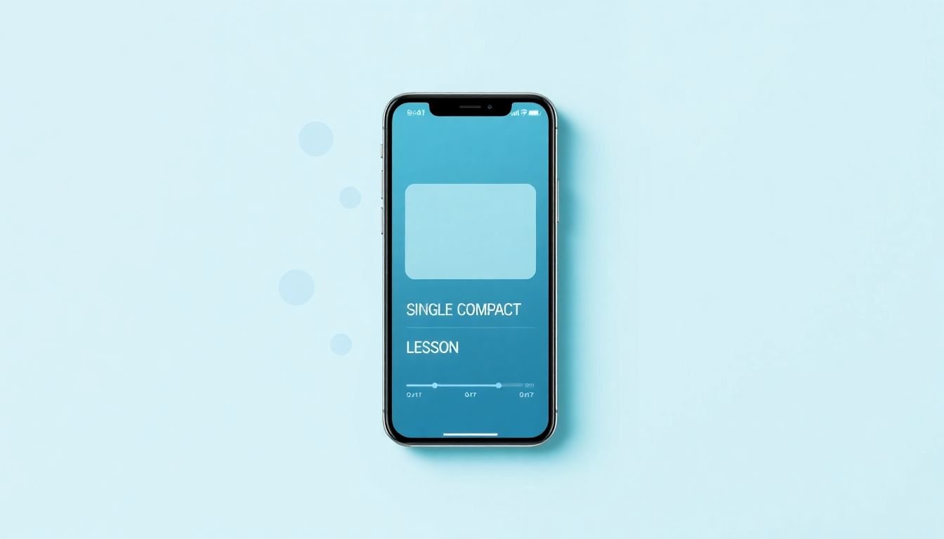
- Mobile learning works best when lessons are short (think 3–10 minutes), visually scannable, and structured so learners can pause and return without getting lost.
- Design for thumbs: big tap targets, simple layouts, readable fonts, and videos with captions (because most people watch with sound off at least sometimes).
- Handle mobile constraints up front—limited screen space, spotty connectivity, and fast loading expectations—by prioritizing the essentials and compressing media.
- Use checkpoints (mini-quizzes, “are you sure you understand?” prompts, and progress indicators) to improve retention and reduce drop-off.
- Plan for what’s next—adaptive learning, AR, and AI-assisted feedback—but only after you’ve nailed the basics (performance, accessibility, and clarity).

1. Understanding the Impact of Mobile Learning on Course Design
Mobile learning isn’t just a “nice to have.” It changes how people consume information—and that forces course design decisions. The market is growing fast too, so it’s not something you can ignore for long. For example, MarketsandMarkets projects the mobile learning market reaching $155.81 billion by 2026.
Here’s what I see in real learning behavior: learners aren’t sitting down for a 90-minute block every time they open your course. They’re fitting study into life—between meetings, on lunch breaks, or during short downtime. That means your course needs to “hold up” in short bursts.
So what should you change? Start with mobile responsiveness, but don’t stop there. I recommend you treat mobile like a separate design experience:
- Objective-first lessons: tell learners what they’ll be able to do in one sentence.
- Clear progression: make the next step obvious (and show where they are).
- Simplified layouts: fewer columns, less clutter, faster loading.
If you’re building a course structure from scratch, a solid course structure is one of the easiest ways to make mobile learning feel natural—because it reduces cognitive load when someone is only able to complete part of a lesson.
And one more thing: I wouldn’t claim a universal “X% faster” completion rate without context. Completion speed depends on course length, assessment design, and learner motivation. What you can measure is whether mobile learners can resume quickly and keep moving without getting stuck.
That’s the real impact: less friction, more consistent usage, and better learning continuity.
2. Benefits of Mobile Learning in Course Design
Let’s talk benefits, but let’s keep it grounded. Mobile learning tends to improve outcomes when it’s designed around the realities of phone usage: short attention windows, touch navigation, and frequent interruptions.
One reason mobile can help retention is that it encourages repetition and practice. When learners can access content quickly, they’re more likely to revisit key concepts. That aligns with findings from learning science on retrieval practice and spaced repetition (if you want a starting point, check resources like the NCBI review literature on mobile learning effects and related education research).
In my testing with mobile-first modules, the biggest “aha” wasn’t video length or fancy graphics. It was how often learners completed a lesson because the course was easier to navigate on a phone.
Here are the practical benefits you can expect when your design is actually mobile-friendly:
- More engagement per session: short modules (3–10 minutes) plus immediate checks for understanding keep momentum.
- Flexibility: learners can study during commutes, breaks, or at home—without needing a laptop setup.
- Better completion rates (when friction drops): if learners can tap, scroll, and resume quickly, fewer people abandon mid-module.
- Higher satisfaction: nobody likes downloading a 200MB video over shaky Wi‑Fi.
- Personalized feedback: interactive elements (quizzes, polls, scenario choices) give learners a reason to stay present.
If you’re going to add interactive elements, quizzes are usually the easiest win. Here’s a helpful guide on how to effectively design quizzes for your students—and you can adapt it specifically for mobile by keeping questions short and answers easy to tap.
Quick example scenario: imagine a learner opens Module 2 during a 6-minute break. On mobile, they can watch a short explanation, answer a 3-question check, and bookmark their spot. Later, they return and continue from the checkpoint. That “resume loop” is what protects retention and completion.
3. Best Practices for Creating Mobile-Friendly Courses
Mobile-friendly doesn’t mean “squeeze everything into a smaller screen.” If you do that, you’ll just create a cramped, slow, frustrating experience.
Instead, design for how phones are actually used. Here are the practices that consistently make a difference.
Keep lessons short (but meaningful)
I aim for 3 to 10 minutes per segment. That doesn’t mean your course gets shallow. It means you chunk big topics into focused slices.
My rule: one segment should teach one concept or one decision. If you can’t explain it in one concept, it’s probably two lessons pretending to be one.
Make reading easy
Mobile learners scan. They don’t read like they’re studying a PDF on a desk.
- Use short paragraphs (1–3 lines).
- Prefer bullet points over long blocks.
- Leave white space so the screen doesn’t feel heavy.
- Use headings that actually summarize the content.
Optimize videos for “real life” viewing
Most people watch on phones with sound off at least sometimes—so captions aren’t optional. I also recommend:
- Keep videos short (again, 3–8 minutes is a sweet spot).
- Use high-contrast visuals and readable text.
- Compress and serve in formats that load fast.
- Include a quick “what to remember” summary after the video.
Design navigation for thumbs
Tap targets matter. If someone has to zoom in or miss-click three times, they’ll bounce.
- Make buttons and links large enough to tap accurately.
- Limit the number of choices per screen.
- Keep a predictable layout so learners don’t feel lost.
Support pausing and resuming
This is one of the most underrated mobile design decisions. People get interrupted. Always.
Use bookmarks, progress indicators, and checkpoints so learners can come back exactly where they left off. If you want a simple pattern, use a checkpoint right after each micro-lesson—so the “resume point” isn’t mid-scroll.
4. Addressing Challenges in Mobile Course Design
Let’s be honest: mobile course design is harder than desktop. You’re working with smaller screens, slower networks, and a wider range of devices.
Limited screen space
You can’t just “fit more.” You have to prioritize.
- Identify what’s essential for the learning goal.
- Move extra detail into optional “deep dive” sections.
- Break lessons into micro-units that make sense on a phone.
Performance and loading times
Nothing kills motivation like a page that spins while someone’s on the move.
In practice, I focus on:
- Image optimization: resize and compress.
- Video compression: reduce bitrate and keep resolutions reasonable.
- Faster formats: avoid heavy or outdated tech where possible.
If you’re not sure where the bottleneck is, test with a throttled connection (like “Slow 3G”) and see what breaks first.
Device compatibility
Design once and hope for the best? That’s how you end up with broken layouts on a subset of learners.
What looks perfect on an iPhone can behave differently on Android browsers. Your best defense is testing across devices and screen sizes before launch.
Distractions and interruptions
Mobile learners are interrupted. Always.
So build for it:
- Checkpoint after each micro-lesson.
- Resume from last checkpoint (not from the top of the page).
- Keep instructions short so learners can reorient quickly.
5. Strategies for Successful Mobile Learning Implementation
If you’re trying to implement mobile learning without turning your course into a patchwork, start with planning.
Use content mapping to chunk the course
I like to begin with content mapping because it forces clarity: what belongs in each module, what can be optional, and what needs to be mastered versus just understood.
Then translate that into mobile chunks. For example:
- Module goal: “Explain the concept and apply it to one scenario.”
- Lesson 1: 5-minute concept video + 3 key bullets.
- Lesson 2: worked example + “tap to reveal” steps.
- Checkpoint: 3-question quiz + short feedback explanation.
Add interactive checkpoints (and keep them short)
Short quizzes work well on mobile because they create a clear “end” to a session.
Instead of 15 questions, try 3–5. Keep answer choices easy to tap, and make feedback specific:
- Correct answer: “Nice—this is the key step because…”
- Incorrect answer: “The difference is X. Re-read the bullet under step 2.”
If you want more guidance, use this guide on how to make effective quizzes for your students and adapt the format for mobile constraints.
Measure the right KPIs (not just page views)
This is where most course creators get lazy: they track traffic and call it a day.
For mobile learning, you want to know where learners drop off and whether they can resume successfully. I recommend tracking:
- Module completion rate (by device type)
- Resume rate (users who return after a pause/checkpoint)
- Quiz completion rate (and quiz pass rate)
- Time-to-first-interaction (does the page load fast enough?)
- Drop-off step (which screen causes the bounce)
If you’re using Google Analytics or a similar tool, you can instrument events around key actions (start module, finish module, submit quiz, resume from checkpoint). The goal isn’t perfect tracking—it’s enough insight to know what to fix first.
Run feedback loops after launch
I always ask for two types of feedback:
- Qualitative: “What felt confusing on mobile?”
- Quantitative: “Which step did you abandon?”
Then you iterate. Mobile improvements are often small: button sizing, clearer progress indicators, faster loading, or better checkpoint placement.
6. Future Directions for Mobile Learning in Education
So what’s next? Mobile learning will keep expanding, but the features that matter will depend on your audience and your content type.
Growth projections are still strong—another example is a forecast of the mobile learning market reaching $340.93 billion by 2029. (Even if you don’t use that exact number, the direction is clear: more learners will be on phones, not desktops.)
AR (augmented reality): use it when it adds real context
AR can be amazing for things like anatomy, equipment training, or “see it in your environment” learning. But it’s not useful for everything.
- Use AR when spatial understanding matters.
- Measure whether learners actually engage with AR content (not just whether it loads).
- Plan for device support and production costs—AR assets can take real time to build.
Adaptive learning: start with simple rules
Adaptive learning sounds fancy, but you can implement it in a practical way.
- Begin with rules like: “If they miss 2 of 3 questions, show a 60-second refresher.”
- Measure improvement in quiz pass rate and subsequent module completion.
- Don’t over-adapt early—too many logic paths can make content harder to maintain.
AI tools: prioritize feedback and support, not gimmicks
AI can help with immediate feedback, answering questions, or recommending the next best module. The part I’d watch carefully is accuracy and tone—learners need help they can trust.
If you’re planning a course that uses AI-assisted teaching, building solid effective teaching strategies is still the foundation. Tools don’t replace pedagogy.
Accessibility will keep getting more important
As mobile learning grows, accessibility can’t be an afterthought. You’ll want to support learners using screen readers, keyboard navigation (where applicable), and captioned media.
The bottom line? Mobile learning keeps evolving, but the winning courses will be the ones that deliver clarity, speed, and continuity—on the device learners actually use.
FAQs
When you design for mobile, you typically restructure content into shorter modules, simplify navigation, and make interactive elements more prominent (like quizzes and checkpoints). The layout usually shifts to a mobile-first pattern: fewer distractions, more scannable text, and media that loads quickly on phones.
Mobile learning makes it easier for students to access lessons anywhere and anytime, which supports consistency. It also boosts engagement when your course includes interactive content and clear progress cues. Plus, mobile-friendly courses can be updated more quickly when you need to fix content or add new material.
Designers usually run into compatibility issues across devices and browsers, performance problems from heavy media, and the challenge of fitting complex material into small screens without losing depth. Connectivity differences also matter—what loads fast on Wi‑Fi might struggle on cellular.
Segment lessons into short units, keep navigation simple, optimize media for faster loading, and make touch targets easy to tap. Captions for videos and clear progress indicators also make a big difference—especially when learners are watching on the go or getting interrupted mid-lesson.