
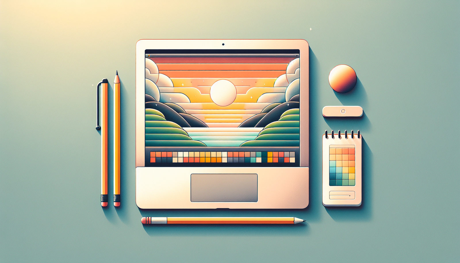
How to Use Canva to Create Course Visuals Effectively
Creating course visuals can feel like a lot at first, right? You know you need them—slides, worksheets, thumbnails, all that—but Canva can be a little overwhelming when you’re staring at a screen full of templates and buttons.
What I noticed when I first started is that most people (me included) jump straight into picking a template and then… nothing looks consistent. Fonts don’t match. Colors clash. Exports come out blurry. Then you end up redoing the same pages three times.
This post is me fixing that exact workflow. I’ll walk you through how I use Canva to build course visuals that look intentional and stay consistent—without wasting hours. We’ll cover template selection, text + image layout, branding (Brand Kit), and—this is the part people skip—export settings and accessibility checks you can actually verify.
Key Takeaways
- Create a free Canva account, then set up your workspace so you’re not hunting for assets later.
- Use the Search bar, but search with intent (example: “lesson plan A4”, “course thumbnail 1280x720”, “worksheet grid”).
- Pick templates based on asset type (slides vs worksheets vs thumbnails), not just aesthetics.
- Keep text readable: I aim for 16–22 pt for most on-screen body text and 24–40 pt for headings (adjust by layout size).
- Set up Brand Kit (colors, fonts, logo) so every new page starts consistent.
- Use Canva elements (icons, lines, shapes) to guide attention—sparingly—so the page doesn’t feel “busy.”
- Export with purpose: PNG for most web images, JPG for smaller thumbnails, and PDF for print-ready worksheets.
- Do a quick accessibility pass: check contrast, avoid tiny fonts, and verify your layout works on mobile.
Using Canva to Create Course Visuals
Canva makes course visuals pretty straightforward. But the “secret” isn’t the tool—it’s how you build the workflow.
In my experience, the best results come when you treat visuals like a system: consistent typography, consistent spacing, and exports that match where the image is going (web vs print vs embed in a lesson page).
You can use Canva for slides, worksheets, lesson cover images, and even marketing graphics. The templates help, but you still want to customize them so your course doesn’t look like it came from the same generic pack as everyone else’s.
Getting Started with Canva
Start by going to Canva’s website and creating an account. I recommend starting free first—you can still do plenty (templates, uploads, Brand Kit if available on your plan, and clean exports).
Once you’re in, I’d spend 3–5 minutes getting familiar with the left sidebar. You’ll see design types grouped like presentations, posters, social media, and so on. That matters, because the fastest way to good visuals is selecting the right canvas size from the beginning.
Then use the Search bar, but don’t just type “worksheet.” Try something like:
- “lesson plan A4”
- “worksheet grid”
- “course thumbnail 1280”
- “presentation 16:9”
That one change alone saves me time because the template usually already matches the right layout proportions.
Choosing the Right Template for Your Course
Picking a template is where a lot of people go wrong. They choose based on vibes only. But templates should match the job your visual has to do.
Ask yourself: is this a quick “what you’ll learn” slide, a printable worksheet, or a thumbnail that needs to pop in a feed?
Here’s how I choose:
- Kids course? I look for larger headings, higher spacing, and simpler icon styles.
- Professional audience? I prefer cleaner grids, fewer decorative elements, and more consistent typography.
- Technical content? I pick templates with room for charts, callouts, or step-by-step sections.
Worked example (what I changed): I redesigned a “Module 1 Overview” slide set. The original template had tiny text and decorative gradients behind every section. Learners kept saying they had to “zoom in” on mobile.
So I swapped to a template with a stronger grid, increased body text size, and reduced the number of background shapes. Result? Fewer revision requests from the instructor and cleaner readability when viewed on phones.
Customizing Visuals with Text and Images
Once you’ve picked a template, edit with intention. Click the text boxes and replace them with your course wording. Don’t just copy/paste paragraphs—course visuals aren’t essays.
My rule: one visual should communicate one idea. If you can’t summarize it in a headline + 2–4 supporting bullets, the layout probably needs splitting.
For text, I like to keep a consistent hierarchy:
- Title: big, short, and specific
- Subtitle / section label: medium size
- Body bullets: smaller but readable (especially on mobile)
When it comes to images, you’ve got two paths:
- Upload your own photos/diagrams (best for brand + authenticity)
- Use Canva’s image library (fastest for prototypes)
Tip: don’t pick images that fight with your text. If the image has high contrast or busy detail, either darken/lighten it or place your text on a solid shape behind it.
Also, consider using the visual type that matches the content:
- Infographic: summarizing a process or concept
- Chart: showing comparisons or trends
- Callout box: spotlighting a definition or “watch out for this” note
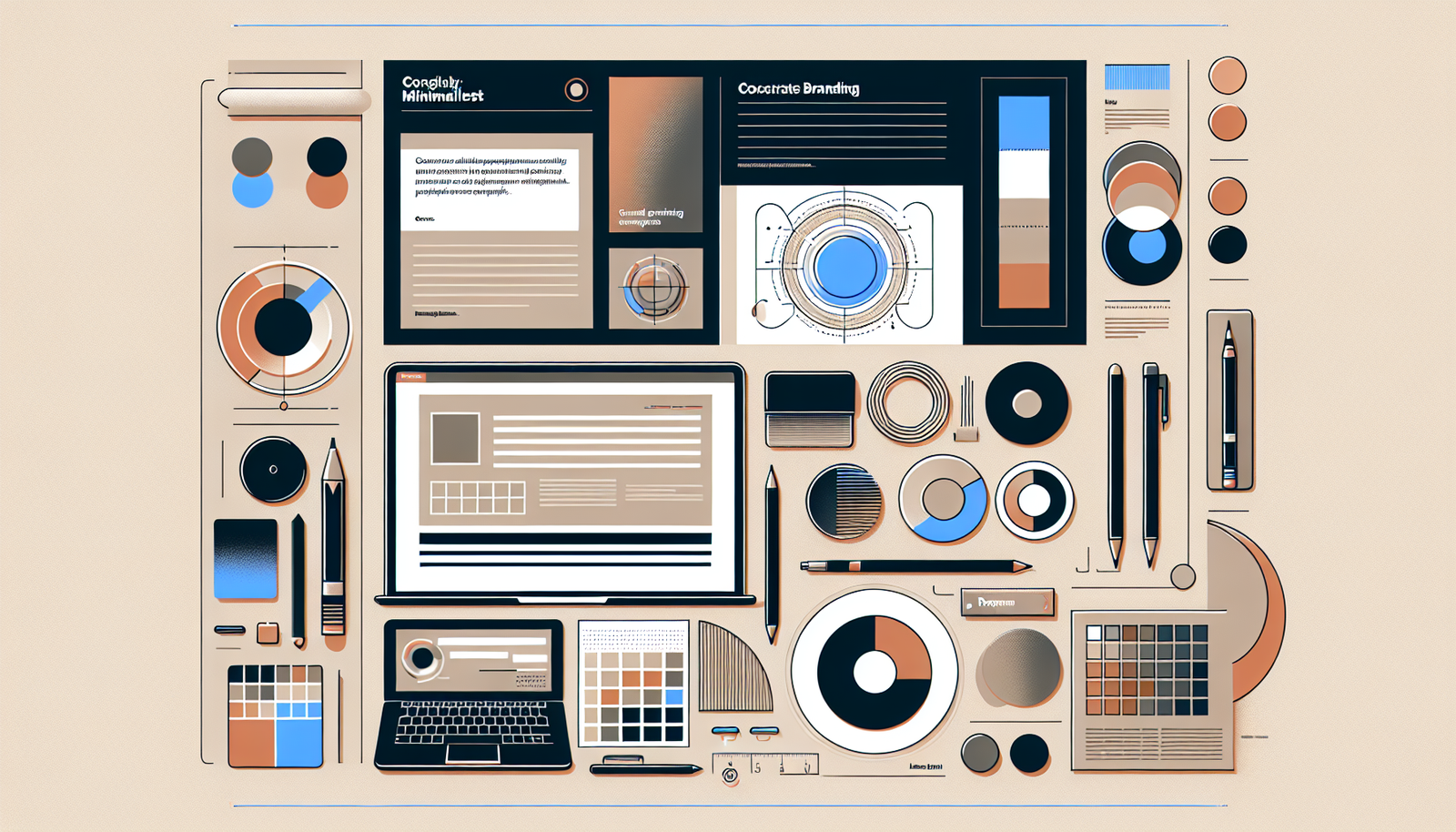
Adding Branding to Your Course Visuals
This is the part that makes everything look like it belongs together. Branding isn’t just slapping a logo in the corner—it’s consistency.
Step 1: Set up Brand Kit (if you have it on your plan). In Canva, look for the Brand Kit area (often under your account settings). Add:
- Your brand colors
- Your fonts (or closest available equivalents)
- Your logo
Step 2: Use the same layout rules every time. For example, keep your logo placement consistent (top-right or bottom-left), and keep your headline style consistent (same font + size range).
Step 3: Control your tone. If your brand voice is friendly, don’t use harsh, corporate icon sets. If it’s professional, don’t overload with playful illustrations.
Worked example (branding that actually helped): I updated a course worksheet series by using the same accent color and the same “section header” style across 8 pages. The instructor told me it looked “more cohesive” immediately—because the structure repeated, not because the design was flashy.
Using Canva Elements for Engaging Designs
Canva elements are where you can add polish without overthinking it. Shapes, lines, icons… they can make a page feel organized.
Here’s what I use them for:
- Shapes for grouping (like a callout background behind key text)
- Icons to label sections quickly (“Step 1,” “Video,” “Practice”)
- Dividers/lines to break up dense layouts
One quick tip: if you find yourself adding 15 icons, pause. Try one icon per section or one icon per “type” of content. Otherwise it starts looking like clipart.
You’ll find these under the Elements tab. I usually filter by style (outline vs filled) so the set looks consistent.
Exporting Your Visuals for Different Platforms
Export is where quality usually goes to die. I’ve seen it happen: you design something crisp, export it, and suddenly it’s blurry or the text looks fuzzy.
Here’s a practical cheat sheet based on how course visuals are used:
Best export formats (what to use when)
- Web slides / lesson embeds: PNG (or JPG if you need smaller files)
- Thumbnails (course marketing images): JPG or PNG (JPG for smaller size, PNG for sharper text)
- Print worksheets / handouts: PDF
Recommended dimensions (so exports don’t get resized badly)
- Course thumbnail: 1280 × 720 (16:9) or 1080 × 1080 (square)
- Lesson slide (standard): 1920 × 1080 (16:9)
- Worksheet (letter/A4 style): A4 or Letter canvas size inside Canva
PDF settings that matter
When downloading as PDF, I aim for:
- PDF Print when it’s going to be printed (better color handling)
- Standard PDF if it’s just for on-screen viewing
Also check whether you need crop/bleed. If your design goes edge-to-edge, PDF Print settings help avoid ugly white borders.
Resolution guidance (the “why is it blurry?” fix)
When exporting images (PNG/JPG), higher resolution is usually safer—especially for text-heavy visuals. Web visuals can tolerate some compression, but course worksheets and diagrams need clarity.
If your text looks soft after download, don’t just blame your viewer—re-export at a higher resolution and confirm you’re not resizing the image down too aggressively in your lesson platform.
Tips for Creating Effective Course Visuals
Good course visuals do two things: they grab attention and they make information easier to process.
Here are the tips I actually use when I’m building a set of visuals for a course:
- Limit text per visual: if a slide has more than ~6–8 bullets, it’s probably too dense.
- Use white space: empty space is not wasted space—it helps learners find the important bits.
- Create visual hierarchy: make the heading the biggest element, then bullets, then supporting icons.
- Keep alignment consistent: use Canva’s alignment guides so everything “snaps” into a grid.
- Do a quick mobile check: preview on a phone-sized view. If you can’t read it without squinting, increase font size.
Accessibility checklist (quick, but real):
- Contrast: aim for WCAG AA (generally 4.5:1 for normal text, 3:1 for large text).
- Font size: I don’t go below 16 pt for body text on screen-heavy designs (and I go bigger if the course audience is older or the layout is compact).
- Color-blind safety: don’t rely on color alone to convey meaning—pair colors with icons, labels, or patterns.
- Readability: avoid light gray text on white backgrounds. It looks “modern,” but it’s often hard to read.
- Alt text: if you’re using these assets in a platform that supports it, make alt text descriptive (what the learner needs to know from the image).
If you want a simple sanity check: zoom out to 80–90% and see if the layout still makes sense. If it doesn’t, the issue is usually font size, contrast, or spacing—not “creativity.”

Additional Canva Features for Enhanced Learning Materials
There are a few Canva features I keep coming back to when I’m building learning materials:
- Collaboration: invite another educator or teammate and review in real time. This cuts down “wait for edits” cycles.
- Animation options: subtle animations on text or elements can make presentations feel less static (just don’t overdo it).
- Brand Kit: saves your colors, fonts, and logo so every new page starts aligned with your course identity.
- Content Planner: if you’re promoting your course on social, scheduling assets ahead of time keeps you consistent.
In practice, the collaboration feature is the one that saves the most time—especially when you’re working with someone who’s reviewing pedagogy, not design.
Common Mistakes to Avoid When Designing Course Visuals
If you want to avoid redoing work, watch for these common traps:
- Overcrowding: too many elements + too much text = confusion. Aim for one main idea per visual.
- Ignoring mobile readability: if it looks fine on desktop but unreadable on a phone, your learners will struggle.
- Poor contrast: low-contrast text is one of the fastest ways to lose accessibility (and attention).
- Inconsistent styling: mixing fonts, random accent colors, and different icon styles makes the course feel scattered.
- Skipping a final review: I always do a last pass for typos, alignment, and export quality before sharing.
FAQs
Canva is a design tool that helps educators create course materials like slides, worksheets, infographics, and course promotion images. You can start from templates, then customize fonts, colors, images, and layout to match your course style.
Choose templates based on what the visual needs to do (slide vs worksheet vs thumbnail), not just how it looks. Also pick layouts that make text easy to read—especially on mobile—and that leave enough space for your content to breathe.
Avoid overcrowding, inconsistent fonts/colors, and low-contrast text. Also make sure your designs are readable on phones and that your layout is structured enough for learners to scan quickly.
Use the download button in Canva and select your format (PNG/JPG/PDF). For web, PNG or JPG usually works best. For print worksheets, export as PDF. Then double-check size and clarity after downloading—especially for text-heavy pages.