
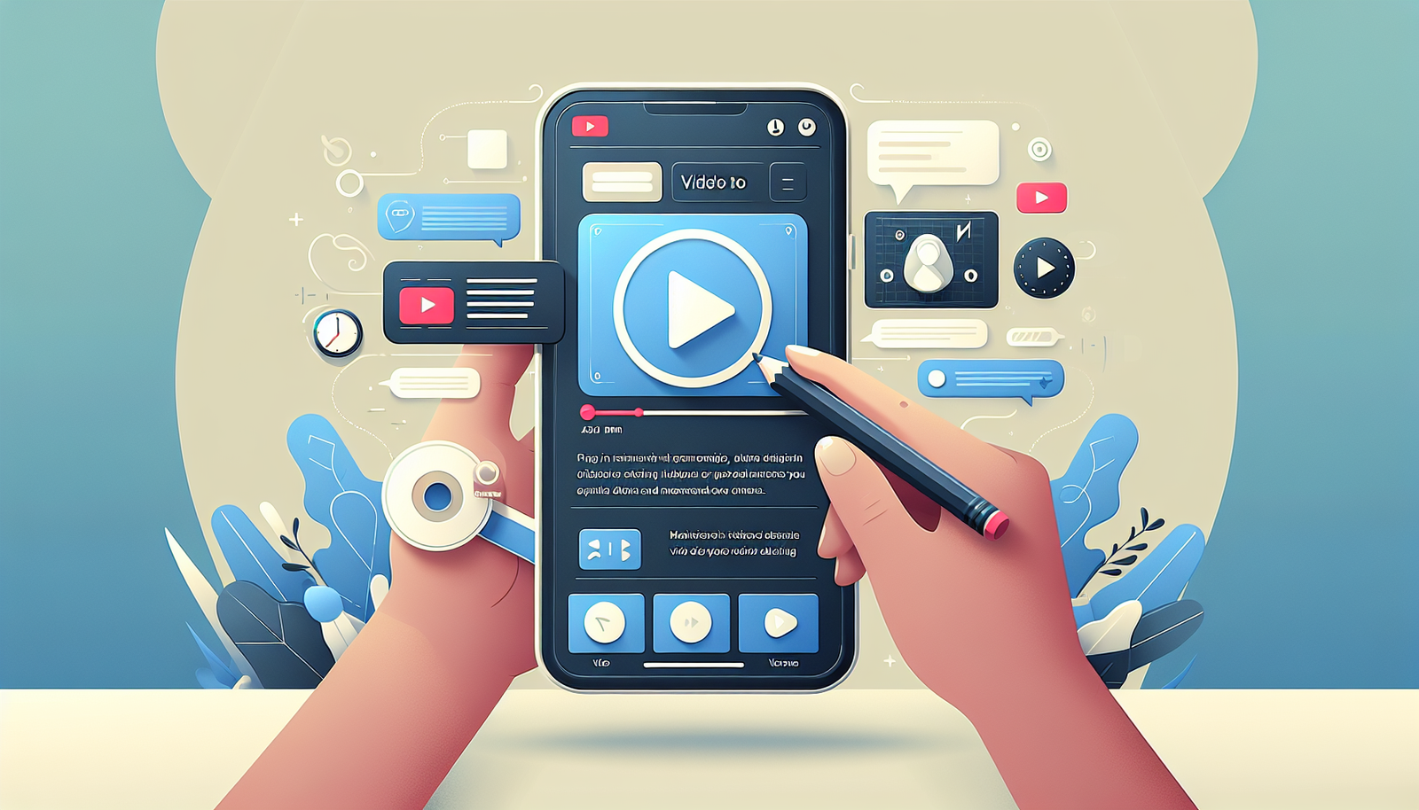
How to Optimize Course Videos for Mobile Viewing Effectively
I’ve had students try to watch my course videos on their phones and… yeah, it can get ugly fast. The two most common issues I see are (1) awkward cropping where the important parts of the frame disappear and (2) buffering that turns a “quick lesson” into a 10-minute waiting game. If your learners are mostly on mobile, you can’t just upload whatever file you exported on your desktop and hope for the best.
In my experience, mobile optimization isn’t one single trick. It’s a bunch of small decisions—codec, bitrate, thumbnails, player behavior, and testing—stacking together so playback feels smooth even on spotty Wi‑Fi or when someone’s on LTE. And honestly? Most course creators don’t test enough before publishing, so they only find out after people complain.
Here’s how I’d optimize course videos for mobile viewing, with practical targets and a workflow you can actually follow.
Key Takeaways
- Export to MP4 (H.264) for broad mobile support, then tune bitrate and resolution so the video loads quickly without turning into a blurry mess.
- Compress with real encoding settings (CRF/bitrate, GOP/keyframe interval, audio codec). If you don’t control this, file size will sneak up on you.
- Use thumbnails that stay readable on a small screen: bold subject, high contrast, minimal text (and keep it big).
- Keep visuals simple. On mobile, long captions and tiny UI screenshots are basically invisible.
- “Responsive” means your player handles aspect ratio correctly (no weird stretching), and your poster/controls don’t break across iOS/Android.
- Test with a plan: a few real devices + network throttling + measurable checks (startup time, rebuffer rate, playback resolution).

How to Optimize Course Videos for Mobile Viewing
Optimizing course videos for mobile viewing isn’t just “nice to have.” It’s the difference between learners finishing a lesson and learners bouncing after 30 seconds.
Most course audiences I’ve worked with are a mix of iPhone and Android, and they don’t always have fast Wi‑Fi. So your video has to be resilient on slower networks, varying screen sizes, and different browsers (Safari vs Chrome can behave differently).
The goal is simple: make your videos load fast, display correctly (no awkward cropping), and stay readable while people are on the move.
Choosing the Right Video Format
Format is where you win or lose before anyone even presses play.
MP4 with H.264 is still the safest default for course platforms because it’s widely supported across iOS and Android. If you’re also using a modern player, you can layer in adaptive streaming later, but starting with MP4/H.264 avoids a lot of “why won’t this play on my phone?” headaches.
Here’s what I recommend targeting for course content:
- Container: MP4
- Video codec: H.264 (Baseline/Main profile depending on your tool)
- Audio codec: AAC (usually 128–192 kbps for most course audio)
- Frame rate: match your source, but 24/25/30 fps is typical—avoid weird conversions
Now, about aspect ratio. If your course includes screen recordings, you don’t want critical UI elements getting cut off. Vertical video can work great for certain lesson types (short explanations, talking head demos), but for most “teach-with-a-screen” courses, a clean landscape frame with safe margins is usually more reliable.
If you’re thinking about vertical framing for promo clips or bite-sized lessons, it helps to know that vertical content often performs better because it matches how people hold their phones. Still, I wouldn’t force vertical for every lesson—your learners need the content to be readable, not just “mobile-friendly.”
For a related workflow on building the actual lesson content, check out how to create educational video.
Ensuring Fast Loading Times
Here’s the truth: if a video takes too long to start, people don’t “wait it out.” They scroll, they switch apps, they bounce. And on mobile networks, that buffering spiral is real.
In my experience, the fastest wins come from controlling file size and ensuring the player can begin playback quickly (keyframes matter more than people think).
Start with compression, but do it with intent. Tools like HandBrake or FFmpeg are great, as long as you’re using settings that fit video learning content (text-heavy slides, screen recordings, and talking heads all behave differently).
Practical encoding targets (good starting points)
- 1080p lessons: try ~2.5–4.0 Mbps for H.264 if your visuals are fairly clean; if it’s a lot of small text, lean toward the higher end.
- 720p lessons: ~1.5–2.5 Mbps is often enough for screen recordings.
- Audio: AAC at 128–160 kbps (mono is fine for many courses; stereo if you have music/ambience).
FFmpeg example (H.264 + keyframe interval for smoother starts)
If you want a solid baseline, try something like this. (You can adjust resolution/bitrate based on your source.)
720p example (CRF approach):
- CRF: 20–24 (lower = bigger file, higher quality)
- Keyframe/GOP: set so keyframes occur frequently enough for seeking and startup (often 2 seconds works well)
Example command (edit input/output filenames):
ffmpeg -i input.mp4 -vf scale=-2:720 -c:v libx264 -preset medium -crf 22 -g 60 -keyint_min 60 -sc_threshold 0 -c:a aac -b:a 128k -movflags +faststart output_720p.mp4
What I like about this:
- -movflags +faststart moves metadata to the front so playback can begin sooner.
- -g 60 (for 30 fps) gives a keyframe roughly every 2 seconds.
- -crf 22 is a decent balance for most course videos without ballooning file size.
Tradeoff you should expect
If your course is heavy on tiny text (especially screen recordings), aggressive compression can make the text unreadable. That’s not a “quality” problem—it’s a learning problem. When I’ve seen complaints, it’s usually because the export got too small to load fast, and the text became mush. The fix isn’t always “higher bitrate,” either—it can be better cropping, zooming in on key UI areas, or splitting long lessons into smaller segments.
Also, consider using a CDN. A CDN doesn’t magically compress your video, but it can reduce latency dramatically because the file is served closer to the viewer. If you’re seeing slow startup times in one region, that’s a big hint the CDN (or caching config) needs attention.
Quick reality check: I’ve seen course videos improve after switching encoding + enabling faststart, even before touching CDN settings. If you don’t measure, you’ll never know what actually moved the needle.
Creating Mobile-Friendly Thumbnails
Your thumbnail is the “should I press play?” decision. On mobile, that decision happens fast—like, one glance and done.
So make sure the thumbnail works at small sizes. That means:
- Big subject (face, object, or main screen)
- High contrast between subject and background
- Minimal text (if you use text, keep it short and large enough to read at thumbnail size)
- No clutter—if it looks busy on desktop, it’ll be unreadable on a phone
I’m a fan of A/B testing here. Run two versions for a week or until you have enough views to compare (otherwise you’ll just be guessing). Track “play” rate or click-through to video, not just likes.
One more thing: if your thumbnail includes a screen recording, pick a frame where the important UI element is visible. Don’t use some random moment where the cursor is in the wrong place.
For a content-adjacent concept that helps your lessons feel more intentional, you can also check what is lesson preparation.
Using Simple and Clear Visuals
Mobile viewers don’t want to squint. They also don’t want to pause every 20 seconds to figure out what your tiny text says.
What works best is simple, high-contrast visuals and pacing that matches how people watch on phones (often in short bursts).
- Use large fonts and keep text overlays to one idea at a time.
- Avoid dense charts. If you must use them, zoom in and show key parts one at a time.
- When you demo software, zoom so the UI is readable. A “full screen” recording often becomes a “guess what that button says” recording on mobile.
- Use bold colors to highlight what matters, but don’t rely on color alone—pair it with arrows, circles, or labels.
And yes, preferences matter. People do tend to prefer video over reading in many learning contexts, but the real win is not “video beats text.” It’s that your video is structured so the viewer can understand it quickly on a small screen.
This preference underscores the importance of delivering clear visuals, and the lesson plan is where you decide what’s shown, when it’s shown, and how long it stays on screen.
Implementing Responsive Design
Responsive design isn’t just “the video scales.” It’s whether your player behaves correctly across devices and orientations.
Here are the practical things I check:
- No stretching: the video should keep the correct aspect ratio. Stretching makes people’s faces look weird and makes UI distorted.
- Letterboxing vs cropping: decide what’s better for your content. Cropping can hide important info; letterboxing keeps everything visible but adds bars.
- Poster behavior: the thumbnail/poster should look good before playback and shouldn’t jump or blur.
- Controls: play/pause, seek bar, and captions should remain usable without covering the content.
- Orientation: rotate the phone and confirm the video doesn’t resize in a jarring way.
Use a flexible player that supports the layout you want. Then test it in real browsers on real devices. Google’s Mobile-Friendly Test can help you sanity-check the page, but it won’t catch every video-specific issue.
What I’ve noticed is that “responsive” problems show up as soon as someone pauses, scrubs the timeline, or opens captions—so include those actions in your tests.
Testing Across Different Devices
This is where most creators skip, and it’s also where you can save yourself a ton of support messages.
Here’s a testing plan I actually trust:
- Devices: test at least 1 iPhone (Safari) + 1 Android (Chrome). If you can, add a mid-range Android model because that’s where performance issues are most obvious.
- Networks: don’t only test on fast Wi‑Fi. Use network throttling (or mobile data) to simulate slower conditions. A “3G-ish” profile is a good baseline.
- Metrics to watch: startup time (time to first frame), buffering events, rebuffer rate, and whether the resolution drops too aggressively.
- Pass/fail thresholds: if startup time is consistently over ~3–5 seconds on throttled networks, that’s a red flag. If users rebuffer multiple times in a short lesson, you likely need encoding/bitrate tweaks.
Also, check playback quality. If your course includes text or diagrams, zoom in on your own phone and confirm the text is readable without leaning closer.
Emulators can help, but I wouldn’t rely on them alone. Real devices catch things emulators miss—like how Safari handles autoplay restrictions or how Chrome buffers under load.
If you have analytics, look for drop-offs at the same timestamp across many viewers. That pattern often points to a specific problem—maybe the video switches quality, maybe the scene changes too fast, maybe the lesson is just too long without a recap.
When I’ve done this kind of testing, it’s usually clear within a couple iterations what to fix first: encoding settings, keyframe interval, or player layout.

Gathering Feedback for Improvements
Once your course is live, you’ll get the kind of feedback you can’t simulate in testing—because it comes from your actual learners.
Ask specific questions. Not “Was the video good?”—more like:
- Did the video start quickly?
- Did it buffer or lower quality?
- Was the text readable on your phone?
- Did anything feel confusing visually?
You can do this with a short survey at the end of lessons or a quick poll in your course community. Keep it short. People are busy.
Then look for patterns. If multiple people mention the same lesson “takes forever to load,” don’t just shrug—check that specific video’s encoding settings and file size. That’s usually where the issue is hiding.
And when you fix it, tell your learners. Even a quick “I improved video loading based on your feedback” message goes a long way.
Providing Download Options for Offline Viewing
Offline viewing is one of those features learners love, especially if they travel, commute, or study in places with spotty connectivity.
If you can offer downloads, do it in a way that’s easy to find:
- Provide a download link/button near the video player or in the lesson description.
- Use a widely compatible format like MP4.
- Include clear instructions: where to tap, how to download, and how to access the file afterward.
One limitation to be aware of: downloads can increase storage/CDN costs and can complicate access control. So if you’re doing this, make sure it matches your platform’s capabilities and your licensing/permissions needs.
Still, when it’s done well, offline options can increase “watch later” behavior—which usually improves completion rates over time.
Incorporating Accessibility Features
Accessibility isn’t just about compliance. It’s also about clarity for everyone.
Here’s what I recommend for course videos:
- Captions/subtitles: add them for hearing accessibility and also for learners watching without sound.
- Readable caption styling: make sure captions don’t blend into the background. Use a clear font and contrast.
- Audio clarity: if your voice is quiet under music or screen noise, captions won’t fix that—adjust your mix.
- Color choices: avoid relying on red-green contrast alone. If you use color to highlight, add labels or shapes too.
If you can, run an accessibility check (or at least manually verify captions timing). The biggest issue I’ve seen is captions that are out of sync by even a second or two—on mobile, that can be extra distracting.
When accessibility is solid, learners tend to engage more because the content is easier to follow, period.
FAQs
MP4 is usually the best default for mobile because it’s widely supported and easy to stream. Pair it with H.264 for video and AAC for audio, then tune bitrate/resolution so it loads quickly without making text unreadable.
Compress your videos with controlled encoding settings (don’t rely on “export default”). Use faststart so playback can begin sooner, and consider a CDN so files are served closer to your learners. Then test on throttled networks—fast Wi‑Fi doesn’t tell you the truth.
Design for small screens: big subject, high contrast, and minimal text. If your thumbnail includes UI, choose a frame where the important element is clearly visible at thumbnail size.
Use short surveys or in-course polls after lessons, and pair that with analytics to see where learners drop off. Ask specifically about startup time, buffering, and whether the video content is readable on a phone.