
How To Design Mobile-First eLearning Interfaces: Key Principles & Tips
Designing mobile-first eLearning interfaces can feel a bit like solving a puzzle—especially when you’re staring at a tiny screen and trying to make it work for real people in real moments. In my experience, the biggest mistake teams make is starting with the desktop layout and then “shrinking it down.” It usually ends up cramped, slow, and confusing.
So instead, I build from the phone outward. What does that mean day-to-day? It means you design the smallest, most touch-heavy version first—then you scale up only when it actually helps learners.
In this post, I’m going to walk through the principles that matter most, what learners actually expect on mobile, which tools I use to prototype, and the testing process that keeps you from shipping a “pretty” interface that nobody can use.
Key Takeaways
- Go mobile-first: design for thumb use and slow/spotty connections before you think about tablets or desktops.
- Keep layouts clean and fast—aim for “tap, respond, continue” without loading dead-ends.
- Use touch-friendly UI: big tap targets (at least 44px), generous spacing, and obvious calls to action.
- Build for the learning moment: quick resume, clear progress, and fewer decisions per screen.
- Prototype early with tools like Adobe XD or Sketch so you can test flows before you build them.
- Use multimedia with restraint: short video clips, captions/transcripts, and lightweight alternatives.
- Make responsive design part of your definition of done (not an afterthought).
- Test with real users and iterate based on measurable friction (time-on-task, drop-offs, mis-taps).

Key Principles of Mobile-First eLearning Interface Design
Mobile-first design means you prioritize the mobile experience from the start—layout, navigation, content density, and performance. Not “make it fit.” Prioritize.
When I’m designing mobile-first, I’m always asking: What’s the next action? If the answer isn’t obvious within a second or two, the screen needs work.
Here’s the mobile-first baseline I recommend:
- Start with a single-column layout and stack everything vertically (headings, instructions, questions, actions).
- Load fast on real networks—assume learners might be on 4G, in a tunnel, or on Wi‑Fi that’s “technically working.”
- Reduce decisions per screen. If a learner has to choose between five things, you’re probably doing too much.
- Use strong visual hierarchy so people can skim and still know what to do.
- Keep the “resume” path obvious. A “Continue” button beats hunting through modules every time.
In my experience, the interface that feels easiest is usually the one with fewer moving parts: one primary action, one secondary action (at most), and clear feedback after each tap.
If you want a quick reference point for how course structure and UX choices affect engagement, you can also check Create a Course for guidance on teaching approaches that pair well with mobile-friendly layouts.
Understanding User Needs for Mobile Learning
Mobile learners don’t interact like they’re sitting at a desk. They’re often multitasking, in transit, or doing a “quick check” that turns into a 12-minute session. So your interface needs to support interruption.
What I’ve found works well is building around three needs:
- Clarity: learners should know exactly what to do next.
- Continuity: they should resume without friction.
- Confidence: progress should feel measurable and believable.
Instead of throwing random stats at the page (which I don’t love when they’re not sourced), I usually base decisions on what shows up in testing:
- If learners can’t find the “continue” path within 5 seconds, navigation is too complex.
- If learners rewatch videos because they missed instructions, your screen needs better context (e.g., “Watch for X” before playback).
- If they drop during quizzes, it’s often because answer options are too small, too close together, or the feedback is unclear.
Here’s a concrete example of a mobile learning screen that’s built for real moments:
- Top: Course title + “Continue” (or “Restart”).
- Middle: 1–2 sentence learning objective (“By the end, you’ll be able to…”).
- Next: One content card (text summary or short video).
- Bottom: One primary CTA (“Start quiz”) and one secondary CTA (“Review notes”).
Also, don’t ignore social learning. If you include discussion, make it lightweight: quick prompts, simple replies, and notifications that don’t overwhelm.
And yes—consider accessibility and learning variety. Not everyone processes information the same way. Offer options like:
- Short video + captions
- Text summary under the video
- Audio transcript option
- Practice questions with instant feedback
Choosing the Right Design Tools for Mobile-First Development
Tools don’t make the design good, but they absolutely affect how fast you can test. If you can’t prototype quickly, you end up guessing.
In my workflow, I split tooling into three phases:
- Wireframes (structure + flow): quick low-fidelity layouts
- High-fidelity prototypes (visual + interaction): realistic spacing, typography, states
- Analytics + iteration (what’s actually happening): drop-offs, time-on-task, and click/tap behavior
For high-fidelity prototyping, Adobe XD and Sketch are solid choices. I like them because you can build realistic mobile screens, including different states (loading, error, quiz feedback).
If you want something more straightforward for putting courses together without getting stuck in every design detail, platforms like Can Anyone Create a Course? can be useful—especially when you’re focusing on content and learning outcomes first.
No matter what you use, I’d strongly suggest you build feedback loops into your process. For example:
- Prototype → test with 5 users (not 50)
- Fix the top 3 usability issues
- Prototype v2 → test again
That’s how you avoid “polishing” a screen that people can’t use.
Essential Elements of User-Friendly Mobile Interfaces
Mobile UI is unforgiving. Tiny text, cramped buttons, and vague feedback don’t just look bad—they actively block learning.
Here are the elements I pay attention to first:
- Typography that survives small screens
Aim for 16px minimum for body text. If you go below that, you’ll hear about it in testing. Also use a line-height of ~1.4–1.6 so paragraphs don’t feel like a wall of text. - Touch targets you can actually tap
Use 44px minimum tap target size (Apple’s accessibility guidance aligns with this). If your buttons are smaller, you’ll see mis-taps and rage quits. - Spacing that prevents accidental taps
Give interactive elements breathing room. A common issue I’ve seen: two quiz answers are so close that users tap the wrong option. - Color contrast you can trust
Don’t rely on “it looks fine on my phone.” Check contrast ratios (WCAG guidance). If your text is light gray on a white background, learners will struggle outdoors. - Clear navigation and feedback
After a tap, users should immediately see what happened: loading state, progress update, or confirmation.
One more thing: don’t just test on your device. I always check at least two screen sizes (for example, a smaller Android phone and an iPhone with a different notch/safe area). Safe areas, zoom behavior, and font scaling can break layouts in annoying ways.
Best Practices for Navigation in Mobile eLearning
Navigation on mobile isn’t just about finding things—it’s about keeping momentum. If learners have to backtrack, they lose the thread. And once they lose the thread, they don’t come back.
Here’s what I recommend for a mobile eLearning navigation system:
- Use a simple information architecture
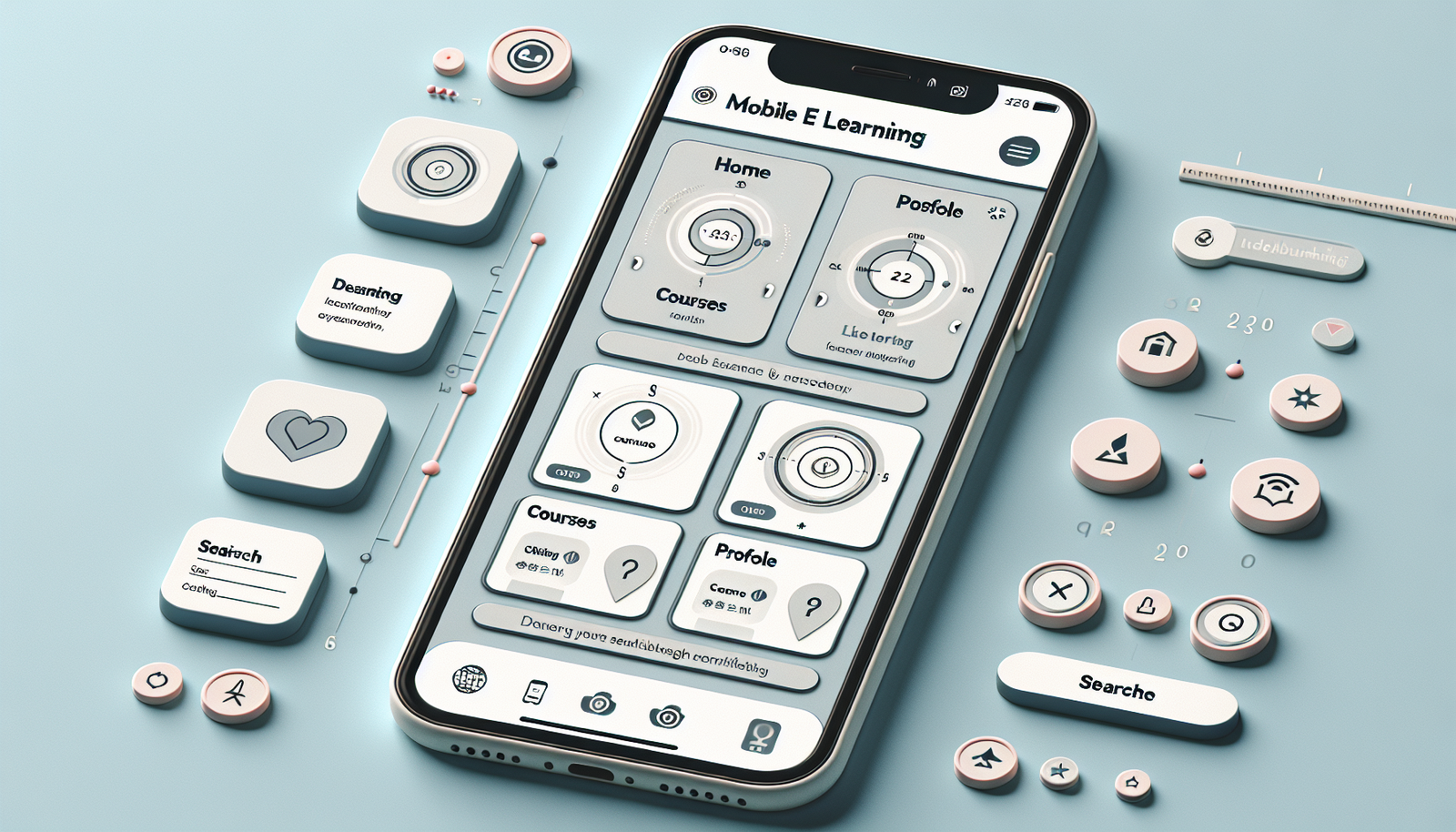
Limit top-level sections. If you have Home, Courses, Profile, and Settings, great—if you have 12 items in a menu, it’s too much. - Consider a bottom navigation bar
Bottom tabs work well for thumb reach. Typical items: Home, Courses, and Profile. Keep icons consistent and labels readable. - Add a persistent “Back” behavior
Learners should know what back means. If “Back” takes them to a different screen than expected, you’ll see confusion in testing. - Make search easy to reach
A search icon/button should be accessible from the main learning area—not hidden three levels deep. - Use breadcrumbs only when they’re useful
If your course structure is deep (module → lesson → activity), breadcrumbs can help. If your structure is shallow, breadcrumbs can clutter the UI.
Quick checklist I use before shipping navigation:
- Can a new learner find “Continue” within 5 seconds?
- Are quiz answers reachable without zooming?
- Does the user know where they are (module/lesson/activity)?
- Does progress save instantly or at least reliably?
How to Optimize Content for Mobile Screens
Mobile content should be scannable. People skim. They don’t read like they’re taking notes in a classroom.
What I do is rewrite content with “screen reality” in mind:
- Break lessons into bite-sized sections
Aim for 1 idea per screen card whenever possible. If a page has 12 paragraphs, it’s not a mobile screen—it’s a desktop page. - Use lists for key takeaways
Bullets and numbered steps help learners move quickly. Keep each bullet short (think one line or two). - Strengthen headlines
Instead of “Lesson 3: Overview,” try “Lesson 3: How to Avoid Common Mistakes.” It’s clearer in a scrolling feed. - Design for skimming
Use bold for terms, spacing between blocks, and short paragraphs (2–4 sentences).
Multimedia is where teams often oversell. Here’s the honest version:
- Video helps when you need demonstration (procedures, walkthroughs, tone of delivery).
- Video hurts when it’s long, slow to load, or missing captions.
- Keep clips short—I generally target 30–90 seconds per segment for mobile learning, then follow with a question.
- Plan for accessibility: captions and transcripts aren’t optional if you want broad usability.
- Don’t make learners wait: show a thumbnail + “Tap to play,” and keep loading states clear.
Finally, use whitespace like it’s part of the lesson. White space isn’t “empty.” It’s how learners separate ideas in their heads.
Importance of Responsive Design in eLearning
Responsive design matters because learners don’t all use the same screen. Even within “mobile,” you’ll see different aspect ratios, font scaling settings, and safe areas.
What I want responsive design to do for me:
- Keep text readable (no overlapping lines or clipped buttons)
- Maintain consistent spacing and alignment
- Ensure interactive elements stay tappable at every breakpoint
- Prevent layout jumps when images load
Instead of tossing out unsourced percentages, I’ll frame it like this: mobile use is high and growing, and your interface should behave predictably across devices. If your UI breaks on tablets or larger phones, you’ll lose learners who prefer bigger screens.
Practical tip: use CSS media queries to adjust typography and spacing, not just columns. For example, increase line-height slightly on larger screens and adjust card padding so it doesn’t look cramped.
Also, test rotation (portrait → landscape). A lot of mobile eLearning breaks when a learner turns the phone to watch a video or complete a quiz in landscape.
Testing and Iterating Your Mobile eLearning Interface
Testing is where mobile-first design stops being theory and becomes reality. If you only test on your own device, you’re basically designing for yourself—which is risky.
This is the testing approach I’ve used (and what I learned from it):
- Recruit 5–8 participants (enough to find patterns, not enough to waste time).
- Give them 3 tasks that match real goals, like:
1) “Find the next lesson and resume.”
2) “Complete a quiz and understand the feedback.”
3) “Return to the course overview and locate a specific module.” - Watch for friction: mis-taps, hesitation, backtracking, and “I don’t know what to do” moments.
- Log what you can: drop-offs, time-on-task, and where users abandon.
What typically fails in early mobile tests? Usually one of these:
- Buttons that look clickable but aren’t (too small, too close, low contrast)
- Progress indicators that don’t match user expectations (“I thought I finished!”)
- Navigation that hides the course structure instead of showing it
In one project I worked on, we reduced quiz abandonment by improving the answer layout: we increased spacing between options, increased tap target size, and made feedback appear immediately after submission (instead of after a loading delay). The result wasn’t magic, but it was measurable: fewer users backed out after answering, and completion rate improved noticeably over the next iteration.
Keep iterating after launch, too. Testing doesn’t stop when the course goes live. Learners will find edge cases you never thought about.

Case Studies: Successful Mobile-First eLearning Interfaces
I’m a big fan of studying apps that already solve the “mobile learning” problem. But instead of just name-dropping, here’s what to look for in each example—the UI patterns and the reason they work.
Lynda.com (LinkedIn Learning)
- Pattern: clear module/lesson progression with a simple player experience.
- Navigation approach: course structure stays findable without overwhelming the screen.
- What it solves: learners can jump back in and keep momentum—especially when they stop mid-lesson.
Lynda.com is a good example of how progress + a clean player layout reduces confusion.
Edmodo
- Pattern: social/community elements are integrated directly into the learning flow.
- Navigation approach: discussion and resources are accessible without digging through settings.
- What it solves: learners feel connected, and participation becomes part of the routine—not an extra step.
Edmodo shows how community features can live comfortably inside a mobile UI when they’re prioritized and consistent.
Coursera
- Pattern: structured course organization with visible progress and clear “next step” cues.
- Navigation approach: learners can orient themselves quickly (module/lesson context stays present).
- What it solves: reduces the “Where am I?” problem that kills mobile learning sessions.
Coursera is also a useful reference for how to keep course organization readable on small screens.
One limitation to keep in mind: public apps don’t always reveal the exact metric behind their improvements. So treat these as design pattern references, then validate with your own user testing.
Future Trends in Mobile-First eLearning Design
Mobile-first eLearning is still evolving fast. A few trends I’m watching closely:
- AI-powered personalization
Instead of generic “recommended for you,” the best personalization adjusts pacing and content based on what learners actually struggle with (quiz errors, skipped sections, time spent). - Smarter scaffolding
Not just “show the next video.” Think hints, micro-summaries, and targeted practice when a learner misses a concept. - Gamification that respects attention
Badges and points can work, but only if they don’t distract from learning. In mobile UI, I prefer lightweight mechanics: progress streaks, quick achievements, and feedback that’s instant and relevant. - AR for specific use cases
AR is amazing when you need spatial understanding (equipment training, anatomy, step-by-step procedures). For everything else, it can be overkill and increase load time. - Better performance as networks improve
As 5G becomes more common, video and richer media get easier—but you still need good loading states and fallbacks for slower connections.
The main takeaway? Future features should still follow today’s rules: clarity, touch-friendly UI, fast feedback, and accessibility.
FAQs
Mobile-first design means you build the mobile experience first—then adapt it for larger screens. The goal is to make content and interactions work smoothly on small displays, where touch, speed, and screen space really matter.
Optimize content by keeping it scannable: shorter sections, clear headings, and lists for key points. Use responsive layouts, readable font sizes (generally 16px+), and touch-friendly spacing. Prioritize the information learners need right now, not everything at once.
A user-friendly mobile interface typically includes intuitive navigation, responsive layout behavior, minimal clutter, and touch targets that are easy to tap. Clear feedback (loading states, confirmations, quiz results) and accessible visuals (contrast, captions for media) also make a big difference.
Testing helps you catch usability issues that are easy to miss during design—like buttons that are too small, confusing navigation, or media that loads slowly. Iterative testing with real users improves the learning experience and reduces drop-offs because you’re fixing real friction, not assumptions.