Effective Multimedia Integration In Courses: 6 Easy Steps
We’ve all been there—opening a course that sounds helpful, then realizing it’s basically a slideshow with random videos sprinkled in. Text walls. Cheesy animations. Audio that’s too quiet. And somehow the “multimedia” is just… noise. Not learning.
In my experience, the difference between a course that feels alive and one that feels like a chore comes down to one thing: you can’t treat multimedia like decoration. It has to earn its place.
So here’s how I approach effective multimedia integration in courses, step by step. I’m going to keep this practical—stuff you can actually apply when you’re building lessons for real learners (not just demoing ideas).
Key Takeaways
- Start with the goal, not the media: if the objective is “demonstrate,” use video; if it’s “compare,” use charts; if it’s “practice,” use interactive tasks.
- Quality is part of instruction: crisp audio, readable visuals, and stable playback matter because learners blame the content when it’s hard to follow.
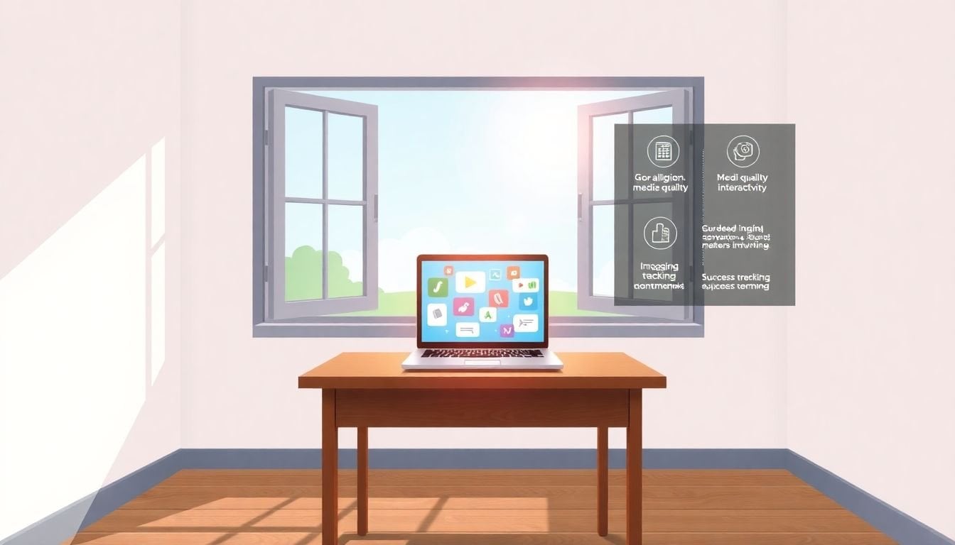
- Mix media on purpose: short videos (often 60–300 seconds), screenshots, podcasts, and micro-quizzes beat long, single-format modules.
- Add interaction at decision points: quizzes, polls, clickable diagrams, and scenario prompts should show up right when learners might get confused.
- Accessibility isn’t optional: accurate captions, transcripts, alt text, and fast-loading assets help everyone (and reduce support requests).
- Measure what breaks learning: track completion, quiz performance, and drop-off timing—then run small A/B tests (even simple ones).

1. Align Multimedia with Learning Objectives
The first rule I use is simple: every media element should answer a specific learning question. Not “make it engaging.” Not “add variety.” A real objective.
For example, if you’re teaching cooking by experimenting, a video showing hand placement, timing, or plating is far more helpful than a paragraph like “do it until it looks right.” Learners can copy the process.
On the other hand, if your objective is “understand the difference between two concepts,” charts and infographics usually beat video. A good comparison graphic lets learners pause, scan, and re-check without rewinding 10 times.
Here’s what I actually do before I create anything:
- Write the objective in plain language (e.g., “After this lesson, learners can identify 3 signs of protein deficiency.”)
- Underline the verb (identify, explain, compare, practice, apply).
- Pick the media that matches the verb:
- Demonstrate / model → screen recordings, short video demos
- Explain / clarify → diagrams, annotated visuals, short explainer clips
- Practice / apply → scenarios, drag-and-drop, branching choices
- Remember / recall → spaced micro-quizzes, flashcard-style prompts
And yes—sometimes the best multimedia choice is no multimedia. If the objective is “read and reflect,” a clean text section with a strong example might outperform a distracting animation.
Before you upload or build anything, revisit your course outline and map each lesson to your your teaching plan and learning objectives. If you can’t explain why a clip belongs there in one sentence, it probably doesn’t.
2. Focus on Quality of Media
Here’s the annoying truth: poor multimedia quality creates extra cognitive load. Learners end up working harder just to decode what you’re showing.
I’ve noticed this especially with audio. If the voice is muffled or inconsistent, people don’t just “hear less”—they trust the content less. And when trust drops, engagement drops with it.
My baseline checklist before publishing:
- Audio: clear voice, no background hum, consistent volume (aim for roughly the same loudness across clips)
- Video: stable framing, readable text overlays, no distracting motion in the background
- Lighting: no blown-out highlights, no harsh shadows across faces or slides
- Captions: captions that match the spoken words (more on this in the accessibility section)
- Playback: test on mobile Wi‑Fi and a slower connection if you can
You don’t need a Hollywood budget. A decent USB condenser mic can make a huge difference for voiceovers. For video editing, I’ve used tools like Filmora, DaVinci Resolve, and iMovie—and even simple edits (trim silence, correct levels, export in a compatible format) make the course feel “real.”
If you want a practical walkthrough for creating educational video content, see how to create an educational video. Even if you’re brand-new, the workflow helps you avoid the common traps (like recording too long and then trying to fix it in post).
In my experience, the biggest quality wins usually come from tightening your delivery: shorten takes, reduce background distractions, and make sure the key visual is obvious within the first 2–3 seconds.
3. Mix Different Media Types for Engagement
Long text-only modules are tough. Long video-only modules are tough too. Learners need variety and structure.
Instead of “hours of content,” I aim for “small learning moments.” That usually means short videos, quick visuals, and some kind of check-in after each chunk.
About the “69% prefer short videos” claim—there are plenty of surveys out there, but that exact number needs a source and context (who was surveyed, what year, and what “prefer” means). Since I can’t verify that specific figure from the text here, I’m not going to lean on it.
What I can say confidently: short videos tend to work better when they’re focused. If your clip is 12 minutes long, learners don’t “stay engaged”—they drift. If you keep clips around 60–300 seconds, learners are more likely to stay with you and actually retain what you taught.
Here’s a mix that works well in most courses:
- Short video demo (1 key idea, 1 example)
- Screenshot or annotated image (a visual recap)
- Micro-activity (1 question, 1 poll, or 1 scenario choice)
- Optional audio (podcast-style summary or “walkthrough”)
Example: after a video explaining a concept, embed a quick interactive quiz right inside the module. Not a 10-question test. Just 2–4 questions that check understanding and point learners to what to do next.
If you need help designing quizzes that don’t feel like punishment, use how to make a quiz for students. The key is to write questions that match your lesson objective, not random trivia.
4. Incorporate Interactive Elements
Interactive elements are how you keep learners from passively consuming content. But here’s the part people miss: interaction should happen at the right moments.
If you sprinkle quizzes randomly, learners feel like it’s “gotcha time.” If you place them right after a key explanation or before a tricky step, they feel like support.
Good interaction ideas that don’t require fancy tech:
- Short quizzes after videos or sections (2–5 questions)
- Polls (“Which option would you choose?”)
- Clickable images (tap hotspots to reveal explanations)
- Scenario-based choices (branching based on answers)
- Discussion prompts with a clear question and a time window
One thing I like: embed a quiz right after the “hard part” of a lesson. For example, if your video teaches a process with 3 steps, quiz after step 2—so learners catch mistakes before they continue.
If you want a straightforward path for quiz creation, again, how to make a quiz for students is a solid starting point.
For discussions, don’t just open a forum and hope. Give learners a prompt like: “Share one example from your experience that matches this concept—and explain why it fits.” You’ll get better answers and fewer “me too” comments.
And if you like live participation tools, Poll Everywhere or Slido can be great for live or cohort-based sessions. The real benefit isn’t the tool—it’s that learners see other responses and think, “Oh, I’m not the only one.”
Just don’t turn your course into a carnival. Interactivity should clarify, practice, or check understanding—not distract from it.
5. Ensure Accessibility for All Learners
Accessibility is one of those topics people leave until the end. Then they realize they can’t fix it quickly—because captions, transcripts, and alt text affect everything from editing to publishing.
So I build accessibility in from the start.
Start with captions and subtitles. Yes, YouTube auto-captions exist—but they’re often wrong, especially with names, acronyms, and technical terms. I’ve seen captions turn “enzyme” into “en-some” more times than I’d like to admit.
Here’s a workflow I recommend:
- Generate captions (auto-caption is fine as a draft)
- Review for the top 10 errors first (proper nouns and key terms)
- Re-export or update captions so the timing matches the audio
- Test on mobile to confirm readability and line breaks
If you have audio-only lessons, add transcripts. It helps learners who can’t listen in the moment—and it usually reduces support questions like “What did you say at minute 4?”
Accessibility also includes performance. If your multimedia is heavy, learners on slower internet will bounce. Compress images and videos using tools like TinyPNG or HandBrake, and don’t assume everyone has the same connection speed.
Also pay attention to color contrast. High contrast between text and backgrounds helps learners with color blindness and visual impairments, and it generally improves readability for everyone.
If you want deeper guidance on structuring readable, accessible lesson content, check lesson writing. Clear writing and accessible design go together more than people think.
And yes—depending on where you operate, accessibility may be legally required. Even if it weren’t, it’s still the right thing to do.
6. Measure Effectiveness and Adjust
Once your course is live, the question becomes: is it actually working? Multimedia can look great and still fail learners if it’s confusing, too long, or placed at the wrong time.
I measure in two layers: behavior (what they do) and outcomes (what they learn).
Behavior metrics to pull from your LMS usually include:
- Completion rate (did they finish the module?)
- Quiz scores (did they understand?)
- Viewing duration / time-on-task (did they stay with it?)
- Drop-off timing (where do they leave?)
Then I map common patterns to likely causes:
- Drop-off right after a video starts → probably too long intro, weak hook, or audio/visual issues
- Drop-off mid-video → chunk it; add a pause point and a question
- Low quiz scores after a specific media segment → the explanation may be unclear, or the media doesn’t match the objective
- High completion but low performance → learners are moving through, but not retaining—add more practice and retrieval questions
Here’s a simple test plan you can run without overcomplicating things:
- Pick one module with the biggest drop-off or lowest quiz results
- Change one variable (e.g., split a 10-minute video into 3 clips + 2 micro-quizzes)
- Run for one cohort or a fixed time window (enough learners to see a pattern)
- Compare metrics (completion, average quiz score, and where learners stop)
Also ask learners directly. A short survey can be more revealing than dashboards alone. Use Google Forms or Typeform and ask things like:
- Which part felt hardest?
- Was the video helpful, confusing, or too fast?
- What would you remove or add?
If videos aren’t resonating, don’t force it. Try podcasts, interactive diagrams, or a scenario exercise instead. You’re not married to any format—you’re building learning outcomes.
If you want help interpreting what’s happening (especially when results are mixed), it helps to review effective teaching strategies. The point is to connect the data to the instructional design, not just stare at numbers.
Keep iterating. That’s how multimedia stops being “stuff you added” and becomes “instruction you can rely on.”
FAQs
Multimedia works best when it directly reinforces the objective. If the goal is to demonstrate a process, use video or screen recordings. If the goal is to explain relationships, use diagrams or charts. The rule I follow is: each media element should answer “How does this help learners do the learning task?” If it can’t, it’s probably filler.
Engagement usually improves when you mix formats and add short checks for understanding. Videos work well when they’re focused and short. Infographics and screenshots help learners scan and review. Audio can be great for summaries. And interactive elements—like quizzes, polls, and scenario questions—tend to keep learners actively thinking instead of passively watching.
Accessibility ensures learners can actually access the content—whether they use screen readers, need captions, or can’t listen to audio in the moment. Captions, transcripts, and descriptive alt text aren’t just “nice to have.” They make learning more inclusive and reduce frustration for everyone.
Track a few core metrics consistently: completion rates, quiz results, and where learners drop off. Then pair that with feedback from a short survey. When you see a pattern—like low quiz scores after a specific segment—adjust that part of the multimedia and retest with the next cohort.