How to Design Assessments for Color-Blind Learners in 8 Easy Steps
I know how tricky it can be to create assessments that work for color-blind learners; colors alone can definitely leave some students guessing. But don’t worry—you can design tests that are clear and fair for everyone.
If you keep reading, I’ll share simple tips to make your assessments more accessible, from choosing the right color combinations to adding labels and textures that everyone can understand. These little tricks will help you reach all learners without extra stress.
We’ll look at ways to avoid relying only on color, use contrast and patterns, and even check your assessments with special tools—making your tests inclusive and effective for all students.
Key Takeaways
- Don’t rely only on color to communicate information. Add labels, symbols, or patterns so everyone can understand your assessment clearly.
- Use high contrast colors like blue, yellow, and orange, and check that text and backgrounds have enough difference to be easily read for all users.
- Add textures, shapes, and patterns to visual elements. Using different shapes or patterns helps distinguish options even without color.
- Label color-coded parts clearly with text or icons, so learners who can’t see the colors can still follow along easily.
- Adjust the brightness or darkness of colors to improve visibility. Light and dark shades help differentiate without relying solely on color.
- Test your assessments with tools that simulate color blindness. This shows how visuals appear to users with different vision types and helps you fix issues.
- Offer alternative formats like audio or text descriptions. Providing multiple ways to access content increases accessibility for everyone.
- Review and update your design practices regularly, following accessibility standards and asking for diverse feedback to improve inclusivity.

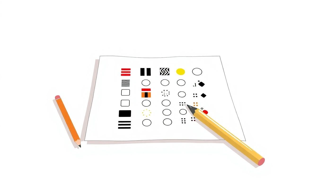
1. Design Assessments that Do Not Rely on Color Alone2. Choose High-Contrast and Color-Friendly Combinations3. Include Patterns, Textures, and Shapes for Clarity
4. Clearly Label Color-Coded Elements
Labeling color-coded parts of your assessment helps everyone follow along easily, especially those who can’t distinguish certain colors.
For example, add text labels like “Correct” or “Incorrect” next to answers instead of relying solely on color cues.
You can also include icons or symbols—checkmarks, crosses, or flags—that serve as visual markers regardless of color perception.
This way, even if someone sees colors differently, they can still understand what each element means.
Using descriptive labels alongside colors makes your assessments more understandable and accessible for all learners.
To keep it simple, review your designs and ask yourself: “Would someone with color blindness be able to interpret this easily?”
5. Use Lightness and Darkness to Differentiate Colors
Changing the brightness or darkness of colors is a quick way to make your visuals more inclusive.
For instance, instead of just light green and dark green, try pairing a light yellow with a deep orange for contrast.
This simple trick improves legibility for people who perceive colors differently or view your content in black and white.
Follow guidelines like maintaining a contrast ratio of at least 4.5:1 for text and background colors.
Tools like [Contrast Checker](https://contrastchecker.com/) can help you see if your choices meet accessibility standards.
Plus, experimenting with shades can reveal which combinations look clear and distinct, even without color differentiation.
6. Test Assessments with Color Blindness Simulation Tools
The best way to see how your assessments perform for everyone is to test them with tools that simulate color vision deficiencies.
Apps like **Color Oracle** or online simulators let you view your designs as they would appear to someone with red-green color blindness or other types of CVD.
This hands-on approach highlights potential issues before your learners do.
Take a moment to check your visuals in grayscale or in monochrome modes—it can reveal how much clarity is retained without color.
By testing early, you save yourself headaches down the line and ensure your assessments are truly inclusive.
So, give it a try—you might be surprised what gets lost or misunderstood without that quick check.
7. Provide Assistive Technology and Alternative Formats
Offering options like screen readers, audio descriptions, or downloadable text makes your assessments accessible for everyone.
For example, include transcripts for videos or audio instructions so learners with visual impairments can follow along easily.
Providing large-print versions or audio files is especially helpful for those with low vision or reading difficulties.
Think about integrating tools like [Text-to-Speech](https://createaicourse.com/what-is-lesson-preparation/) to support learners who benefit from audio formats.
Offering multiple formats ensures that your content is accessible regardless of how someone prefers to learn or what disabilities they may have.
Basically, variety is the spice of accessibility—it’s all about making it easy for your audience to engage.
8. Review Best Practices to Enhance Accessibility
Stay updated with the latest tips and standards for designing accessible assessments.
Regularly check your visuals and content against guidelines provided by organizations like the [WCAG](https://createaicourse.com/learning-and-earn-money/), which help keep your assessments inclusive.
Ask for feedback from diverse users to see if your assessments remain clear and helpful for everyone.
Remember, what’s accessible today might need adjusting tomorrow as technology and standards evolve.
Keep learning about new tools and techniques—it’s a good habit for anyone serious about inclusion.
After all, making your content accessible isn’t a one-time task; it’s an ongoing process of improvement and listening.
FAQs
Use patterns, textures, and labels along with colors. Test your designs with color blindness simulation tools to identify issues and ensure all users can understand the content easily regardless of color perception.
Opt for high-contrast combinations like dark text on light backgrounds and avoid relying on color alone. Combining bold colors with different lightness levels helps differentiate elements clearly for everyone.
Incorporate different patterns, textures, and shapes to distinguish elements. These visual cues aid understanding, especially when color cues are insufficient or not perceivable by all users.
Label color-coded elements clearly, test with accessibility tools, and provide alternative formats. Regular reviews of design guidelines help maintain inclusivity for users with different needs.