Creating Engaging Animations for Explanations: 8 Simple Tips
Making animations that actually help people understand something can feel tough at first. I get it—you’re trying to explain a real concept, not just decorate the screen. And if you’ve ever watched your own draft and thought, “Wait… did they even follow that?” you’re not alone.
What usually throws people off is the fear of going too “jargony,” or worse, losing attention halfway through. In my experience, that’s rarely a motivation problem. It’s almost always a structure and pacing problem.
So instead of guessing, I’ll show you a practical workflow I’ve used to turn plain explanations into animations that feel clear, paced well, and—yes—kind of fun to watch. You’ll go from script to storyboard, choose the right animation style, optimize for engagement, and then measure what worked so you can improve the next one.
Key Takeaways
- Create a script that matches scenes line-by-line (and storyboard it before you animate).
- Use simple, relatable visuals—especially metaphors—so the audience doesn’t have to “translate” your idea.
- Keep it short (often 60–90 seconds for a single concept) and build rhythm with quick visual changes every 1–3 seconds.
- Pick 2D vs 3D based on cost, timeline, and how realistic the visuals need to be.
- Open with a hook that creates curiosity, and end with a next step that fits your goal (not just “like and subscribe”).
- Place the video where people already look for answers (above the fold on key pages, or mid-page right after the problem).
- Do SEO the “timestamp” way: map keywords to sections and write a transcript that matches search intent.
- Track retention and click-through by device and time—then revise the exact segment where people drop.

Create Engaging Animations for Clear Explanations
Creating animations that engage viewers and make explanations stick isn’t just “being creative.” It’s really about reducing confusion while keeping momentum.
Quick reality check: explainer videos often perform well for marketing, but the exact “conversion lift” varies by industry, audience, and baseline. I’ve seen strong gains in the 10–30% range when the video matches a specific page intent (for example, a “how it works” video embedded on a pricing page). If you’re quoting bigger numbers, I’d treat them as case-study results, not guarantees.
Here’s what I noticed after testing explainer-style animations with the same script but different visuals: when the video uses simple visuals that directly map to the words, people understand faster and stay longer. That’s the whole point—animations can reduce cognitive load because your brain isn’t trying to “hold” the concept while it figures out what you mean.
Let me give you a concrete example. Suppose you’re explaining a technical concept like how API authentication works (API keys, tokens, and requests). Instead of saying “the token is validated,” I used a metaphor: a keycard at a door. The “token” became the keycard, the “server” became the door reader, and “permissions” became the door’s allowed rooms. The result? Viewers didn’t get stuck on the jargon. They understood the flow.
And yes—include a story or emotional hook, but don’t overdo it. One simple narrative beat is enough. For instance: “If you’ve ever been blocked trying to access an account, here’s what’s happening behind the scenes.” That line makes people feel like the video is for them, not just for the algorithm.
Write a Clear Script and Storyboard Your Ideas
A strong script is the backbone of any animation. If the script is fuzzy, the visuals will feel random—no matter how polished they look.
Here’s the method I use:
- Start with one outcome: “By the end, they’ll understand X and know what to do next.”
- Break it into 3–5 beats: Problem → Why it happens → How it works → What changes → Quick recap.
- Write like you’re talking to a smart friend: short sentences, minimal jargon, and direct phrasing.
Then storyboard it. Not the fancy kind—just enough to answer: “What’s on screen when I say this?”
For example, if your script includes “First, the user requests access,” your storyboard panel should show a user action on the left, a request arrow in the middle, and a response moment on the right. If you can’t draw that quickly, your script might be too abstract.
Also, revise while you’re building. I’ve had drafts where the script sounded great in a doc, but in animation the pacing was wrong. When that happens, I tighten the wording and shorten the scene duration rather than forcing the visuals to “stretch” to fit the narration.
Incorporate Key Elements for Engaging Animation
Animation gets attention, sure—but engagement comes from clarity plus rhythm.
I usually plan visuals around three elements: focus, motion, and supporting cues.
- Focus: one thing should be the “main character” on the screen at a time. If everything moves, nothing stands out.
- Motion: use fluid transitions and movement to reflect meaning (arrows for direction, highlights for emphasis, and simple zooms for “this part matters”).
- Supporting cues: icons, labels, and color coding that match what you say out loud.
Music and sound effects can help a lot—especially for transitions. I’m not talking about blasting background music. Think subtle cues: a soft “click” when something is selected, a gentle swoosh when moving to the next step, and short beats for emphasis.
Duration matters, but more specifically, scene length matters. In most explainer videos, if a scene sits too long without change, people start multitasking. I aim for visual changes every 1–3 seconds. That doesn’t mean chaos—it means the viewer always has something to track.
And yes, a typical target of 60–90 seconds works well when you’re covering one concept. If you need more, split it into a series rather than cramming everything into one long animation.
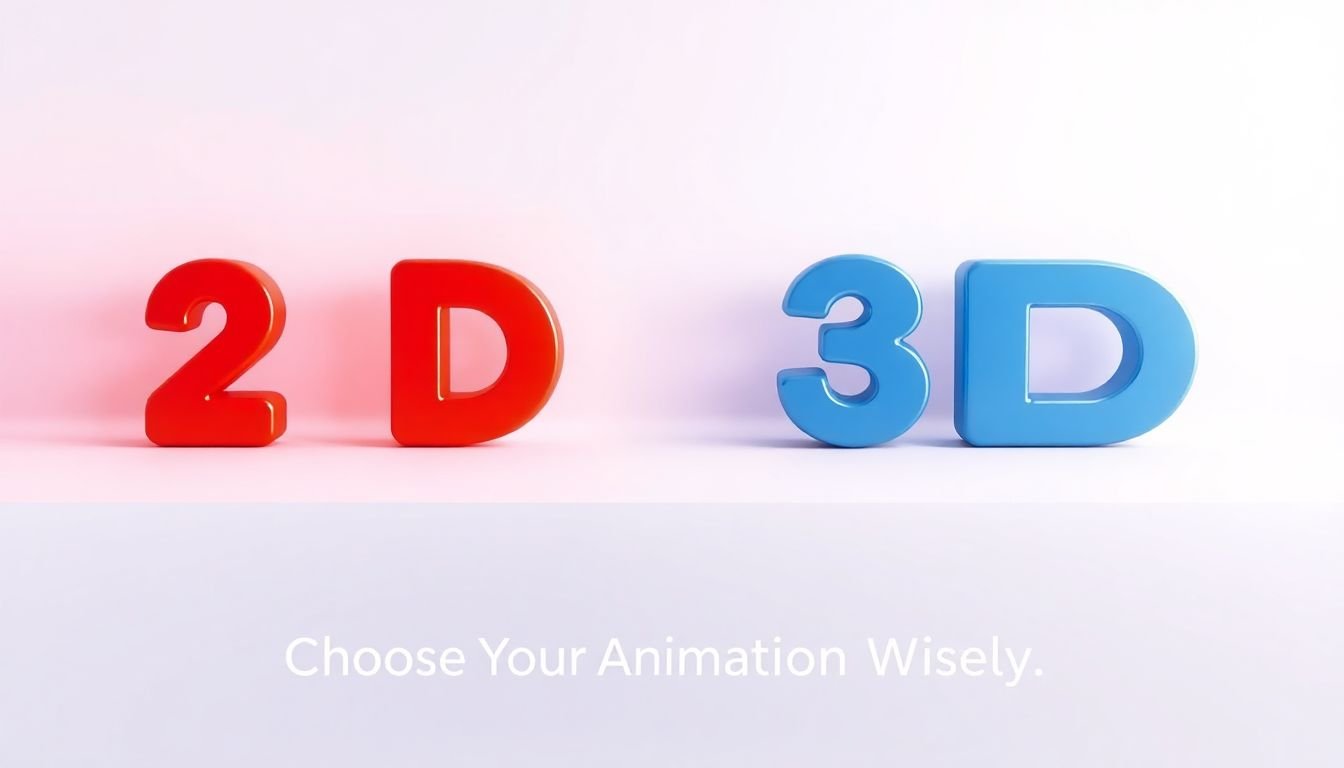
Choose the Right Type of Animation for Your Content
Choosing 2D vs 3D isn’t about “what looks cooler.” It’s about what fits the message and your production constraints.
2D is great when you want something clean and fast. If your explainer is mostly about steps, concepts, or simple comparisons, 2D motion graphics and character-less animations can get the job done without eating your budget.
3D shines when you need depth, realism, or spatial clarity—like showing how a product fits together, or visualizing something physical. The downside? 3D can take longer to model, light, and render. If you’re on a tight timeline, 3D might slow you down more than it helps.
What about your audience? If you’re teaching beginners, quirky 2D styles with clear icons often work better than realistic 3D that distracts from the key idea. If you’re targeting professionals and the concept is technical, 3D can help—but only if the visuals are still easy to read.
And don’t be afraid to test styles. I’ve seen “whiteboard” animations outperform more polished motion graphics for certain audiences because the format feels direct and instructional.
Optimize Your Animation for Viewer Engagement
Optimization is where your animation stops being “nice” and starts being effective.
Start with a hook that’s specific. A thought-provoking question works, but a question like “Have you ever wondered why this happens?” is too vague. Try something like: “If your login keeps failing, it’s usually not your password—here’s the token check.” Now it’s relevant.
In the first few seconds, make the visuals do the talking. I like to show the problem visually before the explanation. Even a simple animation—like a red “blocked” indicator—can set the stage instantly.
At the end, add a call-to-action that matches the viewer’s intent. If this is for education, the CTA might be “Download the checklist” or “Read the step-by-step guide.” If it’s for lead gen, it might be “Get a demo” or “Try the tool.” Don’t end with something generic that doesn’t connect to the content.
Also: mobile optimization is not optional. I’ve watched videos where the text is readable on desktop, but on phones it becomes a blurry line. If you can, design your captions and labels for small screens—bigger font, fewer words per line, and high contrast colors.
Strategically Place and Promote Your Animation
Once your animation is done, the real work is making sure it gets in front of the right people at the right moment.
Placement matters. If you’re using the video to explain how something works, embed it on the page where users are already deciding—often above the fold on a landing page, or right after the first “what is it / why it matters” section. That’s where attention is highest.
On social media, don’t just post once and hope. I usually plan a small cadence: one short teaser (or clip) the day of posting, the full version a day or two later, and then a “key takeaway” cut for retargeting. Platform formats matter too—vertical versions for TikTok/Instagram, and shorter clips for feed-based viewing.
Collaborations can help, but keep it practical. If you do partner content, aim for creators whose audience already cares about the topic you’re explaining. Otherwise your video gets views but not understanding.
Hosting on YouTube or Vimeo is fine, but don’t treat it as a “set it and forget it” situation. Titles, descriptions, and tags still matter—and if you’re embedding the same video on your site, consistency helps both viewers and search engines.
Leverage SEO to Enhance Visibility of Explainer Videos
If you want your explainer video to be discoverable, SEO is the difference between “people find it” and “it lives in the void.”
Start with keyword research, but don’t stop at a single phrase. Think about what people type when they’re stuck. For example, instead of only targeting “API authentication,” you might also target “how to authenticate API requests,” “API token vs API key,” or “why my token is invalid.”
Here’s a tactic I like: keyword-to-timestamp mapping. After you write the script, assign a keyword to each section. Then structure your transcript so those terms appear naturally where the concept is explained.
When you upload, use a title that includes the main keyword and a value promise. A simple example: “API Authentication Explained: API Keys vs Tokens (in 90 Seconds).” In your description, add a short summary plus a few bullet points that mirror your beats.
Transcripts help because search engines and accessibility tools benefit from text. If you can, format the transcript so it reads like clean paragraphs, and include direct captions. It’s not just SEO—it’s usability.
Finally, embed the video in blog posts that match the topic. If your post covers “token validation,” embedding the explainer right after that section can keep users on the page longer and earn more engagement signals.
Track and Analyze Video Performance for Improvement
Here’s the part most people skip: you need to watch how real viewers behave. Not your opinion—actual behavior.
I recommend using Google Analytics and YouTube Insights (or whatever platform you’re using) to monitor:
- Average view duration and overall watch time
- Audience retention (where the curve drops)
- Click-through rate from thumbnails (if available)
- Traffic source (did people come from search, socials, or embeds?)
- Device breakdown (mobile vs desktop)
Now for a practical example. Suppose your retention dips hard around 0:42. That’s usually one of three things: the narration gets too dense, the visuals stop changing, or the concept needs a simpler metaphor. I’d revise that exact segment—shorten the explanation, add a quick visual step, and then re-upload or re-embed.
In one project I worked on, we replaced a long “definition” segment with a simple step-by-step animation. After updating the script and shortening that middle section by about 10–15 seconds, we saw retention improve through the drop point and fewer people bounce on the page.
Also gather feedback. Comments are great, but so are quick surveys. Ask one direct question like: “What part was confusing?” You’ll be surprised how often the answer points to the same spot your retention curve already hinted at.
Then iterate. Review your data monthly, not just after launch. Each revision builds a clearer video over time.
FAQs
Key elements include a storyline that actually matches the visuals, graphics that are easy to read, concise messaging, pacing that doesn’t drag, and small interactive-style moments (like highlights, callouts, or step-by-step reveals) that keep viewers actively tracking the explanation.
Use attention-grabbing visuals at the start, keep a steady rhythm with frequent (but not distracting) scene changes, add sound effects/music sparingly for emphasis, include a clear CTA that fits the viewer’s intent, and make sure everything is legible on mobile—especially text, captions, and contrast.
It depends on what you’re explaining. Whiteboard animation often works well for teaching and step-by-step learning, 2D is great for clear concepts and simple storytelling, and motion graphics are especially useful for data visualization. If the content is spatial or physical, 3D can help—but only if it stays readable.
Optimize your video title, description, and tags with relevant keywords, create an engaging thumbnail that matches the promise, publish a transcript/captions that reflect how people search, and promote the video through blog embeds and social sharing to earn visibility and backlinks.