
Creating Accessible PDFs and Documents: 13 Essential Steps
Making an accessible PDF can feel weirdly hard at first—until you realize it’s mostly about doing the “boring” formatting right from the start. I’ve been on the other side of this too: I’ve opened a document that looked fine on my screen, then watched a screen reader stumble through headings, skip images, and read tables like a random paragraph. Not fun.
So here’s what I do now. I build accessibility into the source document (Word or Google Docs), then I carry that structure through to the PDF tagging and reading order. If you’re exporting reports from an LMS, publishing training handouts, or converting documents for government or compliance work, these steps will save you a lot of rework.
We’ll go step by step: headings, alt text, reading order, link text, list formatting, PDF tags, text reflow, and checks using built-in tools. I’ll also point out the common failure modes I’ve personally run into—like “tagged” PDFs that still don’t read correctly because the reading order wasn’t fixed.
Key Takeaways
- Start with an accessible source document in Word or Google Docs (use styles, not fake formatting).
- Use real heading structure (H1/H2/H3...) so screen readers can navigate by sections.
- Add meaningful alt text to images (and mark decorative images so they don’t get announced).
- Fix the PDF reading order—what looks right visually often isn’t right in assistive tech.
- Write descriptive link text (avoid “click here” and “learn more”).
- Choose fonts and colors with strong contrast; don’t rely on color alone for meaning.
- Format lists with proper list markup so assistive tech recognizes the structure.
- Tag the PDF properly (headings, paragraphs, lists, tables, figures) so navigation works.
- Enable text reflow so content remains readable when users zoom or rotate devices.
- Run accessibility checks in Acrobat/Reader and verify with keyboard-only testing.
- Use OCR for scanned documents and label interactive form fields.
- Set document language and metadata correctly (title/author/keywords/language).
- For complex layouts (forms, multi-column tables, legacy PDFs), get remediation help.

Step 1: Start with an Accessible Source Document
This is where most accessibility problems are born. If your source file is messy, the PDF usually inherits the mess—bad heading structure, weird spacing, and “random” reading order.
In my experience, the easiest way to keep things clean is to work in Microsoft Word or Google Docs using real formatting features (styles, proper lists, and tables). Don’t fake it with extra spaces or manual line breaks.
When it matters: whenever you’re creating new content or converting something like a training handout, syllabus, or policy doc.
How to do it (Word / Docs):
- Use styles for headings (Heading 1, Heading 2, etc.), not bold/size changes.
- Use real lists (bulleted/numbered list tools) instead of typing “1)” manually.
- Keep paragraphs as paragraphs—avoid stacking text boxes or floating elements if you can.
Verify: in the source file, use the built-in “Navigation pane” (Word) or document outline (Docs) to confirm headings appear correctly.
Common error to avoid: exporting with “print layout” tweaks that force multi-column text into separate boxes. It can look identical visually, but the PDF structure often breaks.
Step 2: Use Headings and Structure the Screen Reader Way
Headings aren’t decoration. They’re the map. Screen readers and accessibility tools rely on them so users can jump between sections quickly.
When it matters: long documents (anything over ~2–3 pages), reports, manuals, and training materials.
How to do it:
- Use one Heading 1 for the main title.
- Use Heading 2 for major sections, Heading 3 for subsections, and so on.
- Don’t skip levels (e.g., jumping from Heading 1 to Heading 4) unless you really know why.
Verify: skim the outline. If you can’t explain the document’s structure in 10 seconds, your headings probably aren’t doing their job.
Common error to avoid: using “Heading” styles for decorative text (like a footer banner). That creates fake sections that confuse navigation.
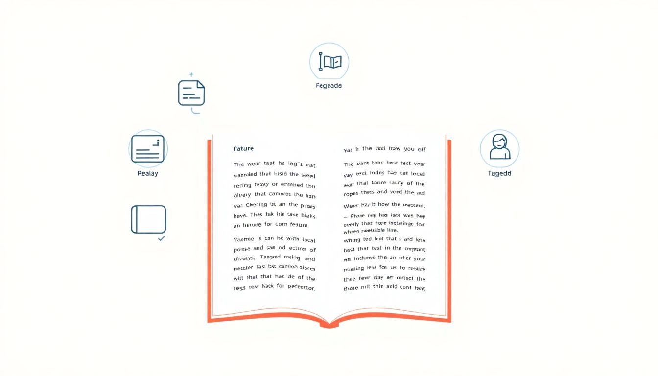
Step 3: Write Alt Text That Actually Helps
Alt text is basically the description your image can’t give on its own. I usually ask: what would someone miss if this image disappeared?
When it matters: every meaningful image—charts, diagrams, screenshots, icons that convey information.
How to do it:
- Be specific (what’s happening, who/what is shown, and any key details).
- Keep it concise. In practice, many alt texts land around 1–2 sentences.
- Skip “image of” / “picture of”. Screen readers already announce it as an image.
- Mark decorative images as decorative when they don’t add meaning (so they’re skipped).
Example: Instead of “dog,” use something like “A fluffy golden retriever playing fetch in the park.” For a chart, describe the takeaway, not just the labels: “Bar chart showing sales increased from Q1 to Q3, peaking in Q3.”
Verify: after converting to PDF, check alt text in the tags panel (or with an accessibility checker) and make sure decorative images aren’t announced.
Common error to avoid: copy-pasting the file name as alt text (“IMG_4829”). That’s not a description—it’s a guess.
Step 4: Fix the Reading Order (Not Just the Visual Layout)
This is one of those steps people skip because the document looks fine. But screen readers follow the PDF’s internal structure, not your designer’s layout.
When it matters: multi-column layouts, sidebars, callouts, and any document with tables or text boxes.
How to do it in Adobe Acrobat:
- Open the PDF in Adobe Acrobat Pro.
- Go to Tools → Accessibility → Reading Order.
- Use the highlighted order to confirm it matches what a person would read top-to-bottom, left-to-right.
- If something is out of place, adjust the reading order blocks until it flows logically.
Verify: run a screen reader pass (or at least keyboard navigation) and listen for jumps—like the reader going from a sidebar back to the middle of a paragraph.
Common error to avoid: assuming that “tagging” automatically fixes reading order. It doesn’t. You often have to do both.
Step 5: Make Links Predictable
Link text is a huge accessibility detail because users often navigate by jumping from link to link. If your links say “click here,” that’s basically giving them nothing.
When it matters: docs with multiple resources—policies, references, training modules, or download links.
How to do it:
- Replace “click here” with something like “Download the accessibility checklist (PDF)” or “Read the course syllabus (DOCX).”
- Keep wording consistent for repeated actions (e.g., every “Download” link uses the same pattern).
- If you link a key term, make sure the term itself is meaningful (not “this” or “that”).
Verify: list all links (in Acrobat or by copying link text) and read them out of context. If they’re confusing when isolated, they’ll be confusing for screen reader users too.
Common error to avoid: linking to a file type without indicating what it is. “Download policy” is better than “Download file.”
Step 6: Pick Fonts and Colors People Can Actually Read
I’m not picky about fonts, but I am picky about readability. If someone has to squint, you’ve already lost.
When it matters: any document where users will read small text—forms, instructions, manuals, and worksheets.
How to do it:
- Use a clean sans-serif font (Arial, Helvetica, Calibri are common choices).
- Aim for at least 4.5:1 contrast for normal text (WCAG 2.2 AA).
- Make sure spacing isn’t cramped. Line height and paragraph spacing help more than people think.
- Don’t use color alone to show meaning (like “red = required”). Add text like “Required fields are marked in red.”
Verify: use the WebAIM Color Contrast Checker for your exact foreground/background colors.
Common error to avoid: setting light gray text on white and calling it “subtle.” Subtle is usually unreadable.
Step 7: Use Lists (and Don’t Break Them)
Lists are one of the easiest things to get right—and one of the easiest things to accidentally mess up during formatting.
When it matters: steps, checklists, feature lists, anything with grouped items.
How to do it:
- Use ordered lists for numbered steps (1, 2, 3...).
- Use unordered lists for bullets.
- Keep list items as real list items—don’t create lists by typing hyphens and hitting space.
Verify: in the source document, click inside a list and confirm the editor still recognizes it as a list (not plain paragraphs). After export, check that the PDF tags show list structure, not one giant paragraph.
Common error to avoid: mixing list types within the same indentation level (bullets inside numbered lists without proper nesting). Screen readers can interpret that wrong.
Step 8: Tag the PDF So It Behaves Like a Real Document
Tagging is where PDFs go from “a picture of text” to something assistive tech can navigate properly.
When it matters: basically every accessible PDF, especially if you need keyboard navigation, headings navigation, or table navigation.
How to do it in Adobe Acrobat Pro:
- Open the PDF and go to Tools → Accessibility → Full Check (this also helps you find tagging issues).
- Open the Tags panel (View → Show/Hide → Navigation Panes → Tags, depending on version).
- Confirm that headings are tagged as H1/H2/etc., paragraphs are P, lists are L with LI items, and images are Figure with alt text.
- For tables, confirm table structure tags (Table, TR, TH/TD). If everything is just “paragraph,” reading order will be messy.
Verify: use keyboard-only navigation and listen for structure. Can you jump by headings? Do lists announce as lists? Are images described at the right moment?
Common error to avoid: tagging everything as plain paragraphs. It’s better to have fewer tags correctly assigned than a whole document tagged incorrectly.
Step 9: Enable Text Reflow (So Zoom Doesn’t Destroy the Layout)
Text reflow is what keeps content readable when users zoom in, rotate a phone, or use narrow screens. Without it, text can overlap or get cut off.
When it matters: mobile-first audiences, documents that include long instructions, and anything users will zoom to read.
How to do it: when exporting to PDF, look for accessibility/export options that preserve reflow and text content. In Acrobat, you can also inspect whether the PDF supports reflow and whether content is tagged as text (not flattened into an image).
Verify: zoom to 200–400% in a PDF viewer and check that text reflows instead of hiding under other elements or requiring horizontal scrolling.
Common error to avoid: exporting “as image” or flattening layers. If text becomes non-text, reflow and screen reader navigation both suffer.
Step 10: Run Accessibility Checks (Then Do Keyboard Testing)
Built-in checkers catch a lot, but they don’t catch everything. I treat them like a checklist, not a final verdict.
When it matters: every time you publish or update a PDF.
How to do it in Adobe Acrobat:
- Open the PDF in Acrobat Pro.
- Go to Tools → Accessibility → Full Check.
- Review results for issues like missing alt text, untagged elements, incorrect heading structure, and problems with form field labeling.
- Fix items in order of impact (reading order and tagging first, then alt text, then minor metadata).
Verify (important): test with keyboard only. Can you tab through links and form fields? Can you reach headings and content without getting trapped?
Common error to avoid: only fixing what the checker flags. Sometimes the checker passes, but reading order is still wrong—especially after complex layout exports.
Step 11: Scanned Files and Interactive Forms Need Extra Care
Scanned PDFs are a special case. If it’s just an image, assistive tech can’t read it until you run OCR.
When it matters: old documents, paper-to-digital conversions, and any PDF with forms or interactive elements.
How to handle scanned documents:
- Run OCR so the PDF contains real text.
- After OCR, confirm that the text layer matches the visual content (no swapped lines, no missing sections).
- Then check tags and reading order—OCR alone doesn’t guarantee accessible structure.
How to handle interactive forms:
- Label every form field (Name, Email, Address, etc.).
- Make sure tab order is logical (top-to-bottom, left-to-right).
- Test the form using only the keyboard—no mouse. If you can’t complete it, many users can’t either.
Common error to avoid: leaving form fields unlabeled or using placeholder text as the only “label.” Placeholders aren’t reliable for accessibility.
Step 12: Review Metadata and Document Properties
Metadata won’t make your PDF readable by itself, but it helps identification, organization, and assistive tech context.
When it matters: shared documents, archives, government publishing, and any content that needs to be searchable and properly labeled.
What to check:
- Document title (not blank, not “Untitled”).
- Language (set the correct language for the content).
- Author/keywords if your organization uses them for discovery.
Verify: in Acrobat, check the document properties and language settings. If the language is wrong, screen readers may use the wrong pronunciation rules.
Common error to avoid: copying metadata from a template and forgetting to update the title and language.
Step 13: Get Help When the Document Is Truly Complicated
Sometimes you can fix it yourself. Other times, the PDF is so tangled (legacy tags, broken reading order, flattened text, complex tables) that DIY becomes a time sink.
When I’d consider professional help: PDFs with complex tables, long multi-column layouts, lots of form logic, or documents that must meet strict targets like WCAG 2.2 AA and PDF/UA compatibility.
What to ask for: remediation that includes (1) corrected tagging, (2) fixed reading order, (3) verified keyboard navigation, and (4) an accessibility test report showing what was checked.
Reality check: not every “PDF accessibility service” does the same level of verification. I’d rather see a clear process and test results than vague promises.
FAQs
An accessible source document makes everything downstream easier. If headings, lists, and alt text are correct in Word/Docs, the exported PDF usually has a cleaner structure and fewer tagging/reading-order problems. It’s also the difference between “fixing” and “remediating.”
Use link text that states the destination or purpose. For example, “Download the accessibility guide (PDF)” tells users what to expect. Avoid vague labels like “click here” or “learn more,” especially when links are read out of context by screen readers.
Text reflow allows content to reformat for different screen sizes and zoom levels. Instead of overlapping or forcing horizontal scrolling, users can read the document more naturally on mobile devices and when zoomed in—especially helpful for low vision users.
Adobe Acrobat Pro’s accessibility checker is a common starting point because it flags issues like missing tags and alt text. I also recommend keyboard-only testing (tab through links/forms) because it catches problems checkers sometimes miss.