Color Grading Basics for eLearning Videos: 8 Simple Steps to a Professional Look
If you’ve ever exported an eLearning video and thought, “Why does this look different from my last one?”—yeah, you’re not alone. Color grading can feel confusing at first, mostly because everyone talks about it like you need a studio setup. You don’t.
In my experience, getting a professional, consistent look comes down to a few repeatable moves: fix what’s broken first, then grade for style, and finally export in a way that won’t betray you on another device. Once you’ve done that a couple times, it starts feeling way less mysterious.
In this post, I’ll walk you through 8 simple steps I use when I’m grading training videos—especially when skin tones need to look natural, UI screens need to stay readable, and the whole course needs to feel like it belongs together. No fancy gear required. No “magic LUT” that somehow fixes everything.
Quick promise: by the end, you’ll know what to adjust, what to look for on scopes, and what export settings help preserve your look across LMS and mobile playback.
Key Takeaways
Key Takeaways
- Start with color correction to fix exposure, white balance, and obvious color casts before you touch “style.”
- Use brightness/exposure → contrast → saturation as your foundation. Small changes beat big swings in eLearning.
- Understand hue, saturation, and luminance so you can keep skin tones natural and backgrounds from stealing attention.
- Scopes (waveform + vectorscope) make adjustments objective—especially when your footage looks “fine” to your eye but isn’t.
- Apply a simple, repeatable grade (preset or LUT + primary tweaks) so every module matches.
- Use LUTs as a starting point, not a final answer. Dial intensity down until clarity stays intact.
- Export with the right bit depth, color space, and transfer characteristics so your look survives compression and playback.
- Do a quick device check (laptop + phone) because what looks good on your monitor can shift after upload.

1. Color Grading Basics for eLearning Videos
When you’re new to color grading, it’s easy to think you need to memorize a bunch of technical terms before you can make anything look better. You don’t.
Here’s the real goal: consistent, readable visuals that support learning. For eLearning, that usually means skin tones look natural, text/UI stays crisp, and your footage doesn’t jump in color between modules.
In practice, I can usually get a noticeable improvement in about 20 minutes per batch of clips—especially when the footage is already close. If it’s wildly off (wrong white balance, heavy compression artifacts, or mixed lighting), it takes longer. But the workflow stays the same.
Think of it like this: color correction is the foundation. Color grading is the styling. And export settings are what keep that styling from falling apart after upload.
2. Start with Color Correction
I always start with correction, because grading on top of a problem is just… compensating for mistakes. It can work, but it’s slower and it usually looks worse when you revisit the project later.
Color correction is about fixing things like:
- Shots that are too dark or too bright
- White balance that’s too green, too blue, or too orange
- Clips that don’t match each other (different cameras, different days, different lighting)
Here’s a real scenario I ran into on a course module: one talking-head segment had a subtle green cast (you could see it most around the shadow side of the face). Another clip from a different recording session looked warmer and slightly brighter.
What I did:
- White balance first until skin stopped looking greenish (in my case, I nudged the temp/tint toward warmer/magenta rather than “cranking saturation”).
- Exposure next: I matched the midtones so the face brightness felt consistent from clip to clip.
- Contrast after that: just enough to add clarity without crushing shadows.
Once those two clips were aligned, the “creative” grade became easy—because the footage was actually neutral enough to style.
If you’re using DaVinci Resolve, a common order in my workflow is: White Balance (Temp/Tint) → Exposure (Lift/Gamma/Gain or similar) → Contrast → Saturation, then secondary tweaks only if needed. In Adobe Premiere, I typically follow the same logic using Lumetri Color (basic correction first, then creative/secondary).
3. Understand Key Color Properties
Hue, saturation, and luminance are the big three. If you get these right, everything else becomes much easier.
- Hue = the “type” of color (red vs blue vs green)
- Saturation = how intense/vivid that color is
- Luminance = brightness (how light or dark it is)
Let me give you a practical example. If your video looks dull, you might be tempted to “turn up saturation.” Sometimes that works. But other times it’s actually a luminance/exposure problem. The saturation bump just makes the wrong thing more noticeable.
In my workflow, I try this order:
- Fix exposure/luminance first so the image has proper brightness and contrast.
- Then adjust saturation so colors feel alive without looking neon.
- Finally tweak hue if skin tones or neutrals still feel off.
Tip that saves time: pick a small area to evaluate (for talking-head videos, the face is usually best; for screen recordings, use a neutral UI element like white text or a light gray panel). Make a small change, compare to before, and repeat. Subtle adjustments win in eLearning because learners need clarity, not “stylized chaos.”
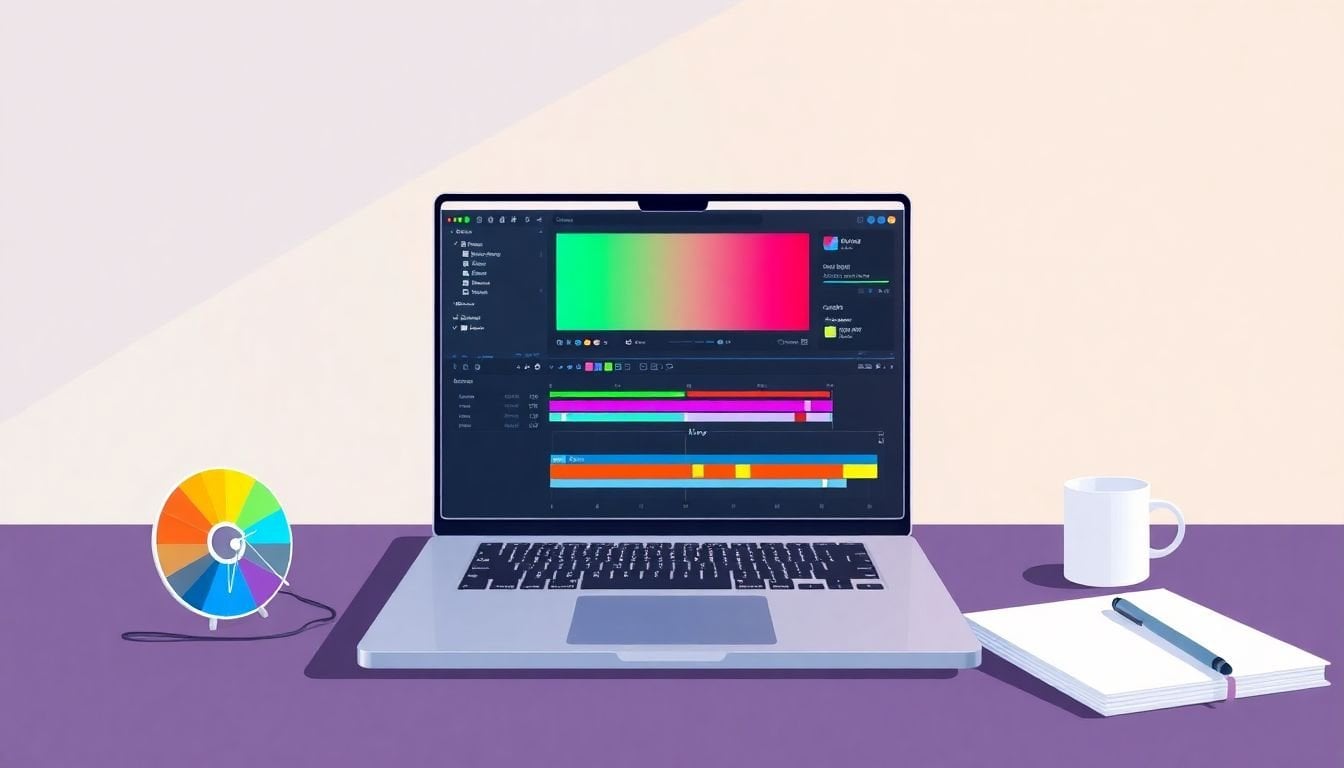
4. Use Scopes and Tools for Accurate Adjustments
Scopes are the part of color grading that makes it feel less like guessing. They show you what’s happening to brightness and color—even when your eyes are fooled by your monitor settings.
Waveform and vectorscope are the two I’d call “must-know” for eLearning.
Waveform (brightness/exposure):
- If the waveform is too high, you’re clipping highlights (skin can look shiny or “blown out”).
- If it’s too low, you’ve crushed shadows (details disappear and faces look flat).
Vectorscope (color balance):
- It helps you judge whether neutrals are actually neutral.
- For skin, you can use it as a guide to keep skin tones from drifting too far into green or magenta.
Here’s how I use scopes while adjusting in a typical Resolve-style workflow:
- Turn on waveform and watch the overall range. Aim for highlights that don’t slam the top.
- Set exposure so midtones feel right. (If your face is the subject, use frames where the face is evenly lit.)
- Adjust white balance until skin and neutrals stop looking tinted.
- Then small saturation tweaks—because saturation changes can make exposure feel off again.
About “AI tools”: some apps now offer automated color adjustments. In my experience, they can be helpful as a first pass, especially for quick normalization. But I still recommend you check the result with scopes. Automation doesn’t know your course needs consistent skin tones across 12 modules.
5. Apply Simple Grading to Create a Consistent Look
Once correction is done, grading is where you make everything look like it belongs together.
For eLearning, I like keeping this simple. Why? Because courses are long. Learners don’t want to notice your grade—they want to notice the content.
My “consistent look” recipe usually looks like:
- Primary adjustments: exposure/contrast/saturation (small moves)
- Optional secondary adjustments: skin tone refinement or background cleanup
- A reusable preset so every module gets the same baseline
If you’re using a LUT, I treat it like a vibe layer. I’ll often apply it after correction, then dial it back (or blend it) so it doesn’t overpower skin tones or UI screens.
Want a practical target? Keep skin tones looking natural and keep whites (like on-screen text backgrounds) from turning yellow/blue/gray. If your whites look “dirty,” your viewers will feel it—even if they can’t explain why.
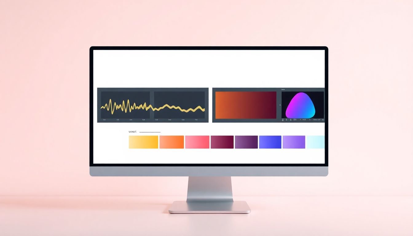
6. Incorporate LUTs Smartly
LUTs (look-up tables) can be great. They’re basically pre-made color transformations. But they can also be ruthless—especially if your footage isn’t corrected first.
Here’s the approach that works for me:
- Pick a LUT that matches the general intent (neutral/clean for training, warmer for friendly content, cooler for tech-forward tutorials).
- Apply it at reduced strength if your editor supports blending (or reduce the intensity in the LUT node).
- Check skin + neutrals immediately. If skin gets orange or green, don’t keep chasing it with saturation. Fix balance first.
If you’re unsure where to start, use a LUT as a base layer and then refine with primary controls (contrast/hue/saturation). That way, you’re not stuck with the LUT’s interpretation of your footage.
One more thing: LUTs are often created for specific camera profiles and lighting conditions. If your footage is a different camera or a different log/rec709 conversion, the LUT may behave differently than you expect. Scopes help you catch that quickly.
7. Export Settings with Color Fidelity in Mind
This is where a lot of people lose the look they worked hard to create. You can grade beautifully and then export in a way that crushes colors, changes brightness, or shifts gamma after upload.
Here are export settings I recommend for most eLearning (especially LMS and web):
- Bit depth: if your workflow supports it, export 10-bit (helps keep smooth gradients and preserves shadow/highlight detail better than 8-bit).
- Color space: for standard web viewing, use Rec. 709.
- Codec: H.264 is widely compatible. H.265 can save space, but make sure your platform handles it well.
For typical 1080p course videos, a practical bitrate target can be:
- H.264: around 8–12 Mbps for good quality
- H.265: around 4–8 Mbps for similar perceived quality (varies by scene complexity)
And here’s the part I always check: transfer characteristics / gamma. If you’re exporting Rec.709 for SDR, make sure the file is tagged correctly as SDR. If you mismatch tags, players can apply the wrong gamma curve and everything looks washed or too dark.
If your course is going to HDR (less common for LMS today), then you’ll want Rec. 2100 and the correct HDR transfer settings. But don’t guess—use your editor’s color management/export options so the file is consistent with the platform’s expectations.
Finally, verify playback. I do a quick test on at least two devices: my laptop and my phone. If the phone makes skin look too orange or text backgrounds gray, that’s usually an export/tagging or compression issue—not a creative grading problem.
8. Bonus Tips for eLearning Specifics
eLearning has a different priority than film or YouTube vlogs. You’re not trying to impress with mood—you’re trying to improve comprehension.
So keep these in mind:
- Protect readability: backgrounds should stay calm. If your grade makes the background too saturated, learners focus on the visuals instead of the explanation.
- Use color to guide attention: if you highlight important points, make sure the highlight color is consistent and doesn’t vary wildly between modules.
- Don’t overdo saturation: a little goes a long way, especially on mobile screens where colors can look louder than you expect.
- Keep UI elements neutral: screen recordings often show compression artifacts. If your LUT shifts UI whites, text can become harder to read.
One more real-world tip: if you have mixed sources (webcam + screen capture), grade them separately at first. Then bring them together with a shared preset. Trying to fix everything in one pass usually leads to “almost right” colors that never fully match.
And yes—review on multiple devices. It’s not optional if you want consistency. Colors drift after upload, and different players handle tags differently.
FAQs
Start with color correction—fix exposure, white balance, and overall tone first. Once the footage is balanced, creative grading becomes much easier and far more consistent across your course.
Focus on hue (color direction), saturation (intensity), and luminance (brightness). Fix exposure/luminance first, then adjust saturation, and only shift hue if skin tones or neutrals still look off.
Use waveform (brightness/exposure) and vectorscope (color balance). These scopes help you spot clipped highlights, crushed shadows, and unwanted color casts—so your adjustments are objective, not guesswork.