Color Grading Basics for eLearning Videos: 8 Simple Steps to a Professional Look
If you’ve ever struggled to make your eLearning videos look polished and consistent, you’re not alone. Color grading can seem tricky, but don’t worry—I promise that understanding a few basics will make the process smoother and give your videos a professional touch. Keep reading, and I’ll show you simple ways to start improving your color skills so your content stands out.
By the end, you’ll know how to tweak colors confidently and use tools that help you get just the right look. We’ll cover everything from fixing the initial shot to applying small adjustments that make your videos look cohesive and polished, all without needing fancy equipment or complicated software.
This little guide is your shortcut to better eLearning videos through smarter color grading.
Key Takeaways
Key Takeaways
- Start with basic color correction to fix issues like exposure and color casts, creating a solid foundation for your videos.
- Focus on simple adjustments of brightness, contrast, and saturation to make your videos look more professional and consistent.
- Understanding hue, saturation, and luminance helps you create a cohesive style and avoid distracting color clashes.
- Use scopes and AI-powered tools to check brightness and color balance, ensuring accurate adjustments efficiently.
- Apply straightforward grading or presets to keep all your videos matching and branded across your course.
- Choose and tweak LUTs carefully to add style without sacrificing clarity, aligning visuals with your course tone.
- When exporting, select high-quality settings and proper color profiles to maintain your video’s look across devices.
- Leverage these basics to make your eLearning videos clearer, more engaging, and visually consistent without complicated software.

1. Color Grading Basics for eLearning Videos
Getting started with color grading might seem overwhelming, but the good news is that you can learn the essentials in about 20 minutes—yes, just twenty! This quick start gives you enough knowledge to improve your videos without drowning in technical jargon.
Essentially, color grading is about adjusting the look of your footage to make it more appealing and consistent, which helps keep your learners engaged. Think of it as giving your videos a little visual polish so they don’t look like they were shot in a rush. For eLearning, a clean, consistent look makes your content feel more professional and trustworthy.
Start with simple tools and fundamental concepts—like brightness, contrast, and saturation—because they are quick to master and make a big difference. As you get more comfortable, you can experiment with more advanced effects like shadows, highlights, and color tones to create specific moods. Remember, the goal isn’t to turn your videos into Hollywood movies but to make them clear and engaging for your audience.
2. Start with Color Correction
Before diving into creative color grading, make sure your footage is properly corrected—a process often called color correction. This means fixing issues like overly dark shots, color casts, or mismatched footage to create a neutral, balanced look. Think of correction as laying a solid foundation before painting a room; it’s crucial for achieving a professional result.
For example, if one clip looks greenish while another appears washed out, use your editing software’s color correction tools to standardize these issues first. Adjust white balance so whites appear true white, then tweak exposure and contrast for brightness and clarity. Tools like DaVinci Resolve or Adobe Premiere have easy-to-use chips and sliders to make this step straightforward.
By starting with correction, you ensure subsequent color grading looks intentional rather than compensating for mistakes, saving you time and frustration in the long run. Plus, a well-corrected video serves as a better base for applying stylish effects or moods later on—when you’re ready to add some visual flair, everything will sit neatly in place.
3. Understand Key Color Properties
To grade smartly, you need to get a handle on the main properties that control how colors look: hue, saturation, and luminance. Think of hue as the color type (red, blue, green), saturation as the intensity of that color, and luminance as brightness or darkness.
For example, if your screen looks a bit dull, you might boost saturation to make colors pop. Or, if a shot looks overly warm, you can cool it down by shifting the hue slightly toward blue. Adjusting luminance allows you to brighten or darken specific parts of your footage without changing colors altogether.
Getting comfortable with these properties helps you create a consistent visual style and avoid color clashes that distract learners. A handy trick is to work on a small section first—try changing hue or saturation slightly, then compare it to your original to see if it improves the overall look. Remember, subtle adjustments often make the biggest difference.

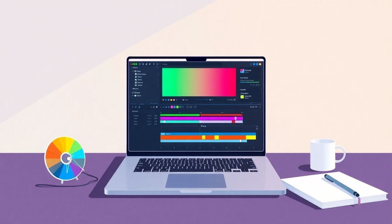
4. Use Scopes and Tools for Accurate Adjustments
Getting your colors just right requires some tools—think of scopes like your video’s health check-up. They show you an honest picture of your footage’s brightness, color balance, and exposure.
Using waveforms and vectorscopes helps you see if highlights are blown out or shadows are crushed, so you can fix these issues before they distract learners.
In 2025, AI-powered tools, such as **Colorlab Ai**, are gaining popularity for automating basic corrections and offering quick, consistent adjustments—saving you heaps of time.
Start by watching the scopes as you tweak sliders—if the waveform peaks at the top, your image might be overexposed. Adjust sliders until you see a balanced, natural look, then move on to fine-tuning hues.
Remember, these tools aren’t just for professionals; they can massively improve your workflow, especially when you’re juggling multiple videos for eLearning courses.
5. Apply Simple Grading to Create a Consistent Look
Once your footage is corrected, applying a straightforward grade makes your videos look more unified. Think of it like giving all your slides the same filter so they match perfectly.
Start with a basic preset or a simple LUT (look-up table) that matches your desired style—like warm, cool, or neutral. This gives you a consistent vibe across all videos without much fuss.
Set your primary color adjustments—like brightness, contrast, and saturation—so the viewer’s focus stays on the content. A simple grade should avoid overdoing it; subtlety often wins in eLearning.
If you want to keep your branding consistent, create a preset that matches your course’s palette. Whenever you add new videos, just apply this preset for quick uniformity.
6. Incorporate LUTs Smartly
LUTs are like filters on steroids—hey, they instantly give your footage a specific look. But in 2025, the trend is to use bold or cinematic LUTs carefully so your content remains clear and professional.
Start by choosing LUTs that match your course’s tone—say, a cool look for a tech tutorial or a warm tone for a motivational video. Don’t just slap on a LUT; tweak its intensity to avoid losing clarity or natural colors.
If you’re unsure, use LUTs as a base layer and refine with subtle adjustments in contrast and hue. This way, your videos feel intentional and polished.
Remember, AI-based tools can now suggest or generate custom LUTs based on your footage, making it easier to find a style that fits your course visuals.
7. Export Settings with Color Fidelity in Mind
When it’s time to export your videos, think about color fidelity—especially if your course will be viewed on different devices. Choose at least a 10-bit color depth if possible, as it preserves details in shadows and highlights.
Export your videos in a format like H.264 or H.265, which balances quality and file size, suitable for web and LMS platforms. Use high-quality compression settings to avoid losing color information.
Double-check your color space—Rec. 709 is standard for most screens, but HDR videos benefit from Rec. 2100 or wider gamuts. If you’re working in HDR, make sure to export with the right bit depth and color settings.
This attention to detail can make your eLearning videos look more professional, helping your content stand out and appear consistent across devices.
8. Bonus Tips for eLearning Specifics
For eLearning videos, clarity and focus are king—color grading should enhance understanding, not distract. Keep backgrounds simple, and use color to highlight important info.
In 2025, bold and realistic looks are trending, so don’t be afraid to make your visuals pop or add subtle mood shifts that reinforce your message.
Using automatic color correction tools can speed up your workflow, letting you focus more on content rather than technical tweaks. Plus, consistent coloration across videos helps learners stay engaged and reduces cognitive load.
Lastly, always review your final videos on multiple devices—laptops, tablets, phones—to ensure your colors look good everywhere. Small adjustments often have a big impact in making your eLearning content look crisp and professional.
FAQs
Start with color correction to fix exposure, white balance, and overall tone before moving to creative grading. This provides a balanced base for consistent and professional-looking videos.
Learn about hue, saturation, and luminance. Adjust these properties carefully to enhance visuals without causing unnatural looks or inconsistencies across your eLearning videos.
Scopes like waveform, vectorscope, and histogram assist in measuring color and exposure. Use these tools to make precise adjustments and keep your videos consistent.