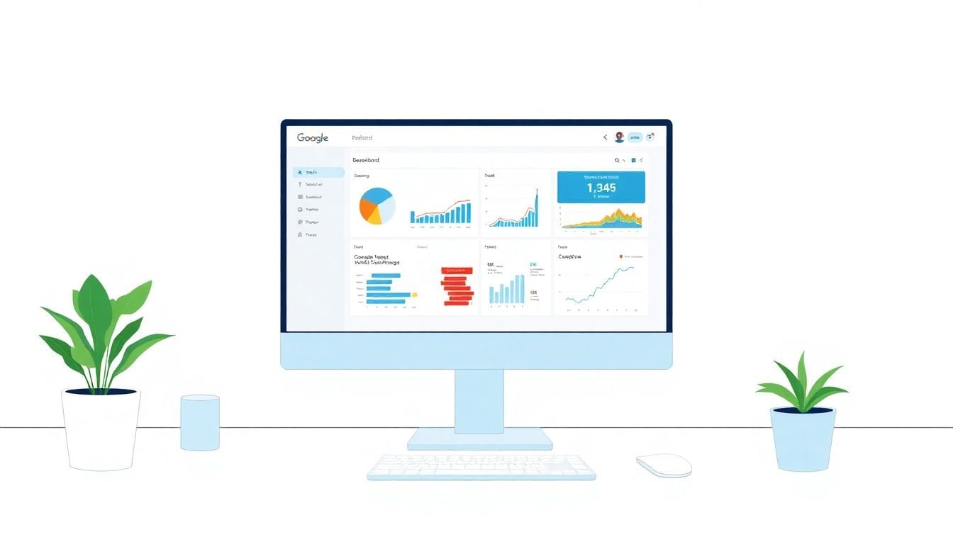
How to Build a Custom Analytics Dashboard in 6 Simple Steps
Building custom dashboards in Google Data Studio can seem tricky at first, especially if you’re not sure where to start. But don’t worry — once you get the hang of it, you’ll have a powerful tool to see your data in a clear way. Keep reading, and I’ll show you how to put together a dashboard that’s just right for your needs.
If you stick with me, you’ll learn easy steps to connect data, create layouts, add visual parts, and share your work with others. By the end, you’ll have a ready-to-use analytics dashboard that keeps your data at your fingertips. Let’s get into how you can build one step by step.
Key Takeaways
Key Takeaways
- Connect your data sources like Google Analytics or Sheets first, ensuring permissions and automatic updates are set correctly. This creates the foundation for your dashboard.
- Start with a clear, organized layout—choose a suitable template, set the page size, and keep things tidy to make data easy to interpret.
- Pick key metrics and KPIs that match your goals. Use visual elements to highlight these numbers and keep your focus on what’s most important.
- Add interactive features like filters and date pickers so users can explore data based on their needs, making the dashboard more useful.
- Set up scheduled data refreshes to keep your dashboard updated automatically and do regular testing to fix issues early.
- Include explanations or notes on the dashboard to give context to the numbers, helping everyone understand what the data shows.
- Design for different devices by using responsive layouts, testing on phones and desktops, and avoiding clutter, so the dashboard looks good everywhere.
- Gather feedback from users, make improvements, and keep your dashboard simple and focused on key insights for better engagement.

Step 1: Connect Your Data Sources
Kick off your dashboard by linking the data sources you use daily, like **Google Analytics 4** or **Google Sheets**.
Think of it as plugging in a bunch of different devices so they can talk to each other.
If you’re pulling in data from multiple platforms, make sure each connection is set up correctly—double-check your permissions and credentials.
For example, linking your GA4 account will allow you to track website traffic metrics right in Data Studio.
A smart tip is to use the built-in connectors available in Looker Studio; it saves time and reduces errors.
Don’t forget to refresh your data sources often—set up automatic updates if possible—to ensure you’re working with the latest info.
If you run into snags with a connection, revisit the permissions or try reconnecting to troubleshoot.
Getting your sources connected cleanly sets the foundation for meaningful insights later on.
Want to add more data later? Just go back into your Data Sources menu and make the connections as simple as adding new tabs in a spreadsheet.
Step 2: Create a New Report and Set Layout
Once your data sources are linked up, create a fresh report to start building your view—think of it as preparing a blank canvas.
Choose a layout that matches your needs—either a freeform for total control or a grid-based one for easy organization.
Responsive layouts are great because they ensure your dashboard looks good on both phones and desktops without extra fuss.
Start by adding a title that clearly states what the report is about—people shouldn’t have to guess.
Next, set up the page size—A4, mobile, or custom—to match where you plan to view it most often.
Use the theme options to pick colors and fonts that match your brand or make important metrics stand out.
Pro tip: Keep your layout clean—don’t clutter it with too many charts all at once.
Spacing and alignment are your friends—use guides and snap-to features to keep everything tidy and professional-looking.
Ultimately, a well-organized layout makes it easier to interpret your data at a glance and keeps the focus on what truly matters.
Step 3: Define Key Metrics and KPIs
This is where you decide what numbers matter most—your show-stopping stats.
Start by identifying your main goals: Is it increasing traffic? Improving engagement? Making sales?
For instance, if you’re a marketer, KPIs like bounce rate, conversion rate, and average session duration often tell the story best.
Create calculated fields if needed—for example, if you want to track monthly growth rate, you can set up a custom formula for that.
A helpful tip is to focus on a handful of core metrics—too much data can be overwhelming and drown out the insights.
Use scorecards or big text boxes to make these vital numbers pop visually, so they become the focal point.
Periodically review if your KPIs are still aligned with your objectives—your priorities might change over time.
Don’t forget, context is key; always provide some background or targets so your viewers understand whether the numbers are good or bad.
By defining clear metrics early, you’ll be able to convincingly track progress and make smarter decisions, plus impress your boss or team with your sharp focus.

Step 7: Use Interactive Charts and Filters
Adding interactive elements like filters, dropdowns, or date range pickers makes your dashboard much more user-friendly.
People can customize what they see, focusing on specific time periods or segments without you needing to create multiple reports.
For example, embedding a date range filter allows viewers to analyze traffic trends over any period they’re interested in.
Looker Studio supports various interactive controls—try out sliders for engagement metrics or checkboxes for different traffic sources.
An often-overlooked trick is to link filters to specific charts so users can drill down into details seamlessly.
Always test these controls before sharing, to make sure they work correctly across devices and browsers.
Use descriptive labels for filters—clear labels prevent confusion and make the dashboard feel intuitive.
Adding these features helps your dashboards become dynamic tools, where viewers can explore data on their own terms.
Plus, interactivity encourages engagement, making your reports more than just static images—they turn into real insights on demand.
Step 8: Set Up Scheduled Data Refreshes
Data doesn’t stay static, and neither should your dashboards—set up automatic updates to keep everything fresh.
Depending on your data source, most platforms allow scheduling refreshes—some as often as every 15 minutes.
For example, connecting your Google Analytics 4 data means you can have up-to-the-minute traffic stats without manual intervention.
The more frequently your data updates, the more reliably you can spot trends or issues early.
Be mindful of your data source’s limitations—a too-frequent refresh can sometimes cause delays or overloads.
In Looker Studio, navigate to Data Source settings to configure your refresh schedule—often found under “Data Controls.”
For real-time monitoring, consider integrating live data streams or direct database connections if your platform supports it.
Remember, automatic refreshes save you time and ensure your team always sees the latest info—no more outdated reports!
When setting up scheduled updates, double-check that your permissions and credentials are still valid to avoid surprises.
Step 9: Include Context with Annotations and Explanations
Numbers alone rarely tell the full story—adding explanations or annotations makes your dashboard more meaningful.
Use text boxes or notes to explain what specific KPIs mean or why certain trends are happening.
For example, if you notice a spike in traffic, add a note indicating a recent marketing campaign or a website update.
Annotations help your team understand data without needing to dig into underlying reports or raw data.
In Looker Studio, you can add text widgets directly on charts to clarify anomalies or highlight targets.
Keep explanations concise—think of them as brief conversations rather than long essays.
This way, dashboards become self-explanatory, saving time during meetings or presentations.
Plus, they make the insights accessible to everyone, even non-technical stakeholders who might not be familiar with all the metrics.
Remember, context is king; a chart with just numbers is like a story without a plot—it leaves everyone guessing.
Step 10: Design for Mobile and Across Devices
Today, dashboards are viewed on a variety of screens, so make sure yours look good everywhere.
Use responsive layouts in Looker Studio to adapt automatically to different screen sizes—big or small.
Test your dashboards on phones, tablets, and desktops before sharing—you might be surprised how things shift.
Avoid cluttering small screens with too many charts—opt for key insights or summarized views.
Consider using larger fonts and clear labels so important numbers are easily visible on any device.
A nifty trick is to preview your dashboard in “mobile view” mode within Looker Studio’s editor.
Additionally, avoid overly complex visualizations; simplicity shines through on limited screens and improves readability.
Remember, a report that looks good on mobile encourages quick checks and fosters ongoing engagement.
After all, if your boss can’t see the key metrics on their tablet, it defeats the purpose of a dashboard.
Step 11: Test and Gather Feedback
Don’t just set it and forget it—testing your dashboard with a small group helps catch issues early.
Ask teammates or stakeholders to navigate and interact with the report, then listen to their feedback.
Pay attention to points of confusion, slow loading times, or visual clutter—these can undermine your efforts.
A good tip is to simulate different use cases—like mobile access or low-bandwidth scenarios—to ensure robustness.
Make tweaks based on suggestions—maybe some charts need redesigning or labels could be clearer.
After refining, schedule a walkthrough session to showcase key features and answer questions.
Gathering feedback isn’t a one-time task; regularly update your dashboards to keep them relevant and user-friendly.
Remember, a dashboard tailored to your audience’s needs is far more impactful than one that feels generic or cluttered.
Bonus Tips: Keep Your Dashboards Simple and Focused
While it’s tempting to cram as much data as possible, less is often more when it comes to dashboards.
Aim for clarity by highlighting only the most important metrics—no one wants to wade through noise.
Use visual hierarchy—big, bold scores for key KPIs, smaller charts for supporting data.
Consistent color schemes and fonts make your dashboard look professional and are easy on the eyes.
Use sparing amounts of color—highlight critical changes or targets, but don’t turn your dashboard into a rainbow.
Aim to tell a story with your data—guide viewers from insights to actions smoothly.
Periodic cleanup helps keep your report relevant; remove outdated metrics or unnecessary visuals.
Finally, remember to save template versions—so you can reuse or tweak dashboards without starting from scratch each time.
A simple, focused dashboard is far more effective at communicating insights than a cluttered one full of everything but the kitchen sink.
FAQs
The first step is to connect your data sources. Make sure all relevant data is linked properly so it can be used in creating accurate and comprehensive reports.
Define your key metrics clearly by choosing relevant KPIs that reflect your goals. Use your data to set measurable targets for tracking success.
Yes, most tools allow you to share dashboards directly or collaborate in real-time, enabling team members to view and edit reports as needed.
Arrange visual elements logically, choose colors carefully, and use consistent fonts. Organize your layout to highlight the most important metrics first.