
Building Branded Lower Thirds in Video Editors: A Simple 7-Step Guide
When I first started building branded lower thirds, I kept overthinking the whole thing. “What if it doesn’t look clean?” “What if the font is blurry?” “What if my logo covers the actual message?” If you’ve felt that way too, you’re not alone.
The good news? Lower thirds are one of those graphics tasks that gets way easier once you have a repeatable structure. In this post, I’ll walk you through a practical 7-step workflow for creating branded lower thirds in common video editors (Premiere Pro and After Effects), plus the exact export settings I use so the result looks sharp on real footage—not just on a white background.
By the time you’re done, you’ll know how to build a reusable lower-third template, swap in names/titles quickly, add subtle animation, and export it in a way that won’t break when you drop it into your edit. No hype. Just the steps.
Key Takeaways
- Build lower thirds using Premiere Pro’s Essential Graphics or After Effects shape/text layers. Keep it consistent: same fonts, brand colors, and short text.
- Use your logo as a supporting element (small corner placement). In my workflow, I keep it at about 6–10% of the lower-third height so it stays visible without stealing focus.
- Design for readability. I usually check contrast by testing the graphic on both light and dark frames from the actual video.
- Use simple animations (fade/slide) that last 0.5–1.5 seconds. If it distracts, it’s too much.
- Save a template version with your logo already placed. That way, you’re only changing text instead of rebuilding the whole layout.
- Export graphics with transparency so they blend cleanly. For 1920x1080, I build the comp at 1920x1080 and export at the same resolution.
- Organize multiple lower thirds with clear names like LT_Speaker_Name_01 or LT_Title_LowerThird_02 so editing doesn’t turn into a scavenger hunt.
- Batch export when you can—but watch timing/scale. I always verify one exported file before exporting the whole set.
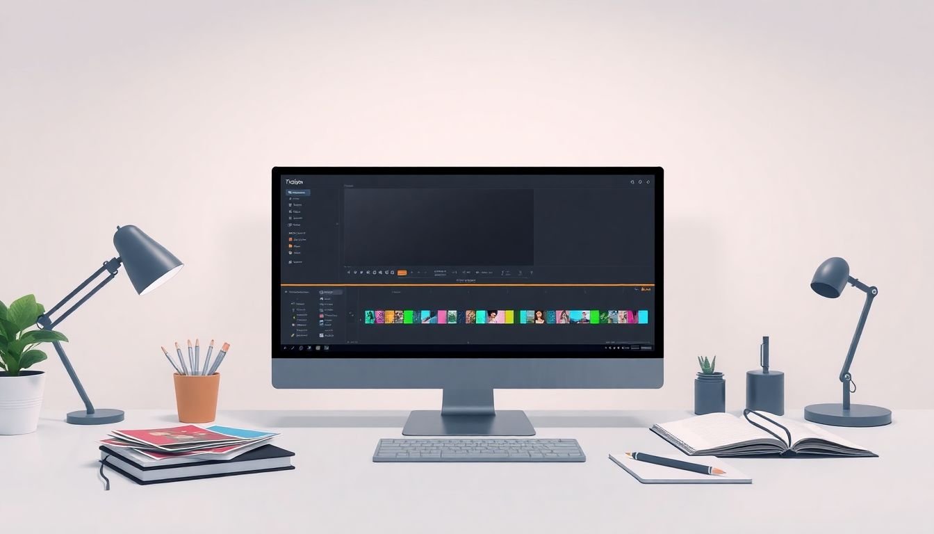
How to Build Branded Lower Thirds in Video Editors
Here’s the workflow I actually use when I need lower thirds that look consistent across a bunch of videos. I’ll call out Premiere Pro and After Effects steps where it matters.
Step 1: Pick your editor workflow (and stick to it).
If you’re working in Adobe Premiere Pro, use Essential Graphics to build a reusable graphic. If you’re in After Effects, build it as a comp with shape/text layers. Both work. The key is keeping your template structure predictable.
Step 2: Start with the right canvas size.
This is where a lot of people lose sharpness. Don’t “make it later.” Create your graphic at the same resolution as your video. For example, for a 1920x1080 video, I create a 1920x1080 composition (or a Premiere canvas that matches that size). Then I design the lower third inside that frame.
Step 3: Build a simple layout you can reuse.
A layout that almost always works: a semi-transparent rectangle behind the text, a left-to-right padding system, and a logo in a corner. Keep the text short. If your title is long, I’d rather it wrap than overflow.
Step 4: Set up text styles (so you don’t fight fonts later).
In my templates, I keep two text fields: one for the name and one for the title. I also save the exact font size and line height per resolution. For 1080p, a common starting point I use is:
- Name: 44–56 px
- Title: 26–34 px
- Padding: 60–90 px from the left edge (depending on logo width)
Want a quick reality check? Zoom out to about 50% in your editor and see if the text still reads. If it doesn’t, increase size now—not after you export.
Step 5: Add the logo without wrecking readability.
I place the logo in a corner, but I don’t let it get huge. If the logo competes with the name text, it’s too big. For most 1080p lower thirds, that means the logo height is roughly 100–160 px (again, depends on the logo’s aspect ratio).
Step 6: Make it feel alive (but keep it subtle).
Animations should support the information, not distract from it. I usually use a fade-in plus a tiny slide (think 10–20 px). Duration: 0.5–1.5 seconds. If you’re making these for short-form content, you’ll get more mileage from “clean and quick” than “fancy.”
Step 7: Export for transparency and matching resolution.
This is the make-or-break step. I export PNG with transparency for overlays, and I test it on both dark and light frames. No guessing.
That’s the core process. Now let’s break down the parts that matter most.
What Are Branded Lower Thirds?
Branded lower thirds are the on-screen graphics—usually at the bottom—that show things like a name, role, organization, episode title, or similar context. They’re not just decoration. They help viewers instantly understand “who is this?” or “what am I looking at?” while reinforcing your brand identity.
I also think they’re especially important for short-form video because people don’t watch long enough to “figure it out later.” A lower third gives context in seconds. You don’t need a study to know that clarity matters—if the viewer can’t read it, it’s not doing its job.
If you want a real-world reference for behavior around mobile video, you can use audience research like the Pew Research Center’s reporting on how people watch video online (not specifically lower thirds, but it supports the “context needs to be readable quickly” point). In my own edits, the biggest difference I notice is reduced confusion when the graphic is clear and consistent.
Key Components of a Branded Lower Third
A branded lower third is basically design decisions that support a simple goal: readability + recognition. Here are the pieces I always include:
1) Brand colors that work on real footage.
Not “works on my screen.” Test against actual frames—especially backgrounds with motion or busy textures.
2) Fonts that stay legible at small sizes.
Use clean, bold typography. If you’re using a fancy font, keep it for headings and avoid it for the body text.
3) Concise text.
In practice, lower thirds work best when the name is the hero and the title is the supporting line. If you’re adding extra info, consider trimming.
4) Logo placement that doesn’t fight the message.
Corner placement is usually the sweet spot. Think “supporting brand mark,” not “main character.”
5) Optional animation that’s fast and consistent.
Fade and slide animations are enough. If your animation lasts longer than the viewer’s attention span, it becomes noise.
6) Safe positioning.
If your video gets cropped for different platforms, your lower third can get cut off. I usually test positioning against common “safe area” expectations by checking how it looks when the frame is slightly cropped.
When these pieces work together, your lower thirds look professional without turning into a complicated art project.

Using Brand Colors and Fonts Effectively
Sticking to your brand colors and fonts does two things: it makes your videos feel consistent, and it makes your lower thirds recognizable instantly.
Colors:
Choose brand colors that still read on top of your video’s backgrounds. If your background is often dark, a light text color works well. If it’s frequently bright, you’ll want stronger contrast—often a darker semi-transparent shape behind the text.
Fonts:
In my experience, sans-serif fonts with consistent strokes are the safest choice. Also, don’t forget how mobile playback looks—smaller screens exaggerate blur and low contrast.
Quick example I use for readability:
If my background shape is #1A1A1A at 80% opacity, I’ll set the text to #FFFFFF. Then I test it over a few real frames from the video (not just a single screenshot). If it still looks washed out, I’ll either increase opacity (e.g., 80% to 90%) or darken the shape.
One more thing: don’t rely on “it looked good in the editor.” Export one test PNG and drop it on your actual timeline. That’s when font rendering and contrast issues show up.
Incorporating Your Logo into Lower Thirds
Your logo should support the lower third, not compete with it. I’ve seen teams accidentally make the logo too large, and then the viewer reads it like it’s the main message. Nope.
Here’s what works in practice:
- Keep it small: enough to be recognizable, not enough to dominate. Corner placement does this naturally.
- Use consistent padding: if your logo hugs the edge in one template and floats in another, your branding will feel inconsistent.
- Prefer vector or high-quality PNG: logos stretched from tiny images will look soft fast.
- Match color treatment: if your design uses light text on a dark shape, don’t use a logo variant that’s meant for white backgrounds.
Also, if you’re building templates for a team, save a version where the logo is already placed. Then everyone only edits text fields. Less room for mistakes.
Making Your Lower Thirds Dynamic with Animations
Animations are optional, but they can make your lower thirds feel more “designed” instead of pasted on.
What I recommend:
- Fade in: 0% to 100% opacity over about 0.4–0.8 seconds.
- Slide in (tiny): move the whole group by 10–20 px and settle quickly.
- Hold time: keep it stable while the name/title is on screen.
- Fade out: a quick fade works better than a dramatic exit.
In After Effects, I’ve used this kind of approach with simple opacity/position keyframes on a group layer (so the animation stays consistent). In Premiere Pro, I’ll do the same concept using Essential Graphics opacity/transform controls.
One pitfall I ran into: if your animation moves the text too much, it can look like it “jumps” when the timeline plays back at slightly different frame rates. Small movement fixes that.
Tips for Managing Multiple Lower Thirds in a Workflow
If you’re making lots of videos, the graphics can become a mess fast—unless you treat them like a system.
This is how I keep it under control:
- Create a “template library”: one base style, then variations for speaker name vs. title vs. call-out.
- Name everything clearly: for example: LT_Base_1080p, LT_Speaker_01, LT_Title_01.
- Use consistent layer order: background shape first, then text, then logo. It prevents accidental stacking issues.
- Batch export carefully: export one test PNG first to confirm transparency looks right. Then export the rest.
Example workflow (Premiere Pro + PNG overlays):
I’ll export each lower third as a transparent PNG at 1920x1080, then place it on the timeline at the correct timecodes. To avoid timing/scale mismatches, I lock the graphic’s transform to 100% scale and only adjust the position if needed (never both, if I can help it).
If you’re doing batch work in After Effects, I’ve found it helps to standardize comp names and output modules before you hit render. Otherwise, you end up with exports at the wrong resolution or with mismatched file naming that makes later editing painful.
Export Settings for Clear, Professional Lower Thirds
Export is where “looks good” turns into “looks blurry” if you’re not careful. Here are the specific settings I recommend and the checks I always do.
1) Use transparency for overlays.
For most editor workflows, export PNG with transparency enabled. That way your lower third blends cleanly over any background.
2) Match your resolution.
For a 1920x1080 video, create a 1920x1080 comp/canvas. Then export the PNG at 1920x1080. Don’t design at 1280x720 and upscale—text edges will soften.
3) Check color space behavior.
If your editor/project is in Rec.709 and you notice color shifts, test against a screenshot of your video. Different pipelines can affect how “brand colors” look once composited. I usually fix this by ensuring the project color management settings match the rest of the edit.
4) Avoid alpha edge issues.
The annoying problem: halos around text or shapes. This happens when transparency edges aren’t handled cleanly. My workaround is simple: keep text and shapes tightly aligned, and export from a comp where the background is truly transparent (not a solid color layer).
5) If you’re exporting for further editing:
Consider PNG sequences or a high-quality intermediate. For example, if you’re animating and need frame-accurate control later, PNG sequences are reliable. If you’re delivering a single final video, you can export your lower third baked into the video instead.
6) Test on real backgrounds.
Before you export the full set, I always test one PNG on a couple of frames: one bright, one dark, and ideally one with motion. If it’s readable across those, you’re good.
That’s the boring part nobody wants to do—but it’s what keeps your lower thirds looking sharp every time.
FAQs
Branded lower thirds are graphic overlays placed at the bottom of a video that show information like names, titles, or branding—helping viewers identify speakers and keeping your visual identity consistent across your content.
Start with a template or new graphic, add your brand elements (colors, fonts, logo), insert your text fields, set your timing/animation, and export with transparency (usually PNG) so you can place it cleanly on your video timeline.
Keep them readable and simple: consistent fonts/colors, short text, strong contrast, and a logo that supports the design without blocking the message. Also, test your lower third on both light and dark frames from the actual video.
Yes. Creating editable templates is one of the best ways to keep branding consistent. Your team should mostly be swapping text fields, not rebuilding layouts from scratch.