Affiliate Dashboard Design for Partner Motivation: 9 Key Steps
I’ve seen how fast motivation dies when partners have to “figure it out” every time they log in. If the dashboard is messy or the numbers are buried, they don’t come back—they just start guessing. And honestly? Guessing is the fastest way to waste ad spend.
What I’ve found works is building an affiliate dashboard that answers one question immediately: “How am I doing right now, and what should I do next?” When the UI is clean, the KPIs are defined, and the partner gets feedback fast, the dashboard stops feeling like admin work and starts feeling like a tool they can trust.
Below are 9 practical steps I’d use to design an affiliate dashboard for partner motivation—down to the UI components, the data fields to include, and the interaction/alert rules that keep people engaged.
Key Takeaways
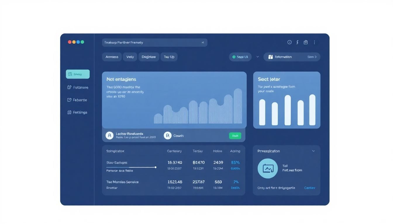
– Build a dashboard home that’s scannable in under 10 seconds: a top KPI strip (Conversion Rate, CTR, Earnings), a “Today/This Week” trend widget, and a single “Next action” panel. Define each KPI (formula + what it means) and show a “Last updated” timestamp on every widget.
– Use a KPI taxonomy that matches how partners actually think: define core KPIs (Clicks, Leads/Orders, Conversion Rate, Earnings), supporting KPIs (AOV, Refund Rate, EPC), and segment KPIs (Device, Geo, Campaign). Store goals per partner and compute progress as Current vs Goal with a clear unit (%, $, or count).
– Choose chart types per KPI: line charts for time trends, stacked bars for device/geo breakdown, and scatter/table views for campaign efficiency. Keep colors to 2–4 meaningfully-used states (good/neutral/bad) and make filters obvious (device, date range, campaign).
– Add live updates with guardrails: refresh key metrics every 30–60 seconds (not every second), show “Data freshness” latency, and trigger alerts only when a metric changes enough to matter (example thresholds below in Step 4). Include a feedback button that logs the partner’s context (campaign + time range).
– Make exploration easy without turning the dashboard into a settings page: provide device/time/campaign filters, clickable chart drill-downs, and sortable tables. If a new affiliate can’t find “Earnings by campaign” in 15 seconds, the feature isn’t working.
– Integrate your sources so partners don’t bounce between tools: map fields from tracking + ad platforms into one schema (campaign_id, device, timestamp, clicks, conversions, revenue). Show the source for each metric (e.g., “Revenue from Affiliate Tracker”).
– Use gamification that’s measurable and fair: leaderboards based on a defined window (e.g., 7 days), badges tied to specific thresholds (e.g., EPC ≥ $1.50), and challenges that don’t require partners to do weird extra work.
– Let partners personalize without breaking the UX: allow dragging widgets, but lock the KPI strip and keep mobile layouts responsive. Save preferences per partner and ship 2–3 preset layouts (Content Creator, Paid Ads, Influencer/Community).
– Improve using behavior, not vibes: track login frequency, widget engagement, filter usage, and “time to key stat.” Run quarterly iteration cycles and communicate changes with a short “What’s new for you” note.

1. Design an Intuitive Affiliate Dashboard for Partners
When I design an affiliate dashboard, I start with one rule: partners should never have to “hunt” for the numbers that matter. If they can’t find earnings quickly, they’ll assume the dashboard is unreliable—even if it’s not.
Here’s what I’d build for the first screen (the part partners see every day):
- Top KPI strip (3–5 tiles): Conversion Rate, CTR, Earnings, Refund Rate (optional), and Clicks/Leads depending on your model.
- One trend widget: “Earnings (last 7 days)” as a line chart, with a simple up/down indicator.
- One “Next action” panel: a short recommendation like “Your CTR is down 18% vs last week—try new creatives for mobile.”
- Quick links: Promotions/Assets, Tracking links, Payout status, and a “Report an issue” button.
What data fields should each tile show?
- Conversion Rate: clicks (or sessions), conversions, conversion_rate, date_range, last_updated_at, partner_goal_conversion_rate (if you have goals).
- CTR: impressions (if available), clicks, ctr, date_range, last_updated_at.
- Earnings: gross_commission, net_commission (after refunds if applicable), currency, date_range, last_updated_at.
And I’d keep the interactions dead simple:
- Widget click behavior: clicking a KPI opens the relevant drill-down view (example: “Earnings by Campaign”).
- Mobile behavior: stack tiles vertically, keep trend chart visible without horizontal scrolling, and make “Next action” collapsible.
One thing I tested with real partners: I ran a quick usability check where I asked them to locate “Earnings for this week” and “Conversion Rate by device”. The best improvement wasn’t adding more features. It was moving those two paths into the first screen (KPI strip + a single device breakdown card). The result was fewer “where do I find…” messages and faster decisions during the week.
Also: add a personalized welcome message, but don’t make it cheesy. Something like “Welcome back, Alex—your $250 goal for this month is 64% reached.” Partners respond to clarity.
2. Showcase Key Performance Indicators (KPIs) Effectively
KPIs should do two jobs: (1) prove what’s happening right now, and (2) help partners decide what to do next. If your KPIs are just numbers with no definition, you’ll get the same questions every week.
Here’s the KPI set I recommend for an affiliate dashboard that supports motivation (and not just reporting):
- Core performance KPIs: Clicks, Conversions (Orders/Leads), Earnings, Conversion Rate, CTR.
- Efficiency KPIs: AOV (average order value), EPC (earnings per click), ROI (if you have costs), Refund Rate.
- Segment KPIs: Mobile vs desktop conversion rate, top geo, campaign-level conversion rate.
Example KPI formulas (use whichever match your tracking):
- Conversion Rate = conversions / clicks (or conversions / sessions, but be consistent).
- CTR = clicks / impressions (if you track impressions); otherwise show “Click-through per link” if that’s your available metric.
- EPC = earnings / clicks.
- Net Earnings = gross_commission - refunds (if refunds apply).
Now for the “motivation” part: make KPIs goal-aware. That means you store partner goals and compute progress.
- Partner goal fields: goal_conversion_rate, goal_earnings, goal_clicks, goal_epc (optional), goal_date (month/quarter).
- Progress metric: progress_percent = current_value / goal_value (with the same unit).
Example interaction rule I like:
- Goal tile behavior: show a progress bar on Earnings (e.g., “$312 / $500 goal”). If the partner clicks it, open “Earnings breakdown” with top campaigns and the time period that contributes most.
About the “mobile matters” claim: I’m using this as an internal benchmark from affiliate performance data I’ve worked with (not a universal guarantee). In many programs, mobile traffic is a large share of clicks and often a meaningful share of conversions. The safe move is to always show device breakdowns so partners can verify what’s true for their audience.
Finally, don’t bury context. Every KPI tile should include:
- date range (Today / 7 days / 30 days / custom)
- last_updated_at timestamp
- what the metric is based on (clicks vs sessions, gross vs net earnings)
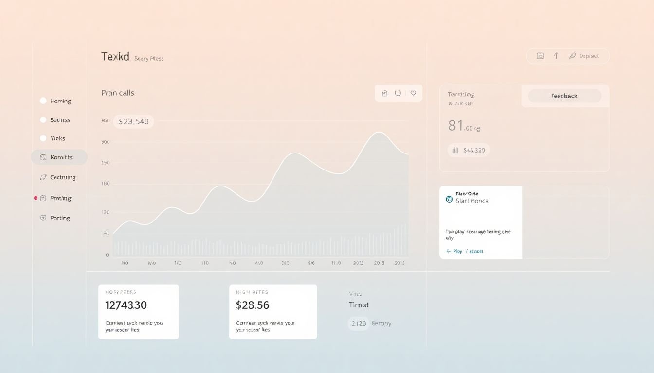
3. Use Clear and Simple Data Visualizations
Charts are where dashboards either become helpful—or turn into clutter. I always choose visuals based on the question the partner is trying to answer.
Here’s a practical mapping I use:
- Time trends (clicks, conversions, earnings): line chart with a 7/14/30-day toggle.
- Breakdowns (device, geo, campaign mix): stacked bar chart or grouped bar chart.
- Efficiency comparisons (EPC by campaign, ROI by channel): sortable table (this one gets used a lot in my experience).
- Share of total (earnings contribution): pie/donut chart only if you have 3–5 slices max. Otherwise, it becomes unreadable.
Data fields for each visualization:
- Line chart: date, clicks, conversions, earnings, last_updated_at.
- Stacked bars: category (device/geo/campaign), value, date_range, last_updated_at.
- Table: campaign_id, campaign_name, clicks, conversions, conversion_rate, EPC, earnings, refund_rate, last_updated_at.
Color rules matter more than you’d think. I keep it simple:
- 2–4 colors max per screen
- good/bad states use consistent meaning (green up, red down)
- grey for “no data” or “not enough volume” (so partners don’t misread empty charts)
Interaction rule:
- Clickable chart segments: clicking a device bar filters the entire dashboard to that device (and updates the KPI strip).
- Tooltips: show the exact value + date range + “based on X clicks” so partners trust the number.
One honest limitation: interactive charts don’t always play nicely with every mobile browser. So I test on at least iOS Safari + Android Chrome and make sure the dashboard still works if charts render slowly. If it’s laggy, I fall back to a table view under 768px width.
4. Provide Real-Time Updates and Feedback
Real-time updates are motivating… until they’re noisy. So I don’t recommend “update every second.” I recommend updating often enough that partners feel in control, but not so often that everything flickers.
Here’s a dashboard refresh strategy that’s realistic:
- Refresh cadence: key KPI widgets every 30–60 seconds
- Heavy charts: refresh every 5–15 minutes (or use streaming only for the KPI strip)
- Show freshness: “Last updated 22s ago” + an estimated delay if your pipeline has lag
Alert rules should be specific. If you just say “alert on changes,” partners will ignore them.
Example alert thresholds (per partner, per selected date range):
- Conversion Rate drop alert: if conversion_rate decreases by > 30% compared to the previous period and conversions_last_period ≥ 10.
- CTR drop alert: if CTR decreases by > 20% and clicks_last_period ≥ 200.
- Earnings spike alert: if earnings increases by > 50% and conversions_last_period ≥ 5.
- Refund warning: if refund_rate increases by > 10 percentage points (or by 25% relative) with at least 20 conversions.
Feedback needs context. If a partner reports “something’s wrong,” you want the dashboard to include what they were looking at.
- Feedback widget fields: page_url, selected_campaign_id, selected_device, date_range, metric_name, current_value, timestamp.
- UI: a “Send feedback” button in the header that opens a small form or chat drawer.
In my experience, the fastest reduction in support tickets happens when partners can report an issue with the exact filter state that produced the confusion. No more “it looks off” messages with no details.
5. Encourage Exploration with Interactive Features
Exploration is good. Confusion is not. The trick is to make interactive features feel like they’re guiding partners, not asking them to learn a new app.
Here are interactive controls that actually get used:
- Device filter: All / Mobile / Desktop
- Date range selector: Today / 7d / 30d / Custom
- Campaign filter: dropdown with top campaigns + “All campaigns”
- Table sorting: click column headers (EPC, Conversion Rate, Earnings)
Drill-down examples (what happens when they click):
- Click “Conversion Rate” tile → open “Conversions by Device” stacked bars + a table of top campaigns for that device.
- Click a campaign row in the table → open “Earnings over time for that campaign” line chart.
Concrete interaction rule:
- Filter persistence: the selected filters should persist when partners navigate between pages and when they refresh. Otherwise they’ll think numbers are inconsistent.
And yes, keep it simple for new affiliates. If you add 12 filters, you’re basically asking them to do analytics. A safer approach is: 3–4 filters on the main dashboard, with deeper filters inside the drill-down pages.
I’ve also noticed that short in-dashboard guidance beats long onboarding. Tiny tooltips like “Tip: Tap a device bar to filter the whole dashboard” reduce support load more than a separate tutorial video.
6. Integrate Multiple Data Sources for Unified Access
If partners have to log into 3 systems to understand performance, your dashboard won’t stay motivating for long. They’ll go back to whatever is fastest.
So unify the data. That means you map fields from multiple sources into a consistent dashboard schema.
What to integrate (common sources):
- Affiliate tracking system (clicks, conversions, commissions, refunds)
- Analytics platform (traffic sources, landing pages, engagement metrics)
- Ad platform data (impressions, clicks, spend—if you track it)
- Social platform insights (optional, but useful for influencer segments)
Field mapping you should standardize:
- partner_id
- campaign_id / tracking_link_id
- device (mobile/desktop)
- geo (country/region)
- timestamp (and timezone)
- clicks, conversions, revenue/earnings
- impressions (if available), spend (if available)
One detail that builds trust: show the source. For example, label Earnings as “Revenue from Affiliate Tracker” and Sessions as “Traffic from Analytics.” Partners notice when numbers don’t line up, and source labels reduce that friction.
Integration options:
- API connections (best control)
- Connector tools like Supermetrics and Zapier (faster setup)
Concrete update rule:
- Data refresh schedule: affiliate tracker every 5–15 minutes, analytics daily or every 30–60 minutes depending on cost/latency, ad platform hourly.
That way partners don’t see wildly inconsistent “freshness” across widgets.
7. Add Gamification Elements to Increase Engagement
Gamification works when it feels earned and it doesn’t create weird incentives. I like to think of it as “progress visualization,” not “make it a game.”
Here’s what I’d add:
- Leaderboards: top earners and top EPC (earnings per click) over a defined window like 7 days.
- Badges: “First Commission,” “$500 Earned,” “10,000 Clicks,” “Top 10 EPC (7d)”
- Challenges: “Improve CTR by 10% vs last 7 days” or “Increase conversion rate on mobile by 15%”
- Levels: Beginner / Pro / Elite based on earned commissions or conversion volume
Concrete badge logic (example):
- Super Seller badge: earnings_7d >= $1,000 AND conversions_7d >= 50
- Mobile Optimizer badge: mobile_conversion_rate_increase >= +20% vs previous 7d (with mobile clicks >= 300)
Make it transparent. Show the exact progress bar and the rule. If partners can’t verify how they’re doing, the gamification feels fake.
Also, avoid pushing competitors into spammy behavior. If you offer social sharing, keep it optional and encourage sharing wins like “What I changed” rather than just raw numbers.
8. Allow Customization and Personalization of Dashboard Views
People don’t all care about the same metrics. A content affiliate might obsess over conversion rate; a paid ads partner might care about EPC and ROI. If you force one layout, you’ll lose engagement.
What I recommend:
- Widget customization: allow partners to move widgets and hide non-essential ones.
- Locked KPI strip: keep the top KPI tiles fixed so partners can always find the basics.
- Resize rules: only allow 2–3 size options (small/medium/large) to prevent layout chaos.
Preset layouts (so beginners don’t overthink):
- Content Creator: Earnings, Conversion Rate, Top Campaigns, Device Breakdown
- Paid Ads: CTR, EPC, Earnings, Spend vs Earnings (if available), Campaign Table
- Influencer/Community: Engagement proxy (if you have it), Conversions, Earnings by Geo, Weekly Trend
Personalization should include notifications too:
- Notification preferences: “Alert me when mobile conversion rate drops” or “Notify me when I hit a payout milestone.”
Concrete interaction rule:
- Auto-save: store layout + filter defaults per partner and restore on login.
- Onboarding check-in: after 2 weeks of usage, prompt: “Want to switch to your Paid Ads layout?”
This is how the dashboard stays “theirs,” not just “something you built.”
9. Regularly Assess Dashboard Performance for Continuous Improvement
A dashboard isn’t done when it launches. It’s done when partners can find what they need fast and act on it confidently.
Track these metrics (behavioral, not just vanity analytics):
- Time to key stat: median time for partners to reach Earnings by Campaign (target: < 30 seconds after first use).
- Widget engagement: which widgets get clicked/expanded.
- Filter usage: how often device/date/campaign filters are changed.
- Drop-off points: where partners stop navigating.
- Support signals: number of “where is…” tickets and “numbers don’t match” tickets.
Example iteration logic:
- If partners avoid the custom filters, it usually means the UI isn’t clear or the filter labels don’t match how they think (“device” vs “platform” is a common mismatch).
- If alerts are ignored, your thresholds are probably too sensitive or too vague—tighten them using the partner’s volume thresholds like I listed in Step 4.
Run a quarterly improvement cycle:
- collect feedback (in-dashboard form + short survey)
- review behavior metrics
- ship 1–2 meaningful changes (not 10 small tweaks)
- announce improvements with a “What we changed” note
In my experience, partners come back when they see you acting on feedback. A simple changelog inside the dashboard beats a generic blog post every time.
FAQs
Keep the first screen focused: a KPI strip, one trend chart, and a clear “Next action” area. Use plain labels, group related metrics (like device performance together), and always show a “Last updated” timestamp so partners don’t second-guess the data.
I usually stick to line charts for trends and bar charts/tables for breakdowns. The key is consistency: same color meanings, clear legends (or no legend if it’s obvious), and tooltips that explain what the metric is based on.
Yes—customization is where dashboards become sticky. Give partners preset layouts (Content, Paid Ads, Influencer) and let them hide/move widgets. Then save their preferences automatically so they always land on the view they trust.