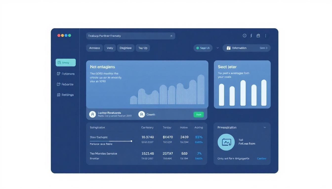
Affiliate Dashboard Design for Partner Motivation: 9 Key Steps
You know, keeping partners motivated can be tough, especially without the right tools. A cluttered or confusing dashboard might make them feel overwhelmed instead of inspired. I get it, no one wants to hunt for info or guess how they’re doing.
But if you build a simple, clear dashboard that shows the right numbers and feedback, your partners will stay engaged and excited to hit their goals. Keep reading, and I’ll share easy ways to design a dashboard that motivates partners and keeps everyone on the same page.
We’ll cover how to showcase key data, add fun features, and make it all personalized so partners love using it every day.
Key Takeaways
– Create a simple, clean dashboard that highlights key data like real-time conversions, clicks, and earnings, making it easy for partners to check their performance quickly. Use clear labels, organize related metrics together, and include quick links to resources. Ensure mobile-friendliness and add personalized greetings to make partners feel welcomed and confident in using the tool.
– Showcase essential KPIs with large, easy-to-read numbers, using color codes to indicate trends. Tailor KPIs to individual partner goals, include real-time data, and compare against past results or benchmarks to help partners track progress and stay motivated.
– Use straightforward visualizations such as bar, line, and pie charts. Label everything clearly, incorporate contrasting but limited colors, and add icons to emphasize trends. Make visuals interactive with filters or toggles for customization, especially on mobile, for quick insights.
– Provide live updates and alerts to keep partners informed about sudden changes or achievements. Enable feedback options like chat or messages within the dashboard so they can share insights or issues instantly. Clear timestamps help avoid confusion over data freshness.
– Incorporate interactive features like filters, toggles, or drill-downs to let partners explore data based on devices, time periods, or campaigns. Keep interfaces simple to prevent overwhelm, and include helpful tooltips to guide new users.
– Combine data from multiple sources—ad platforms, social media, and your tracking system—into one dashboard. Use integrations to pull in updated info regularly, saving partners from navigating multiple tools and giving them a complete view of their campaign performance.
– Add gamification elements such as leaderboards, badges, or challenges to boost engagement. Recognition like milestones or levels encourages partners to strive for better results, making the experience fun and motivating.
– Allow partners to customize their dashboard layout—move, resize, or hide widgets. Provide preset templates for different types of affiliates and enable notifications for key metrics. Personalization increases usage and makes the dashboard more relevant to their needs.
– Regularly gather feedback, monitor how users interact with the dashboard, and analyze feature usage. Use this info to improve layout, add needed features, or simplify clutter. Communicate updates and show you value user input to keep the dashboard effective and partners engaged.

1. Design an Intuitive Affiliate Dashboard for Partners
When creating an affiliate dashboard, think about how easy it is for your partners to find what they need without getting lost in the weeds.
Start with a clean layout that prioritizes the most important info—like real-time conversions, click data, and earnings—so partners can gauge their performance at a glance.
Use simple navigation menus and include clear labels, so even new affiliates won’t feel overwhelmed trying to figure out where to look.
A good tip? Group related metrics together—like all mobile performance data in one spot—to make it easier for partners to spot trends quickly.
Don’t forget to add quick access links to resources such as promotional materials or training guides, which encourage affiliates to stay engaged and informed.
Test your dashboard by having a few real partners use it before launching—see if they can locate key stats within a few seconds, then adjust based on their feedback.
Adding a personalized welcome message or greeting can make the experience feel more human and less robotic, encouraging ongoing use.
Keep in mind that if most of your affiliates are mobile users, the design must be mobile-friendly; otherwise, they’ll struggle to stay motivated on the go.
Finally, remember, an affiliate dashboard isn’t just about displaying data; it should inspire confidence, making partners feel equipped to optimize their efforts daily.
2. Showcase Key Performance Indicators (KPIs) Effectively
The goal with KPIs is to make sure your partners understand exactly how they’re doing, right now.
Highlight conversion rate, click-through rate (CTR), and average order value (AOV) with large, easy-to-read numbers—nothing fancy, just clear figures.
For example, showing that top affiliates have a 5–10% conversion rate can motivate others to aim higher, especially if they see real success stories.
Incorporate color-coding—like green for upward trends and red for declines—to enable quick assessment without needing to interpret charts every second.
Another biggie? Track mobile transactions separately since around 50% of affiliate sales come from mobile devices, so your partners know where to focus their efforts.
Make sure your KPIs are customizable depending on partner goals—some may prioritize AOV, while others care about click-throughs or total sales volume.
Use real-time stats rather than delayed data; this can help affiliates make immediate adjustments to campaigns for better odds of success.
Remember, KPIs should tell a story—so include comparisons to previous periods or benchmarks to help partners see their growth over time rather than just static numbers.
3. Use Clear and Simple Data Visualizations
No one wants to sift through complex charts when quick info is what really matters.
Stick with simple bar charts, line graphs, and pie charts—think of them as the bread and butter of data visuals.
For example, a line graph showing daily click trends over the last month can instantly reveal whether a campaign is gaining momentum or needs a boost.
Color helps! Use contrasting colors to distinguish different data sets, but keep it limited—too many colors can be distracting.
Icons or small visuals next to graphs can help illustrate key points, like an arrow indicating upward or downward trends in conversions.
If you can, add clickable filters so affiliates can customize their views—for example, toggle between device types or time periods—making the dashboard more interactive.
Don’t forget to label everything clearly—missed axes labels or unclear legends can turn a simple visual into a guessing game.
Lastly, test your visualizations on mobile devices. If they don’t load quickly or look cluttered, you’re losing the very benefit of simple, quick insights.

4. Provide Real-Time Updates and Feedback
Partners love seeing their numbers update instantly—there’s nothing more motivating than real-time data.
Set up your dashboard to refresh automatically every few seconds, giving affiliates a live look at their new clicks, conversions, and earnings.
For example, if an affiliate tweaks a campaign and notices their conversion rate jump from 2% to 4%, they can double down immediately.
Use notifications or alerts to flag sudden drops or spikes—these quick updates help affiliates adjust on the fly instead of waiting for end-of-day reports.
Make it easy for partners to give feedback directly through the dashboard, whether it’s about a problem, a suggestion, or a success story.
You could add a chat widget or a feedback button so they feel heard and supported in real-time.
Real-time insights also help optimize ad spend—say, if mobile transactions are rising, partners can shift resources quickly to capitalize.
Remember, the faster your dashboard responds, the more confident your partners will feel about trusting the data and acting on it.
One good tip? Use a clear timestamp on each metric so everyone knows exactly when the data was last updated, avoiding confusion or outdated info.
5. Encourage Exploration with Interactive Features
Partners should be able to dig into the data without feeling lost—interactive features make that possible.
Adding filters lets users customize what they see, like analyzing only traffic from certain countries or specific devices.
This is especially useful since around half of affiliate sales come from mobile devices—so providing options to sort by device type boosts focus.
Dropdown menus, date range selectors, and clickable charts help affiliates discover trends without needing to ask for help.
For instance, a toggle to compare last month to this month can show how a campaign is improving or where to tweak for better results.
You can also embed drill-downs—click on a high-performing influencer segment to see their detailed metrics, including engagement and conversion rates.
Interactive visualizations like sortable tables allow affiliates to prioritize key stats, such as AOV or ROI, based on their goals.
Don’t forget: Keep these features simple and intuitive. Overloading with options can scare newcomers.
Finally, adding tutorial tooltips or brief guides within the dashboard helps users understand how to get the most out of these features.
6. Integrate Multiple Data Sources for Unified Access
Your dashboard should bring together all the data points affiliates care about—in one place.
Imagine having ad platforms, social media insights, and your affiliate tracking tool all feeding into a single dashboard.
This way, partners don’t have to juggle multiple logins or tools, saving time and reducing frustration.
For example, syncing your Google Analytics data with your affiliate system can show mobile engagement, conversion paths, and traffic sources seamlessly.
Integrating influencer metrics from platforms like Instagram or TikTok can give partners a full picture of their campaigns’ reach and effectiveness.
You can use API integrations or third-party connectors to pull in these diverse data sets—just make sure they update regularly.
Consolidated data helps partners identify synergies and make smarter decisions—like whether a certain mobile ad works better on specific platforms.
It also enhances transparency, since affiliates see all relevant metrics without switching apps.
Pro tip: Check out platforms like [Supermetrics](https://supermetrics.com/) or [Zapier](https://zapier.com/) to connect everything smoothly.
Remember, a unified view saves your partners’ time and gives them the confidence that they’re seeing a complete story.
7. Add Gamification Elements to Increase Engagement
Who doesn’t love a little competition? Gamification makes your dashboard fun and encourages affiliates to keep pushing.
You could introduce leaderboards showing top earners or highest conversion rates—showing who’s really rocking it.
Badges and rewards for hitting milestones, like “$500 in commissions” or “10,000 clicks,” can motivate affiliates to aim higher.
Setting up monthly challenges, such as increasing CTR by 10%, adds a competitive edge that drives better results.
You can also create levels—think beginner, pro, expert—where affiliates unlock new features or perks as they advance.
Real-life example: a top affiliate might get a “Super Seller” badge, inspiring others to strive for similar recognition.
Make sure these gamification tools are transparent and achievable; nobody wants to chase unrealistic goals.
Adding a social sharing feature can amplify motivation—partners can boast their wins and rally others to compete or collaborate.
Just keep in mind: The aim is to boost engagement, not to make it feel like a game that’s too complicated or distracting.
8. Allow Customization and Personalization of Dashboard Views
Everyone has their favorite metrics, so let partners tailor their dashboards to fit their goals.
Allow them to move widgets around, resize charts, or hide info they don’t care about—personal control boosts usability.
For example, a content-focused affiliate might want to see influencer engagement stats front and center, while a paid ads partner prefers conversion and ROI metrics.
Offer preset layouts for different types of affiliates—beginners, experienced marketers, or niche specialists—so they can start with what suits their needs.
Enable notifications or alerts for specific KPIs—say, a spike in mobile transactions—so partners get instant updates relevant to their strategy.
Personalization helps partners feel more connected and in control, which often leads to increased dashboard use.
It’s also wise to auto-save these preferences, so every time they log in, they see their customized view.
A little tip: Send periodic check-ins prompting them to update their favorite metrics or layouts based on changing goals.
This flexibility means your dashboard evolves along with your partners’ growth and interests.
9. Regularly Assess Dashboard Performance for Continuous Improvement
A dashboard is only as good as its ability to serve your partners. Keep tabs on how well it’s working.
Gather feedback regularly—ask users what works and what’s a pain to find or understand.
Use your own analytics to monitor how often partners log in, which features they use the most, and where they drop off.
For example, if you notice a lot of affiliates avoid the custom filters, it might mean they’re confusing or not intuitive enough.
Updates should be based on real behavior—adding new features, removing clutter, or simplifying complex charts based on what your partners actually need.
Hold periodic check-ins—like quarterly surveys or quick polls—to keep a pulse on satisfaction and gather ideas for updates.
Benchmark your dashboard’s performance against key metrics like engagement rate or time spent per session.
Remember, a slowly changing dashboard that adapts based on user input shows you care about your partners’ success.
Don’t forget to communicate improvements—if features were added or simplified, tell your affiliates so they know their feedback made a difference.
FAQs
Create a clean layout with straightforward navigation, use simple language, and organize data logically. Prioritize essential KPIs and minimize clutter, making it easier for partners to find key information quickly.
Use clear visual elements like bar charts and line graphs to highlight trends and comparisons. Keep visuals simple, with consistent colors, to help partners easily interpret their performance metrics.
Yes, offering customization options allows partners to prioritize data they find most relevant. This personalizes the experience and helps them focus on the metrics that matter most to their goals.